- Power BI forums
- Updates
- News & Announcements
- Get Help with Power BI
- Desktop
- Service
- Report Server
- Power Query
- Mobile Apps
- Developer
- DAX Commands and Tips
- Custom Visuals Development Discussion
- Health and Life Sciences
- Power BI Spanish forums
- Translated Spanish Desktop
- Power Platform Integration - Better Together!
- Power Platform Integrations (Read-only)
- Power Platform and Dynamics 365 Integrations (Read-only)
- Training and Consulting
- Instructor Led Training
- Dashboard in a Day for Women, by Women
- Galleries
- Community Connections & How-To Videos
- COVID-19 Data Stories Gallery
- Themes Gallery
- Data Stories Gallery
- R Script Showcase
- Webinars and Video Gallery
- Quick Measures Gallery
- 2021 MSBizAppsSummit Gallery
- 2020 MSBizAppsSummit Gallery
- 2019 MSBizAppsSummit Gallery
- Events
- Ideas
- Custom Visuals Ideas
- Issues
- Issues
- Events
- Upcoming Events
- Community Blog
- Power BI Community Blog
- Custom Visuals Community Blog
- Community Support
- Community Accounts & Registration
- Using the Community
- Community Feedback
Register now to learn Fabric in free live sessions led by the best Microsoft experts. From Apr 16 to May 9, in English and Spanish.
- Power BI forums
- Forums
- Get Help with Power BI
- Desktop
- filtering query
- Subscribe to RSS Feed
- Mark Topic as New
- Mark Topic as Read
- Float this Topic for Current User
- Bookmark
- Subscribe
- Printer Friendly Page
- Mark as New
- Bookmark
- Subscribe
- Mute
- Subscribe to RSS Feed
- Permalink
- Report Inappropriate Content
filtering query
Hello,
I am working on some data in excel/dax and want to be able to show all data in a pivot table but also allow a user to select team data on a slicer but only allowing a selection where team data population >= 5.
Obviously if I filter this at the beginning I will have reduced numbers in my all data. Is there a way round this? The lookup table with team data includes team name with accompanying population size.
Many thanks,
Adam
Solved! Go to Solution.
- Mark as New
- Bookmark
- Subscribe
- Mute
- Subscribe to RSS Feed
- Permalink
- Report Inappropriate Content
Hi @adavid999 ,
If you don't want to display the yellow team, we can create a calculate column and put it to filter on this page to meet your requirement.
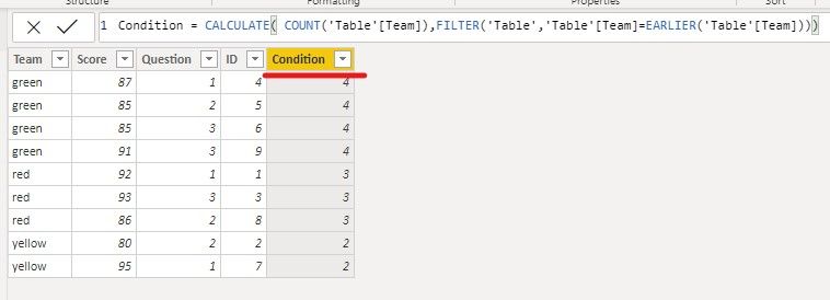
1. Create a column to calculate the count of each team.
Condition = CALCULATE( COUNT('Table'[Team]),FILTER('Table','Table'[Team]=EARLIER('Table'[Team])))

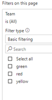
2. Then we can put the condition column to filter on this page, and configure the value is greater than 2.
The result like this,
If it doesn’t meet your requirement, could you please show the exact expected result based on the table that you have shared?
BTW, pbix as attached.
Best regards,
Community Support Team _ zhenbw
If this post helps, then please consider Accept it as the solution to help the other members find it more quickly.
- Mark as New
- Bookmark
- Subscribe
- Mute
- Subscribe to RSS Feed
- Permalink
- Report Inappropriate Content
Hi @adavid999 ,
Do you want to display the data dynamically according to different users?
If yes, maybe you need to configure RLS, please refer this video, hope it helps.
If it doesn't meet your requirement, could you please provide a mockup sample based on fake data and describe the scenario?
It will help others to understand your issue quickly, and provide a better solution.
Best regards,
Community Support Team _ zhenbw
If this post helps, then please consider Accept it as the solution to help the other members find it more quickly.
- Mark as New
- Bookmark
- Subscribe
- Mute
- Subscribe to RSS Feed
- Permalink
- Report Inappropriate Content
Hi @v-zhenbw-msft and @parry2k thanks for responding - I have tables and relationships as examples below. I have a measure to display total average score (by question) and I display this in a pivot table. I would also like users to be able to see average score by question filtered by team - in the same pivot table, by selecting a filter/slicer.
But in example below, I would like to restrict the slicer options on demo 2, team - to only show teams with more then 3 respondents (in this example, a user should therefore only be able to see/select team average for green and red teams). Hope this makes sense!
- Mark as New
- Bookmark
- Subscribe
- Mute
- Subscribe to RSS Feed
- Permalink
- Report Inappropriate Content
Hi @adavid999 ,
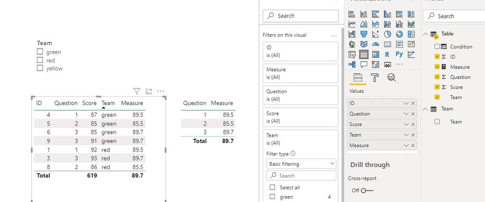
Do you want to calculate the average of the selected Team in each Question?
If our understanding is correct, we can use the following measure to meet your requirement.
Measure =
var Total_each_question = CALCULATE(SUM('Table'[Score]),FILTER(ALLSELECTED('Table'),'Table'[Question]=MAX('Table'[Question])))
var count_ = CALCULATE(COUNT('Table'[Question]),FILTER(ALLSELECTED('Table'),'Table'[Question]=MAX('Table'[Question])))
return
DIVIDE(Total_each_question,count_)
If it doesn’t meet your requirement, could you please show the exact expected result based on the table that you have shared?
BTW, pbix as attached.
Best regards,
Community Support Team _ zhenbw
If this post helps, then please consider Accept it as the solution to help the other members find it more quickly.
- Mark as New
- Bookmark
- Subscribe
- Mute
- Subscribe to RSS Feed
- Permalink
- Report Inappropriate Content
Hi @v-zhenbw-msft and thank you very much for your response. I am sorry I was not more clear - i do struggle sometimes to articulate what I am trying to achieve with dax. The table you set up is close to where I want to get to - i.e. a summary table of all the data (below left), filterable by Team.
What I am wondering though is whether there is a way to show a table like yours on the left but when it comes to filtering, suppress Yellow team as it has less than 3 responses (as shown below). I want to display the 'all' figure, but suppress filtering where team responses do not meet a certain threshold.
Best,
Adam
- Mark as New
- Bookmark
- Subscribe
- Mute
- Subscribe to RSS Feed
- Permalink
- Report Inappropriate Content
Ps @v-zhenbw-msft apologies if you have already solved this and I haven't understood the solution!
- Mark as New
- Bookmark
- Subscribe
- Mute
- Subscribe to RSS Feed
- Permalink
- Report Inappropriate Content
Hi @adavid999 ,
If you don't want to display the yellow team, we can create a calculate column and put it to filter on this page to meet your requirement.
1. Create a column to calculate the count of each team.
Condition = CALCULATE( COUNT('Table'[Team]),FILTER('Table','Table'[Team]=EARLIER('Table'[Team])))

2. Then we can put the condition column to filter on this page, and configure the value is greater than 2.
The result like this,
If it doesn’t meet your requirement, could you please show the exact expected result based on the table that you have shared?
BTW, pbix as attached.
Best regards,
Community Support Team _ zhenbw
If this post helps, then please consider Accept it as the solution to help the other members find it more quickly.
- Mark as New
- Bookmark
- Subscribe
- Mute
- Subscribe to RSS Feed
- Permalink
- Report Inappropriate Content
@adavid999 sorry your question is not fully clear. Can you share sample data with the expected output, it will help enormously to provide a proper solution.
Subscribe to the @PowerBIHowTo YT channel for an upcoming video on List and Record functions in Power Query!!
Learn Power BI and Fabric - subscribe to our YT channel - Click here: @PowerBIHowTo
If my solution proved useful, I'd be delighted to receive Kudos. When you put effort into asking a question, it's equally thoughtful to acknowledge and give Kudos to the individual who helped you solve the problem. It's a small gesture that shows appreciation and encouragement! ❤
Did I answer your question? Mark my post as a solution. Proud to be a Super User! Appreciate your Kudos 🙂
Feel free to email me with any of your BI needs.
Helpful resources

Microsoft Fabric Learn Together
Covering the world! 9:00-10:30 AM Sydney, 4:00-5:30 PM CET (Paris/Berlin), 7:00-8:30 PM Mexico City

Power BI Monthly Update - April 2024
Check out the April 2024 Power BI update to learn about new features.

| User | Count |
|---|---|
| 114 | |
| 99 | |
| 82 | |
| 70 | |
| 60 |
| User | Count |
|---|---|
| 149 | |
| 114 | |
| 107 | |
| 89 | |
| 67 |


