- Power BI forums
- Updates
- News & Announcements
- Get Help with Power BI
- Desktop
- Service
- Report Server
- Power Query
- Mobile Apps
- Developer
- DAX Commands and Tips
- Custom Visuals Development Discussion
- Health and Life Sciences
- Power BI Spanish forums
- Translated Spanish Desktop
- Power Platform Integration - Better Together!
- Power Platform Integrations (Read-only)
- Power Platform and Dynamics 365 Integrations (Read-only)
- Training and Consulting
- Instructor Led Training
- Dashboard in a Day for Women, by Women
- Galleries
- Community Connections & How-To Videos
- COVID-19 Data Stories Gallery
- Themes Gallery
- Data Stories Gallery
- R Script Showcase
- Webinars and Video Gallery
- Quick Measures Gallery
- 2021 MSBizAppsSummit Gallery
- 2020 MSBizAppsSummit Gallery
- 2019 MSBizAppsSummit Gallery
- Events
- Ideas
- Custom Visuals Ideas
- Issues
- Issues
- Events
- Upcoming Events
- Community Blog
- Power BI Community Blog
- Custom Visuals Community Blog
- Community Support
- Community Accounts & Registration
- Using the Community
- Community Feedback
Register now to learn Fabric in free live sessions led by the best Microsoft experts. From Apr 16 to May 9, in English and Spanish.
- Power BI forums
- Forums
- Get Help with Power BI
- Desktop
- dynamic graphic with calculated columns
- Subscribe to RSS Feed
- Mark Topic as New
- Mark Topic as Read
- Float this Topic for Current User
- Bookmark
- Subscribe
- Printer Friendly Page
- Mark as New
- Bookmark
- Subscribe
- Mute
- Subscribe to RSS Feed
- Permalink
- Report Inappropriate Content
dynamic graphic with calculated columns
Hi,
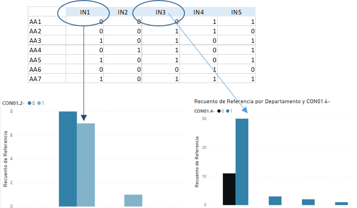
I want to generate a dynamic graph that changes from one calculated column to another, based on a filter. An example of calculated columns: IN1, IN2, IN3, IN4.
I want to generate a unique graphic that could show information from 20 different calculated columns, and I could select the calculated column of the graphic with a filter.
Is there an easy way to do this?
Thanks in advance
Solved! Go to Solution.
- Mark as New
- Bookmark
- Subscribe
- Mute
- Subscribe to RSS Feed
- Permalink
- Report Inappropriate Content
Hello, @Ley022
It's a pleasure to answer for you.
According to its description, I think you can create a table (enter data) with a single column that includes all calculated column name elements, and then create a measure used in the 'values' of the stacked column chart.
Measure =
SWITCH (
    TRUE (),
    SELECTEDVALUE ( 'Table (2)'[IN] ) = "IN1", MAX ( 'Table'[IN1] ),
    SELECTEDVALUE ( 'Table (2)'[IN] ) = "IN2", MAX ( 'Table'[IN2] ),
    SELECTEDVALUE ( 'Table (2)'[IN] ) = "IN3", MAX ( 'Table'[IN3] ),
    SELECTEDVALUE ( 'Table (2)'[IN] ) = "IN4", MAX ( 'Table'[IN4] ),
    SELECTEDVALUE ( 'Table (2)'[IN] ) = "IN5", MAX ( 'Table'[IN5] )
)
// max(your calculate column)
Like this:
Here is my sample .pbix file. I hope it helps.
If you do not solve your problem, please feel free to ask me.
Best regards
Janey Guo
If this post helps,then consider Accepting it as the solution to help other members find it faster.
- Mark as New
- Bookmark
- Subscribe
- Mute
- Subscribe to RSS Feed
- Permalink
- Report Inappropriate Content
@Ley022 , check if measure slicer can help
https://radacad.com/change-the-column-or-measure-value-in-a-power-bi-visual-by-selection-of-the-slic...
https://community.powerbi.com/t5/Desktop/Slicer-MTD-QTD-YTD-to-filter-dates-using-the-slicer/td-p/50...
Microsoft Power BI Learning Resources, 2023 !!
Learn Power BI - Full Course with Dec-2022, with Window, Index, Offset, 100+ Topics !!
Did I answer your question? Mark my post as a solution! Appreciate your Kudos !! Proud to be a Super User! !!
- Mark as New
- Bookmark
- Subscribe
- Mute
- Subscribe to RSS Feed
- Permalink
- Report Inappropriate Content
Great solution. I have achieved those results with table format when trying to create a graphic it does not work. Indeed filtering works properly in table, but when I change it to graphic visualization and add another variable (example, category) graphic does not work properly, and some categories of the axis are missing when it is filtered. Any idea? Thanks
Helpful resources

Microsoft Fabric Learn Together
Covering the world! 9:00-10:30 AM Sydney, 4:00-5:30 PM CET (Paris/Berlin), 7:00-8:30 PM Mexico City

Power BI Monthly Update - April 2024
Check out the April 2024 Power BI update to learn about new features.

| User | Count |
|---|---|
| 111 | |
| 97 | |
| 82 | |
| 67 | |
| 61 |
| User | Count |
|---|---|
| 148 | |
| 113 | |
| 97 | |
| 84 | |
| 67 |

