- Power BI forums
- Updates
- News & Announcements
- Get Help with Power BI
- Desktop
- Service
- Report Server
- Power Query
- Mobile Apps
- Developer
- DAX Commands and Tips
- Custom Visuals Development Discussion
- Health and Life Sciences
- Power BI Spanish forums
- Translated Spanish Desktop
- Power Platform Integration - Better Together!
- Power Platform Integrations (Read-only)
- Power Platform and Dynamics 365 Integrations (Read-only)
- Training and Consulting
- Instructor Led Training
- Dashboard in a Day for Women, by Women
- Galleries
- Community Connections & How-To Videos
- COVID-19 Data Stories Gallery
- Themes Gallery
- Data Stories Gallery
- R Script Showcase
- Webinars and Video Gallery
- Quick Measures Gallery
- 2021 MSBizAppsSummit Gallery
- 2020 MSBizAppsSummit Gallery
- 2019 MSBizAppsSummit Gallery
- Events
- Ideas
- Custom Visuals Ideas
- Issues
- Issues
- Events
- Upcoming Events
- Community Blog
- Power BI Community Blog
- Custom Visuals Community Blog
- Community Support
- Community Accounts & Registration
- Using the Community
- Community Feedback
Register now to learn Fabric in free live sessions led by the best Microsoft experts. From Apr 16 to May 9, in English and Spanish.
- Power BI forums
- Forums
- Get Help with Power BI
- Desktop
- display data in a certain range with a single sele...
- Subscribe to RSS Feed
- Mark Topic as New
- Mark Topic as Read
- Float this Topic for Current User
- Bookmark
- Subscribe
- Printer Friendly Page
- Mark as New
- Bookmark
- Subscribe
- Mute
- Subscribe to RSS Feed
- Permalink
- Report Inappropriate Content
display data in a certain range with a single select slicer
Hello, experts,
I want to built a line chart from a dimension table with year-month column, and a fact table, the two table is connected with yearmonth column, and the slicer is single-select which from year-month column, the data type is string and should not convert into date type because some other reasons.
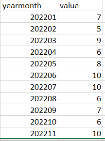
here is the data looks like,
I want to realize that create a line chart visual with the x-axis from dimension table because there are other measures need to display from other fact table;
when the slicer select 202206, then the line chart visual x-axis and relevent data should be start from 202201 and end at 202206, if slicer is 202105, then the x-axis and relevant data should be start from 202101 and end at 202105.
this problem is quite complicate for me, do you have any good ideas, Thank you.
Solved! Go to Solution.
- Mark as New
- Bookmark
- Subscribe
- Mute
- Subscribe to RSS Feed
- Permalink
- Report Inappropriate Content
Hi , @Anonymous
For your case, we implemented your needs with "Filter on this visual", but you said that there are other visuals on your report that need to be filtered by your filter. According to research, if your slicer filter all meet your above needs:
For your case, we implemented your needs with "Filter on this visual", but you said that there are other visuals on your report that need to be filtered by your filter. According to research, if your slicer filter all meet your above needs:
when the slicer select 202206, then the line chart visual x-axis and relevent data should be start from 202201 and end at 202206, if slicer is 202105, then the x-axis and relevant data should be start from 202101 and end at 202105.
You can try the following to keep the 'Table' [datamonth] slicer separate instead of using two slices. If your filtering logic is different, then you need to keep two slicers on the top of your page.
Here are the steps you can refer to :
(1)We need to download the "Preselected slicer" in custom visual :
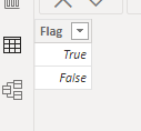
(2)Then we need to create a 'Flag' table, like this:
(3)Then we create a measure :
Measure 3 = var _slicer = SELECTEDVALUE('Slicer'[datamonth])
var _first =VALUE(LEFT( FORMAT(_slicer , "0"),4)&"01")
var _table_datamonth = SELECTEDVALUE('Table'[datamonth])
return
IF( _table_datamonth >= _first && _table_datamonth<=_slicer ,TRUE() ,FALSE())
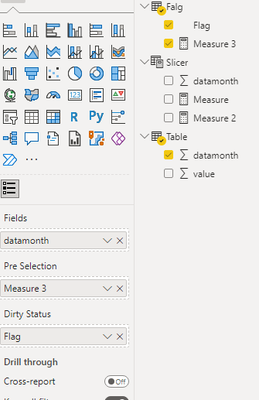
(4)Then we put these fileds on this visual :
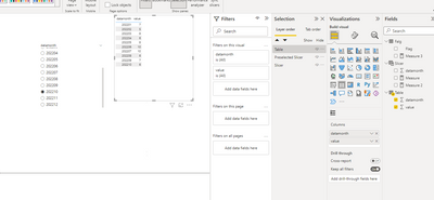
Then we can configure the visual's color to white to ignore the visual on our report and just use the 'Table'[datamonth] slicer:
Thank you for your time and sharing, and thank you for your support and understanding of PowerBI!
Best Regards,
Aniya Zhang
If this post helps, then please consider Accept it as the solution to help the other members find it more quickly
- Mark as New
- Bookmark
- Subscribe
- Mute
- Subscribe to RSS Feed
- Permalink
- Report Inappropriate Content
@Anonymous , when you select 202206 - 202201 to 202206
then why 202101 to 202205 for 202105?
Microsoft Power BI Learning Resources, 2023 !!
Learn Power BI - Full Course with Dec-2022, with Window, Index, Offset, 100+ Topics !!
Did I answer your question? Mark my post as a solution! Appreciate your Kudos !! Proud to be a Super User! !!
- Mark as New
- Bookmark
- Subscribe
- Mute
- Subscribe to RSS Feed
- Permalink
- Report Inappropriate Content
it's a mistake, it should be 202105
- Mark as New
- Bookmark
- Subscribe
- Mute
- Subscribe to RSS Feed
- Permalink
- Report Inappropriate Content
@Anonymous , Create a new table
Month = distinct(Table[Year Month])
Do not join it with your table only use in the slicer
use below measure with month year from your table
Sum of Value =
var _max = Maxx(allselecetd(Month), Month[Yearmonth])
var _min = left(_max&"",4)*100 + 1
return
calculate(sum(table[Value]), filter(Table, Table[Yearmonth] >= _min && Table[Yearmonth] <=_max))
Microsoft Power BI Learning Resources, 2023 !!
Learn Power BI - Full Course with Dec-2022, with Window, Index, Offset, 100+ Topics !!
Did I answer your question? Mark my post as a solution! Appreciate your Kudos !! Proud to be a Super User! !!
- Mark as New
- Bookmark
- Subscribe
- Mute
- Subscribe to RSS Feed
- Permalink
- Report Inappropriate Content
Thanks for your answer, actually I have to join the table because there is another table in the same page that use the same axis and same slicer
- Mark as New
- Bookmark
- Subscribe
- Mute
- Subscribe to RSS Feed
- Permalink
- Report Inappropriate Content
Hi , @Anonymous
For your case, we implemented your needs with "Filter on this visual", but you said that there are other visuals on your report that need to be filtered by your filter. According to research, if your slicer filter all meet your above needs:
For your case, we implemented your needs with "Filter on this visual", but you said that there are other visuals on your report that need to be filtered by your filter. According to research, if your slicer filter all meet your above needs:
when the slicer select 202206, then the line chart visual x-axis and relevent data should be start from 202201 and end at 202206, if slicer is 202105, then the x-axis and relevant data should be start from 202101 and end at 202105.
You can try the following to keep the 'Table' [datamonth] slicer separate instead of using two slices. If your filtering logic is different, then you need to keep two slicers on the top of your page.
Here are the steps you can refer to :
(1)We need to download the "Preselected slicer" in custom visual :
(2)Then we need to create a 'Flag' table, like this:
(3)Then we create a measure :
Measure 3 = var _slicer = SELECTEDVALUE('Slicer'[datamonth])
var _first =VALUE(LEFT( FORMAT(_slicer , "0"),4)&"01")
var _table_datamonth = SELECTEDVALUE('Table'[datamonth])
return
IF( _table_datamonth >= _first && _table_datamonth<=_slicer ,TRUE() ,FALSE())
(4)Then we put these fileds on this visual :
Then we can configure the visual's color to white to ignore the visual on our report and just use the 'Table'[datamonth] slicer:
Thank you for your time and sharing, and thank you for your support and understanding of PowerBI!
Best Regards,
Aniya Zhang
If this post helps, then please consider Accept it as the solution to help the other members find it more quickly
Helpful resources

Microsoft Fabric Learn Together
Covering the world! 9:00-10:30 AM Sydney, 4:00-5:30 PM CET (Paris/Berlin), 7:00-8:30 PM Mexico City

Power BI Monthly Update - April 2024
Check out the April 2024 Power BI update to learn about new features.

| User | Count |
|---|---|
| 107 | |
| 94 | |
| 77 | |
| 63 | |
| 50 |
| User | Count |
|---|---|
| 147 | |
| 106 | |
| 104 | |
| 87 | |
| 61 |


