- Power BI forums
- Updates
- News & Announcements
- Get Help with Power BI
- Desktop
- Service
- Report Server
- Power Query
- Mobile Apps
- Developer
- DAX Commands and Tips
- Custom Visuals Development Discussion
- Health and Life Sciences
- Power BI Spanish forums
- Translated Spanish Desktop
- Power Platform Integration - Better Together!
- Power Platform Integrations (Read-only)
- Power Platform and Dynamics 365 Integrations (Read-only)
- Training and Consulting
- Instructor Led Training
- Dashboard in a Day for Women, by Women
- Galleries
- Community Connections & How-To Videos
- COVID-19 Data Stories Gallery
- Themes Gallery
- Data Stories Gallery
- R Script Showcase
- Webinars and Video Gallery
- Quick Measures Gallery
- 2021 MSBizAppsSummit Gallery
- 2020 MSBizAppsSummit Gallery
- 2019 MSBizAppsSummit Gallery
- Events
- Ideas
- Custom Visuals Ideas
- Issues
- Issues
- Events
- Upcoming Events
- Community Blog
- Power BI Community Blog
- Custom Visuals Community Blog
- Community Support
- Community Accounts & Registration
- Using the Community
- Community Feedback
Register now to learn Fabric in free live sessions led by the best Microsoft experts. From Apr 16 to May 9, in English and Spanish.
- Power BI forums
- Forums
- Get Help with Power BI
- Desktop
- data visualization & complex dax measurements
- Subscribe to RSS Feed
- Mark Topic as New
- Mark Topic as Read
- Float this Topic for Current User
- Bookmark
- Subscribe
- Printer Friendly Page
- Mark as New
- Bookmark
- Subscribe
- Mute
- Subscribe to RSS Feed
- Permalink
- Report Inappropriate Content
data visualization & complex dax measurements
Greetings again to all the members of the community.
Again I am here requesting your appreciated help.
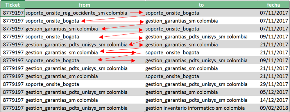
I have the following data that represents the changes of a service ticket from a help desk.
each row represents the source support group and to which it was transferred, together with the date of the action.
I need to visually represent the path that calls have followed
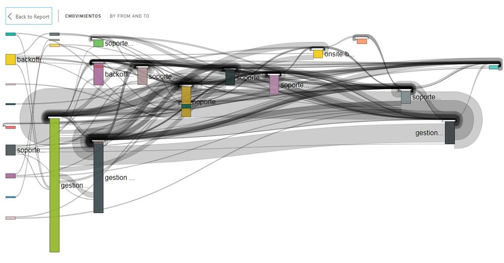
this try to do it with sankey diagram but as you can see in the data the groups are repeated in the column "from" as in the "to" column, therefore the visualization becomes little comprehensible.
Someone has a recommendation on how to represent it in a cleaner way
additional two challenges:
-I need to create two measures one that allows me to calculate the number of transfers, and then the average of them.
for the example it would be:
number of transfers: 13
and the average the sum of the amount of this data among the total.
- the next thing would be to calculate the days between each transfer for each ticket
11/7/2017
11/9/2017
11/21/2017
11/29/2017 etc
I appreciate any help.
Annex link with the complete information
Solved! Go to Solution.
- Mark as New
- Bookmark
- Subscribe
- Mute
- Subscribe to RSS Feed
- Permalink
- Report Inappropriate Content
Hi ccastelb,
For the additional question, would you please clarify more details? For exmaple, which column do you want to calculate the average value of it? What's the logic?
Also, does "the days between transfers" mean that the max date intervals for each ticket and each transfer? If right, you may try measure below and check if it can meet your requirement:
Interval =
CALCULATE (
    MAX ( Table[fecha] ) - MIN ( Table[fecha] ),
    ALLEXCEPT ( Table, Table[Ticket], Table[from], Table[to] )
)
Regards,
Jimmy Tao
- Mark as New
- Bookmark
- Subscribe
- Mute
- Subscribe to RSS Feed
- Permalink
- Report Inappropriate Content
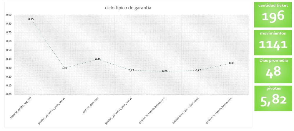
Thank you very much for your support, I had not returned to this thread due to lack of time and work commitments, but in order to contribute something, even if it is not very express how to solve the case. because I could not find a form of representation that would leave clarity about how the tickets move, what I did was to take the average number of movements a ticket has, after that I took the probability that each ticket was in a certain group in each movement, so for example the probability of entering the group xxxx, then take the probability of the group in the second movement and so on, in the end simply model as a line diagram to represent the linearity of the process.
for the subject of the time of each transfer I had more difficulties in the calculation, I really applied it more manually, I know it is the worst option but I am not more alternative, for that matter take a dynamic table and take maximum and minimum for each line, later average, that I estimate that throws me the amount of days on average that are consumed per ticket.
I know that this solution is not the most orthodox yet I comment it with the encouragement that it serves as a guide for some more brilliant people.
However, since I am not a specialist, if I have made an error, I accept the corrections of the case.
Thank you again for your time and effort.
- Mark as New
- Bookmark
- Subscribe
- Mute
- Subscribe to RSS Feed
- Permalink
- Report Inappropriate Content
@v-yuta-msft Thank you very much for the diligent response, I'll explain my need a bit better with the hope that you can help me
the measures should behave as follows
count for each ticket the amount of changes example:
ticket 8779197 changes 13
ticket 8793872 changes 14
ticket 8795592 changes 10
average 12.3 this would be the first required result
relative to the dates I require something similar but with the days
example:
ticket 8779197
starting date 07/11/2017
Final date 02/09/2018
total days 94
ticket 8793872
start date 10/11/2017
final date 04/02/2018
total days 86
ticket 8795592
start date 11/14/2017
final date 03/01/2018
total days = 50
average 77 this would be the second required result
and the most challenging challenge would be to establish which of the groups is the most delayed in attending their tickets
example: ticket 8779197
group Sum of days consumed
gestion_garantias 11
gestion_garantias_pdts_unisys 75
support_onsite_bogota 11
this table represents the number of days that each group took to take action, which is the difference between a
Annex clarifying image
here for example gestion_garantias_pdts_unisys takes 12 days to move to the group gestion_garantias
- Mark as New
- Bookmark
- Subscribe
- Mute
- Subscribe to RSS Feed
- Permalink
- Report Inappropriate Content
Hi,
You may refer to my solution - Visualising data flows using Custom Visuals.
Hope this helps.
Regards,
Ashish Mathur
http://www.ashishmathur.com
https://www.linkedin.com/in/excelenthusiasts/
- Mark as New
- Bookmark
- Subscribe
- Mute
- Subscribe to RSS Feed
- Permalink
- Report Inappropriate Content
@Ashish_Mathur I really appreciate your help, this solution presents a difficulty and is that as you can see in the example and in the information the same ticket number passes several times through the same group and then move on to others, this really complicates things because I want to represent that linearity that is following the ticket.
for example for the first service:
support_consent_reg_occident
>> support_onsite_bogota
>> gestion_garantias
>> support_onsite_bogota
>> gestion_garantias_pdts_unisys
>> gestion_garantias
>> support_onsite_bogota
>> gestion_garantias_pdts_unisys
>> gestion_garantias
>> support_onsite_bogota
>> gestion_garantias_pdts_unisys
>> gestion_garantias
>> gestion_garantias_pdts_unisys
>> gestion informatica inventory sm colombia
anexo ejemplos de como se sankey para este tipo de información
ajustando el parametro de visualización en
"draw backward link" o "duplicate"
As you can see, the visual representations are confusing and I want to see it more clearly
thank you can you help me again
- Mark as New
- Bookmark
- Subscribe
- Mute
- Subscribe to RSS Feed
- Permalink
- Report Inappropriate Content
Hi,
I dont think i can help here.
Regards,
Ashish Mathur
http://www.ashishmathur.com
https://www.linkedin.com/in/excelenthusiasts/
- Mark as New
- Bookmark
- Subscribe
- Mute
- Subscribe to RSS Feed
- Permalink
- Report Inappropriate Content
@Ashish_Mathur Do not worry, I am also very grateful for your diligence when you come to my aid.
For now the only thing that occurs to me to model this issue is to manually perform a calculation that indicates the probability of each group at a given time of the calls and represent it as a line graph with the path most likely to follow the services
Thanks for your interest
Helpful resources

Microsoft Fabric Learn Together
Covering the world! 9:00-10:30 AM Sydney, 4:00-5:30 PM CET (Paris/Berlin), 7:00-8:30 PM Mexico City

Power BI Monthly Update - April 2024
Check out the April 2024 Power BI update to learn about new features.

| User | Count |
|---|---|
| 109 | |
| 98 | |
| 77 | |
| 66 | |
| 54 |
| User | Count |
|---|---|
| 144 | |
| 104 | |
| 100 | |
| 86 | |
| 64 |


