- Power BI forums
- Updates
- News & Announcements
- Get Help with Power BI
- Desktop
- Service
- Report Server
- Power Query
- Mobile Apps
- Developer
- DAX Commands and Tips
- Custom Visuals Development Discussion
- Health and Life Sciences
- Power BI Spanish forums
- Translated Spanish Desktop
- Power Platform Integration - Better Together!
- Power Platform Integrations (Read-only)
- Power Platform and Dynamics 365 Integrations (Read-only)
- Training and Consulting
- Instructor Led Training
- Dashboard in a Day for Women, by Women
- Galleries
- Community Connections & How-To Videos
- COVID-19 Data Stories Gallery
- Themes Gallery
- Data Stories Gallery
- R Script Showcase
- Webinars and Video Gallery
- Quick Measures Gallery
- 2021 MSBizAppsSummit Gallery
- 2020 MSBizAppsSummit Gallery
- 2019 MSBizAppsSummit Gallery
- Events
- Ideas
- Custom Visuals Ideas
- Issues
- Issues
- Events
- Upcoming Events
- Community Blog
- Power BI Community Blog
- Custom Visuals Community Blog
- Community Support
- Community Accounts & Registration
- Using the Community
- Community Feedback
Register now to learn Fabric in free live sessions led by the best Microsoft experts. From Apr 16 to May 9, in English and Spanish.
- Power BI forums
- Forums
- Get Help with Power BI
- Desktop
- Re: data collected at different time interval but ...
- Subscribe to RSS Feed
- Mark Topic as New
- Mark Topic as Read
- Float this Topic for Current User
- Bookmark
- Subscribe
- Printer Friendly Page
- Mark as New
- Bookmark
- Subscribe
- Mute
- Subscribe to RSS Feed
- Permalink
- Report Inappropriate Content
data collected at different time interval but shown as if at same time interval
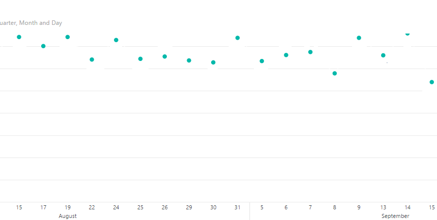
As shown in picture above. I plotted a line graph and turn it into dots since I dont want the dots to be connected.
My problem now is that when I drill down the data, not every day is shown on the x-axis (which is what I want). It will be still ok if the shown dots are correctly spaced. For example, the data of August 19, 22, 24, 25,26 are equally spaced, which created a false impression that the dots of data are collected at an equal interval of date, which are not.
Thank you in advance.
Solved! Go to Solution.
- Mark as New
- Bookmark
- Subscribe
- Mute
- Subscribe to RSS Feed
- Permalink
- Report Inappropriate Content
Hi!
You can create a measure like this
calculate(values'datestabel'[date],
if(isblank(sum('yourtable'[columnwithvalues])),
blank() , --(or 0 depending on what you want to see)
sum('table'[column])
)
)
to show blank (zero) values.
Regards,
Arthur
- Mark as New
- Bookmark
- Subscribe
- Mute
- Subscribe to RSS Feed
- Permalink
- Report Inappropriate Content
Hi @Qianru221,
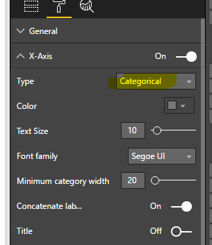
Please set the X-axis as Categorical type as the screenshot below shown, and check if it works fine.
If this still doesn't resolve your issue, do you mind share your .pbix file for further analysis?
Best Regards,
Angelia
- Mark as New
- Bookmark
- Subscribe
- Mute
- Subscribe to RSS Feed
- Permalink
- Report Inappropriate Content
Hi Angelia,
Thank you for your information. However the method does not work in this case. I cannot share the data with you either.
- Mark as New
- Bookmark
- Subscribe
- Mute
- Subscribe to RSS Feed
- Permalink
- Report Inappropriate Content
Hi @Qianru221,
In your resource table, is there every day of data? If it doesn't have, please create a Calendar table, and create a rebationship between fact table and Calendar table, then try the solution above.
Best Regards,
Angelia
- Mark as New
- Bookmark
- Subscribe
- Mute
- Subscribe to RSS Feed
- Permalink
- Report Inappropriate Content
hmm. Indeed I tried to create a calendar table and connect the calendar table date to the date that has values. However it is still not working. The setting has to stay in categorical, because I need the marker topple to be on. I only want the data points to be shown and not the lines in between. If the data is set to continuous, indeed the problem is solved, however the data points cannot be shown any more....So it is really confusing.
- Mark as New
- Bookmark
- Subscribe
- Mute
- Subscribe to RSS Feed
- Permalink
- Report Inappropriate Content
Hi @Qianru221,
If we set the x-asix as categorical, the dots shows according to your values in the field shown on x-axis. If there is value on August 19, it will display on the chart. We can't set same time internal, for example August 19, 21, 23, 25, 27 and so on.
Best Regards,
Angelia
- Mark as New
- Bookmark
- Subscribe
- Mute
- Subscribe to RSS Feed
- Permalink
- Report Inappropriate Content
Hi @v-huizhn-msft,
Thank you for your reply.
My point was, it the data are on e.g Aug 1st, Aug 10th and Sep 1st, can the distance between the dots have a horizontal distance that is proportional to the time difference in between? (as shown in my very 1st post)
Thanks.
- Mark as New
- Bookmark
- Subscribe
- Mute
- Subscribe to RSS Feed
- Permalink
- Report Inappropriate Content
Hi @Qianru221,
We can't set values on x-axis that proportial to the time difference directly. You can create a calendar, set x-axis and show all the dates x-axis, the y-value will display proportionally to the time difference, because there is no y value in some dates.
Best Regards,
Angelia
- Mark as New
- Bookmark
- Subscribe
- Mute
- Subscribe to RSS Feed
- Permalink
- Report Inappropriate Content
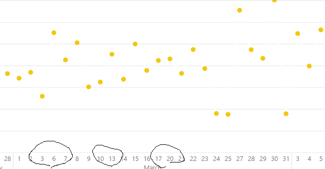
Yes. That is actually what I have done:
1. I have created a time calendar table with every day ranging from 2015-2017
2. I have a table with dates and numbers.
3. I have connected the dates with numbers to calendar table
4. I set the time in time calendar table as X axis
5. I set the numbers as Y axis.
Still.....
- Mark as New
- Bookmark
- Subscribe
- Mute
- Subscribe to RSS Feed
- Permalink
- Report Inappropriate Content
Hi @Qianru221,
For your requirement, the x-axis should show all day of each month, right?
Best Regards,
Angelia
- Mark as New
- Bookmark
- Subscribe
- Mute
- Subscribe to RSS Feed
- Permalink
- Report Inappropriate Content
Yes. Or at least the points above are distanced proportionally to the time they are collected (should of be equally distanced since they are collected at different time intervals)
Helpful resources

Microsoft Fabric Learn Together
Covering the world! 9:00-10:30 AM Sydney, 4:00-5:30 PM CET (Paris/Berlin), 7:00-8:30 PM Mexico City

Power BI Monthly Update - April 2024
Check out the April 2024 Power BI update to learn about new features.

| User | Count |
|---|---|
| 118 | |
| 107 | |
| 69 | |
| 68 | |
| 43 |
| User | Count |
|---|---|
| 148 | |
| 104 | |
| 102 | |
| 89 | |
| 66 |


