- Power BI forums
- Updates
- News & Announcements
- Get Help with Power BI
- Desktop
- Service
- Report Server
- Power Query
- Mobile Apps
- Developer
- DAX Commands and Tips
- Custom Visuals Development Discussion
- Health and Life Sciences
- Power BI Spanish forums
- Translated Spanish Desktop
- Power Platform Integration - Better Together!
- Power Platform Integrations (Read-only)
- Power Platform and Dynamics 365 Integrations (Read-only)
- Training and Consulting
- Instructor Led Training
- Dashboard in a Day for Women, by Women
- Galleries
- Community Connections & How-To Videos
- COVID-19 Data Stories Gallery
- Themes Gallery
- Data Stories Gallery
- R Script Showcase
- Webinars and Video Gallery
- Quick Measures Gallery
- 2021 MSBizAppsSummit Gallery
- 2020 MSBizAppsSummit Gallery
- 2019 MSBizAppsSummit Gallery
- Events
- Ideas
- Custom Visuals Ideas
- Issues
- Issues
- Events
- Upcoming Events
- Community Blog
- Power BI Community Blog
- Custom Visuals Community Blog
- Community Support
- Community Accounts & Registration
- Using the Community
- Community Feedback
Register now to learn Fabric in free live sessions led by the best Microsoft experts. From Apr 16 to May 9, in English and Spanish.
- Power BI forums
- Forums
- Get Help with Power BI
- Desktop
- customized region data type
- Subscribe to RSS Feed
- Mark Topic as New
- Mark Topic as Read
- Float this Topic for Current User
- Bookmark
- Subscribe
- Printer Friendly Page
- Mark as New
- Bookmark
- Subscribe
- Mute
- Subscribe to RSS Feed
- Permalink
- Report Inappropriate Content
customized region data type
Hi,
My organization uses custumized regions for management purposes. As an example we have one region called "Europe and Middle East" and "Asia Pacific". I need to create a map visualisation to show some data per region (organisation region). Is it possible to define custumized regions and link them to the real country names in order to have a map that shows our data per regions (same color for all countries that form one or regions), totals and legends to represented with our internal regions?
if yes, How can I accomplish this?
Thanks,
Zu
Solved! Go to Solution.
- Mark as New
- Bookmark
- Subscribe
- Mute
- Subscribe to RSS Feed
- Permalink
- Report Inappropriate Content
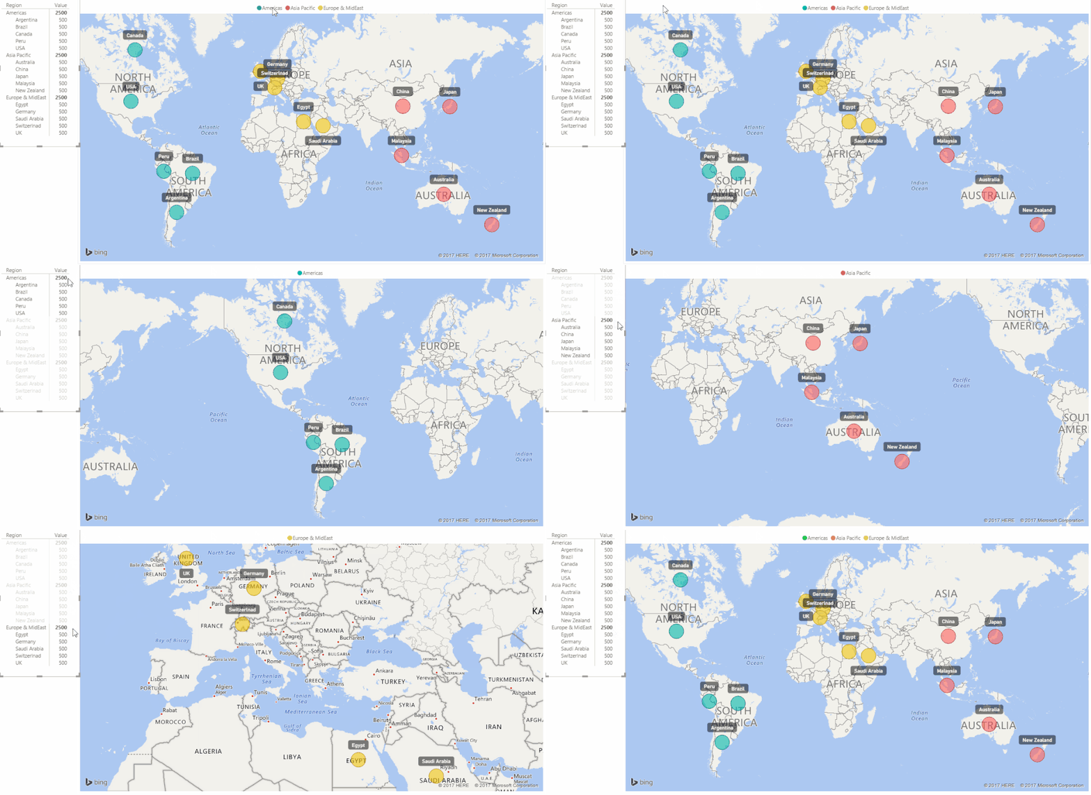
You can't use the Legend and Color Saturation at the same time!
Remove anything you have in the Color Saturation
Place New Golder Region in the Legend and leave Region in Location and whatever you have in the Size
Then click the Formating Paint Brush and this is where you can set the Data Colors
The Table Next to my Map is the Matrix Preview Visual showing the new Cross-Highlighting feature
This should work.
Let me know if you have any questions.
Good Luck! ![]()
- Mark as New
- Bookmark
- Subscribe
- Mute
- Subscribe to RSS Feed
- Permalink
- Report Inappropriate Content
If you have a region column in your data just place it in the Legend of a Map.

If you don't how you proceed will depend on how many countries you have.
You could use a SWITCH statement (nested IFs) to assign the regions
Or you can create the Region column in the Query Editor - Add Column tab - Conditional Column
and use the User Interface to create it - again it would depend on how many countries you have.
Or you can use another table for this to obtain the region...
Hope this helps!
- Mark as New
- Bookmark
- Subscribe
- Mute
- Subscribe to RSS Feed
- Permalink
- Report Inappropriate Content
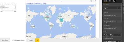
@Sean - Thanks for your reply! I'm new in Power BI so I'm don't know how to do some of this basic things. In my data table I have a column that is called region where I have a city country where the projects are located (see image data.png). I have a second column where I have my organization region (New Golder region) that I populated with a vlookup in Excel before uploading the data.
In my visualisation I added a map and attempt like you mentioned to add the region or my organisation region to the Legend field of map but it didn't accept any of this two columns in that field. Is there something wrong with the way I created the data.
Also how did you got the colors to be by region, I can only have colors by the number of sites in each region. See my image map.png
Also I tried to create a table of data next to the map as you did but is not connected to the map. How you did this? how did you got the countries and regions to show in hierarchical view in the table next to the map? .
Thanks,
Zu

- Mark as New
- Bookmark
- Subscribe
- Mute
- Subscribe to RSS Feed
- Permalink
- Report Inappropriate Content
Here are my images:
- Mark as New
- Bookmark
- Subscribe
- Mute
- Subscribe to RSS Feed
- Permalink
- Report Inappropriate Content
You can't use the Legend and Color Saturation at the same time!
Remove anything you have in the Color Saturation
Place New Golder Region in the Legend and leave Region in Location and whatever you have in the Size
Then click the Formating Paint Brush and this is where you can set the Data Colors
The Table Next to my Map is the Matrix Preview Visual showing the new Cross-Highlighting feature
This should work.
Let me know if you have any questions.
Good Luck! ![]()
- Mark as New
- Bookmark
- Subscribe
- Mute
- Subscribe to RSS Feed
- Permalink
- Report Inappropriate Content
@Sean,
I'm having the same problem but I don't understand how you two solved the problem. Would you mind explaining it to me again.
I have our company information set in region data and I need to assign those regions to countries. I have a separate .xls file with the headers "Country", "Region", and "Area" and the Region and Country are different types of grouping. How do I get the map to draw on this file?
- Mark as New
- Bookmark
- Subscribe
- Mute
- Subscribe to RSS Feed
- Permalink
- Report Inappropriate Content
Helpful resources

Microsoft Fabric Learn Together
Covering the world! 9:00-10:30 AM Sydney, 4:00-5:30 PM CET (Paris/Berlin), 7:00-8:30 PM Mexico City

Power BI Monthly Update - April 2024
Check out the April 2024 Power BI update to learn about new features.

| User | Count |
|---|---|
| 114 | |
| 98 | |
| 86 | |
| 70 | |
| 62 |
| User | Count |
|---|---|
| 151 | |
| 120 | |
| 103 | |
| 87 | |
| 68 |


