- Power BI forums
- Updates
- News & Announcements
- Get Help with Power BI
- Desktop
- Service
- Report Server
- Power Query
- Mobile Apps
- Developer
- DAX Commands and Tips
- Custom Visuals Development Discussion
- Health and Life Sciences
- Power BI Spanish forums
- Translated Spanish Desktop
- Power Platform Integration - Better Together!
- Power Platform Integrations (Read-only)
- Power Platform and Dynamics 365 Integrations (Read-only)
- Training and Consulting
- Instructor Led Training
- Dashboard in a Day for Women, by Women
- Galleries
- Community Connections & How-To Videos
- COVID-19 Data Stories Gallery
- Themes Gallery
- Data Stories Gallery
- R Script Showcase
- Webinars and Video Gallery
- Quick Measures Gallery
- 2021 MSBizAppsSummit Gallery
- 2020 MSBizAppsSummit Gallery
- 2019 MSBizAppsSummit Gallery
- Events
- Ideas
- Custom Visuals Ideas
- Issues
- Issues
- Events
- Upcoming Events
- Community Blog
- Power BI Community Blog
- Custom Visuals Community Blog
- Community Support
- Community Accounts & Registration
- Using the Community
- Community Feedback
Register now to learn Fabric in free live sessions led by the best Microsoft experts. From Apr 16 to May 9, in English and Spanish.
- Power BI forums
- Forums
- Get Help with Power BI
- Desktop
- custom limit lines using line graph
- Subscribe to RSS Feed
- Mark Topic as New
- Mark Topic as Read
- Float this Topic for Current User
- Bookmark
- Subscribe
- Printer Friendly Page
- Mark as New
- Bookmark
- Subscribe
- Mute
- Subscribe to RSS Feed
- Permalink
- Report Inappropriate Content
custom limit lines using line graph
Hello, I have a set of data that if correct should present to form limit lines. For example one set might be:
y-axis x-axis
#amount amount
15 100
15 600
30 1,200
30 1,400
Idealy for the limit lines to present correctly the line would be connected from 100 to 600 then disconnected from 600 to 1200 and connected from 1200 to 1400.
All I can get is them the apear in point forms or one whole line. Is there a way, what should i try.
Any and all help is greatly apriciated, thanks
Collin.
Solved! Go to Solution.
- Mark as New
- Bookmark
- Subscribe
- Mute
- Subscribe to RSS Feed
- Permalink
- Report Inappropriate Content
Hi Collin,
So how can we or the graph know which dots should be connected and which dots shouldn't be connected?
Maybe there is a workaround that adds a new column to group these dots. Please download the demo and give it a try.
1. Create a column.
Column = if([X] <= 600, 1, 2)
2. Add it to the legend.
Best Regards,
Dale
If this post helps, then please consider Accept it as the solution to help the other members find it more quickly.
- Mark as New
- Bookmark
- Subscribe
- Mute
- Subscribe to RSS Feed
- Permalink
- Report Inappropriate Content
- Mark as New
- Bookmark
- Subscribe
- Mute
- Subscribe to RSS Feed
- Permalink
- Report Inappropriate Content
Thankyou Dale that Worked,
One more thing,
is there a way to have a diffrent or added legend to the graph without changing the data.
the graph looks good but would like the legend to catagorize diffrently.
thanks for the help.
- Collin
- Mark as New
- Bookmark
- Subscribe
- Mute
- Subscribe to RSS Feed
- Permalink
- Report Inappropriate Content
Hi Collin,
So what's the result you expect?
Best Regards,
Dale
If this post helps, then please consider Accept it as the solution to help the other members find it more quickly.
- Mark as New
- Bookmark
- Subscribe
- Mute
- Subscribe to RSS Feed
- Permalink
- Report Inappropriate Content
The x and y values line up with a units column, so if you had:
y-axis x-axis
units #amount amount
1 15 100
1 15 600
2 30 1,200
2 30 1,400
id like the legend to show the 1s and 2s not the Y vaules.
Thanks for replying, -Collin
- Mark as New
- Bookmark
- Subscribe
- Mute
- Subscribe to RSS Feed
- Permalink
- Report Inappropriate Content
- Mark as New
- Bookmark
- Subscribe
- Mute
- Subscribe to RSS Feed
- Permalink
- Report Inappropriate Content
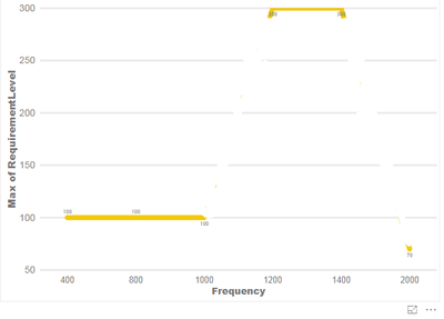
Hello dale, so this is what i have for data now . i would like to be able to have these dots connect but not continuous .


thanks,
-Collin
- Mark as New
- Bookmark
- Subscribe
- Mute
- Subscribe to RSS Feed
- Permalink
- Report Inappropriate Content
Hi Collin,
So how can we or the graph know which dots should be connected and which dots shouldn't be connected?
Maybe there is a workaround that adds a new column to group these dots. Please download the demo and give it a try.
1. Create a column.
Column = if([X] <= 600, 1, 2)
2. Add it to the legend.
Best Regards,
Dale
If this post helps, then please consider Accept it as the solution to help the other members find it more quickly.
- Mark as New
- Bookmark
- Subscribe
- Mute
- Subscribe to RSS Feed
- Permalink
- Report Inappropriate Content
yes, Thankyou, that equasion was exactly what i needed.
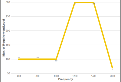
I have another question. I have a graph that looks like this currently .
This is the data for the chart above-------------
| ID | Frequency | Requirement Level | Values in chart |
| 1 | 1 | 70 | point 1 |
| 1 | 15 | 106 | ? |
| 1 | 30 | 106 | ? |
| 1 | 15 | 96 | ? |
| 1 | 30 | 96 | ? |
| 1 | 30 | 106 | ? |
| 1 | 400 | 96 | point 4 |
I would like it to show all 7 points and not sum diffrent things. i have made the frequency and requirement columns set to not sum from the modeling tab. "values in chart " is not part of graph.
Thanks for the help.
- Collin
- Mark as New
- Bookmark
- Subscribe
- Mute
- Subscribe to RSS Feed
- Permalink
- Report Inappropriate Content
Hi Collin,
How about applying the same trick on this topic? If it can't work, I would suggest you create a new thread in this forum. One topic, one post. Please also mark the proper answers as solutions. Thanks for your understanding.
Best Regards,
Dale
If this post helps, then please consider Accept it as the solution to help the other members find it more quickly.
Helpful resources

Microsoft Fabric Learn Together
Covering the world! 9:00-10:30 AM Sydney, 4:00-5:30 PM CET (Paris/Berlin), 7:00-8:30 PM Mexico City

Power BI Monthly Update - April 2024
Check out the April 2024 Power BI update to learn about new features.

| User | Count |
|---|---|
| 111 | |
| 94 | |
| 83 | |
| 66 | |
| 59 |
| User | Count |
|---|---|
| 151 | |
| 121 | |
| 104 | |
| 87 | |
| 67 |
