- Power BI forums
- Updates
- News & Announcements
- Get Help with Power BI
- Desktop
- Service
- Report Server
- Power Query
- Mobile Apps
- Developer
- DAX Commands and Tips
- Custom Visuals Development Discussion
- Health and Life Sciences
- Power BI Spanish forums
- Translated Spanish Desktop
- Power Platform Integration - Better Together!
- Power Platform Integrations (Read-only)
- Power Platform and Dynamics 365 Integrations (Read-only)
- Training and Consulting
- Instructor Led Training
- Dashboard in a Day for Women, by Women
- Galleries
- Community Connections & How-To Videos
- COVID-19 Data Stories Gallery
- Themes Gallery
- Data Stories Gallery
- R Script Showcase
- Webinars and Video Gallery
- Quick Measures Gallery
- 2021 MSBizAppsSummit Gallery
- 2020 MSBizAppsSummit Gallery
- 2019 MSBizAppsSummit Gallery
- Events
- Ideas
- Custom Visuals Ideas
- Issues
- Issues
- Events
- Upcoming Events
- Community Blog
- Power BI Community Blog
- Custom Visuals Community Blog
- Community Support
- Community Accounts & Registration
- Using the Community
- Community Feedback
Register now to learn Fabric in free live sessions led by the best Microsoft experts. From Apr 16 to May 9, in English and Spanish.
- Power BI forums
- Forums
- Get Help with Power BI
- Desktop
- Re: custom card to show actual value and variance
- Subscribe to RSS Feed
- Mark Topic as New
- Mark Topic as Read
- Float this Topic for Current User
- Bookmark
- Subscribe
- Printer Friendly Page
- Mark as New
- Bookmark
- Subscribe
- Mute
- Subscribe to RSS Feed
- Permalink
- Report Inappropriate Content
custom card to show actual value and variance
Kindly help me with a custom visual which can show value and variance with up or down arrow or green or red arrow to show actual value and variance.
Thanks in advanced
Solved! Go to Solution.
- Mark as New
- Bookmark
- Subscribe
- Mute
- Subscribe to RSS Feed
- Permalink
- Report Inappropriate Content
Hi @Minakshi ,
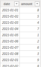
I created some data:
Custom rules:
Variance: the variance of January and February
Actual value: January and February as a percentage of the total value
Here are the steps you can follow:
1. Create measure.
variance% =
var _month_1=CALCULATE(SUM('Table'[amount]),FILTER(ALL('Table'),MONTH('Table'[date])=1))
var _month_2=CALCULATE(SUM('Table'[amount]),FILTER(ALL('Table'),MONTH('Table'[date])=2))
return
DIVIDE(_month_1-_month_2,_month_1)
actual value =
var _month_1=CALCULATE(SUM('Table'[amount]),FILTER(ALL('Table'),MONTH('Table'[date])=1))
var _month_2=CALCULATE(SUM('Table'[amount]),FILTER(ALL('Table'),MONTH('Table'[date])=2))
var _all=SUMX(ALL('Table'),'Table'[amount])
return
DIVIDE(_month_1+_month_2,_all)
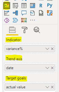
2. Find the KPI chart, place [date] in Trend axis, place [actual value] in Target goals, and place [variance%] in Indicator
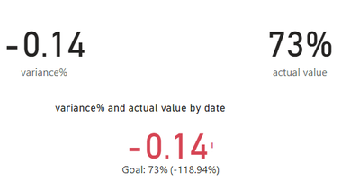
3. Result:
Best Regards,
Liu Yang
If this post helps, then please consider Accept it as the solution to help the other members find it more quickly
- Mark as New
- Bookmark
- Subscribe
- Mute
- Subscribe to RSS Feed
- Permalink
- Report Inappropriate Content
this video is useful in helping you to understand how to use the kpi card https://www.youtube.com/watch?v=zHzSBNES6jE
If I took the time to answer your question and I came up with a solution, please mark my post as a solution and /or give kudos freely for the effort 🙂 Thank you!
Proud to be a Super User!
Helpful resources

Microsoft Fabric Learn Together
Covering the world! 9:00-10:30 AM Sydney, 4:00-5:30 PM CET (Paris/Berlin), 7:00-8:30 PM Mexico City

Power BI Monthly Update - April 2024
Check out the April 2024 Power BI update to learn about new features.

| User | Count |
|---|---|
| 112 | |
| 100 | |
| 76 | |
| 74 | |
| 49 |
| User | Count |
|---|---|
| 146 | |
| 108 | |
| 106 | |
| 90 | |
| 62 |


