- Power BI forums
- Updates
- News & Announcements
- Get Help with Power BI
- Desktop
- Service
- Report Server
- Power Query
- Mobile Apps
- Developer
- DAX Commands and Tips
- Custom Visuals Development Discussion
- Health and Life Sciences
- Power BI Spanish forums
- Translated Spanish Desktop
- Power Platform Integration - Better Together!
- Power Platform Integrations (Read-only)
- Power Platform and Dynamics 365 Integrations (Read-only)
- Training and Consulting
- Instructor Led Training
- Dashboard in a Day for Women, by Women
- Galleries
- Community Connections & How-To Videos
- COVID-19 Data Stories Gallery
- Themes Gallery
- Data Stories Gallery
- R Script Showcase
- Webinars and Video Gallery
- Quick Measures Gallery
- 2021 MSBizAppsSummit Gallery
- 2020 MSBizAppsSummit Gallery
- 2019 MSBizAppsSummit Gallery
- Events
- Ideas
- Custom Visuals Ideas
- Issues
- Issues
- Events
- Upcoming Events
- Community Blog
- Power BI Community Blog
- Custom Visuals Community Blog
- Community Support
- Community Accounts & Registration
- Using the Community
- Community Feedback
Register now to learn Fabric in free live sessions led by the best Microsoft experts. From Apr 16 to May 9, in English and Spanish.
- Power BI forums
- Forums
- Get Help with Power BI
- Desktop
- cumulative data base on earlier dates with client ...
- Subscribe to RSS Feed
- Mark Topic as New
- Mark Topic as Read
- Float this Topic for Current User
- Bookmark
- Subscribe
- Printer Friendly Page
- Mark as New
- Bookmark
- Subscribe
- Mute
- Subscribe to RSS Feed
- Permalink
- Report Inappropriate Content
cumulative data base on earlier dates with client filter based on slicer
Hello,
First sorry for my English which is not my mother tongue.
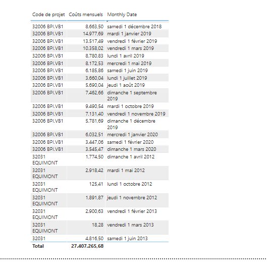
I have a huge table containing 3 columns : Client reference code, monthly costs and monthly date (first day of the month).
This table contains the data for all clients
In the other hand, i have a slicer which i can use to choose a client reference code.
So i can use a Line Chart visual to represents data monthly for one client.
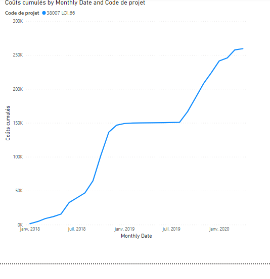
My problem is the following : i need to visualize cumulative costs monthly, by summing the costs of the previous months, based on the client reference code (=slicer) , to obtain something like that :
I am completely stucked...Someone could help me ?
Thanks in advance,
Michael
Solved! Go to Solution.
- Mark as New
- Bookmark
- Subscribe
- Mute
- Subscribe to RSS Feed
- Permalink
- Report Inappropriate Content
Hi @mhendel
create a column like
Cumulative Sum =
CALCULATE(
SUM(Table[monthly costs]),
FILTER(ALL(Table), Table[monthly date] <= EARLIER(Table[monthly date]) && Table[Client reference code] = EARLIER(Table[Client reference code]) )
)
and use it as chart Y-axis value
- Mark as New
- Bookmark
- Subscribe
- Mute
- Subscribe to RSS Feed
- Permalink
- Report Inappropriate Content
Hi @az38 ,
It is almost what i want, but it remains one problem :
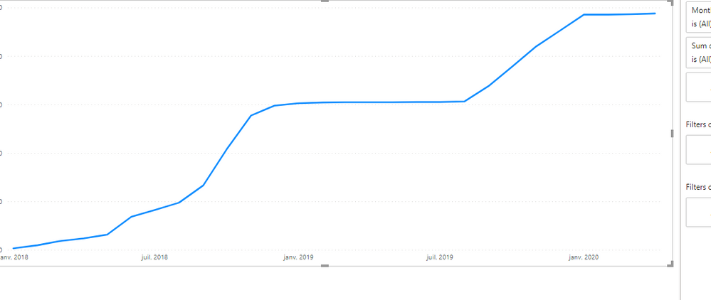
Sometimes, i have no data for one month, and so i wanted my curve to continue to be horizontal when no data is present for that month. You can see the difference between the two plots. I dont know if i explain well....
Any hint? Thanks for your help,
Michael
- Mark as New
- Bookmark
- Subscribe
- Mute
- Subscribe to RSS Feed
- Permalink
- Report Inappropriate Content
Hi @mhendel
for your new demand you should use a little bit more complicated data model
you need to add a Calendar table, like
Calendar Table = CALENDAR(MIN(Table[monthly date]), MAX(Table[monthly date]))then create a relationships between calendar table and your table and put Calendar Table[Date] field on the X-axis
- Mark as New
- Bookmark
- Subscribe
- Mute
- Subscribe to RSS Feed
- Permalink
- Report Inappropriate Content
@az38 Thanks for your quick answer.
My problem is i have in the same table mutliple projects (project code) with several dates for each project...Do i have to split the table by project? Any hint?
Regards?
- Mark as New
- Bookmark
- Subscribe
- Mute
- Subscribe to RSS Feed
- Permalink
- Report Inappropriate Content
- Mark as New
- Bookmark
- Subscribe
- Mute
- Subscribe to RSS Feed
- Permalink
- Report Inappropriate Content
Thanks a lot!!!
Helpful resources

Microsoft Fabric Learn Together
Covering the world! 9:00-10:30 AM Sydney, 4:00-5:30 PM CET (Paris/Berlin), 7:00-8:30 PM Mexico City

Power BI Monthly Update - April 2024
Check out the April 2024 Power BI update to learn about new features.

| User | Count |
|---|---|
| 110 | |
| 94 | |
| 82 | |
| 66 | |
| 58 |
| User | Count |
|---|---|
| 151 | |
| 121 | |
| 104 | |
| 87 | |
| 67 |


