- Power BI forums
- Updates
- News & Announcements
- Get Help with Power BI
- Desktop
- Service
- Report Server
- Power Query
- Mobile Apps
- Developer
- DAX Commands and Tips
- Custom Visuals Development Discussion
- Health and Life Sciences
- Power BI Spanish forums
- Translated Spanish Desktop
- Power Platform Integration - Better Together!
- Power Platform Integrations (Read-only)
- Power Platform and Dynamics 365 Integrations (Read-only)
- Training and Consulting
- Instructor Led Training
- Dashboard in a Day for Women, by Women
- Galleries
- Community Connections & How-To Videos
- COVID-19 Data Stories Gallery
- Themes Gallery
- Data Stories Gallery
- R Script Showcase
- Webinars and Video Gallery
- Quick Measures Gallery
- 2021 MSBizAppsSummit Gallery
- 2020 MSBizAppsSummit Gallery
- 2019 MSBizAppsSummit Gallery
- Events
- Ideas
- Custom Visuals Ideas
- Issues
- Issues
- Events
- Upcoming Events
- Community Blog
- Power BI Community Blog
- Custom Visuals Community Blog
- Community Support
- Community Accounts & Registration
- Using the Community
- Community Feedback
Register now to learn Fabric in free live sessions led by the best Microsoft experts. From Apr 16 to May 9, in English and Spanish.
- Power BI forums
- Forums
- Get Help with Power BI
- Desktop
- Re: consistent display of multiple text fields
- Subscribe to RSS Feed
- Mark Topic as New
- Mark Topic as Read
- Float this Topic for Current User
- Bookmark
- Subscribe
- Printer Friendly Page
- Mark as New
- Bookmark
- Subscribe
- Mute
- Subscribe to RSS Feed
- Permalink
- Report Inappropriate Content
consistent display of multiple text fields
I would like to display some informational comments associated with my dataset.
Imagine that you use a slicer to select a date datapoint. It is associated with the text string: "first day for quarterly report".
I can use a card visualization to display the text string.
My problem occurs when selecting multuple datapoints through the slicer.
The card seems to randomly choose which string to display.
Ideally, I'd like to see:
1- display ALL strings selected (would need a scroll bar)
2- display the FIRST or LAST string (since the datapoints are dates, it could take that into account)
Is there a way to do this with either basic or custom visualizations?
Solved! Go to Solution.
- Mark as New
- Bookmark
- Subscribe
- Mute
- Subscribe to RSS Feed
- Permalink
- Report Inappropriate Content
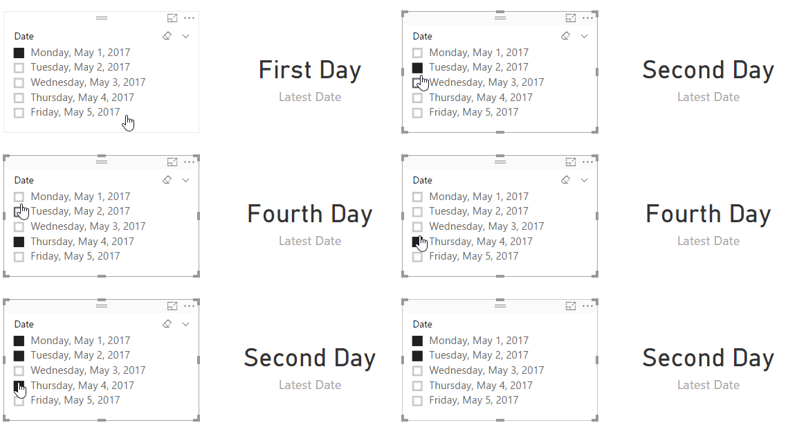
Gotcha, well we can use CALCULATE() to solve this problem. I'm curious if it can be done easier, though. Anyway, this works:
Latest Date = CALCULATE(MAX(MuhDates[Comment]), FILTER(MuhDates, MuhDates[Date] = MAX(MuhDates[Date])))
Let's see if this forum allows GIF images:
- Mark as New
- Bookmark
- Subscribe
- Mute
- Subscribe to RSS Feed
- Permalink
- Report Inappropriate Content
If you're working specifically with dates, you can create a measure for the text you're after and display that in a card. I've done this a few times.
FIRSTDATE()/LASTDATE() would get you the information. From here, you can use FORMAT() to get it how you want it, such as having long text month names or 2-digit years.
- Mark as New
- Bookmark
- Subscribe
- Mute
- Subscribe to RSS Feed
- Permalink
- Report Inappropriate Content
I'll test it as suggested, but I thought I'd clarify what I'm after (just to make sure)
If my data looks like this:
date comments
May1 first day
May2 second day
May3 third day
May4 fourth day
May5 fifth day
And I have 2 visualizations:
A slicer for date selection
A card for comment display
If I select dates: May2, May4 & May5, I would like for the card to consistently display "fifth day" (the comment associated with the latest date)
- Mark as New
- Bookmark
- Subscribe
- Mute
- Subscribe to RSS Feed
- Permalink
- Report Inappropriate Content
Gotcha, well we can use CALCULATE() to solve this problem. I'm curious if it can be done easier, though. Anyway, this works:
Latest Date = CALCULATE(MAX(MuhDates[Comment]), FILTER(MuhDates, MuhDates[Date] = MAX(MuhDates[Date])))
Let's see if this forum allows GIF images:
- Mark as New
- Bookmark
- Subscribe
- Mute
- Subscribe to RSS Feed
- Permalink
- Report Inappropriate Content
Nice! thank you
Helpful resources

Microsoft Fabric Learn Together
Covering the world! 9:00-10:30 AM Sydney, 4:00-5:30 PM CET (Paris/Berlin), 7:00-8:30 PM Mexico City

Power BI Monthly Update - April 2024
Check out the April 2024 Power BI update to learn about new features.

| User | Count |
|---|---|
| 110 | |
| 97 | |
| 78 | |
| 63 | |
| 55 |
| User | Count |
|---|---|
| 143 | |
| 109 | |
| 89 | |
| 84 | |
| 66 |


