- Power BI forums
- Updates
- News & Announcements
- Get Help with Power BI
- Desktop
- Service
- Report Server
- Power Query
- Mobile Apps
- Developer
- DAX Commands and Tips
- Custom Visuals Development Discussion
- Health and Life Sciences
- Power BI Spanish forums
- Translated Spanish Desktop
- Power Platform Integration - Better Together!
- Power Platform Integrations (Read-only)
- Power Platform and Dynamics 365 Integrations (Read-only)
- Training and Consulting
- Instructor Led Training
- Dashboard in a Day for Women, by Women
- Galleries
- Community Connections & How-To Videos
- COVID-19 Data Stories Gallery
- Themes Gallery
- Data Stories Gallery
- R Script Showcase
- Webinars and Video Gallery
- Quick Measures Gallery
- 2021 MSBizAppsSummit Gallery
- 2020 MSBizAppsSummit Gallery
- 2019 MSBizAppsSummit Gallery
- Events
- Ideas
- Custom Visuals Ideas
- Issues
- Issues
- Events
- Upcoming Events
- Community Blog
- Power BI Community Blog
- Custom Visuals Community Blog
- Community Support
- Community Accounts & Registration
- Using the Community
- Community Feedback
Register now to learn Fabric in free live sessions led by the best Microsoft experts. From Apr 16 to May 9, in English and Spanish.
- Power BI forums
- Forums
- Get Help with Power BI
- Desktop
- Re: comparison visualization between annual averag...
- Subscribe to RSS Feed
- Mark Topic as New
- Mark Topic as Read
- Float this Topic for Current User
- Bookmark
- Subscribe
- Printer Friendly Page
- Mark as New
- Bookmark
- Subscribe
- Mute
- Subscribe to RSS Feed
- Permalink
- Report Inappropriate Content
comparison visualization between annual average of value vs each Month of that year( Line&Bar Charts
Hi everyone,
Anybody knows which visualization model can help to design a fixed trend line for specific year over each month in that year? for example I waana have a line and Bar chart which the fixed line shows the total average value over 2015 in different range buckets and bars show the value for Month May 2015 in those ranges and I can go over different months by filter or slicers while the 2015 line doesnt change?
Solved! Go to Solution.
- Mark as New
- Bookmark
- Subscribe
- Mute
- Subscribe to RSS Feed
- Permalink
- Report Inappropriate Content
Hi @Saba
Any trend line in visualization model will be affected by the values in data model. It will change automatically when you filter the data using slicer. From what I know, you can create a calculated column(Average) in table, then create a Line and Stacked column chart, add the average line as follows.
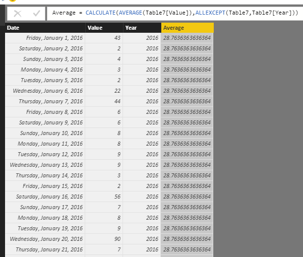
First, I use the data below to reproduce you scenario, and create a column using the formal below, which will calculate the average of each year.
Average = CALCULATE(AVERAGE(Table7[Value]),ALLEXCEPT(Table7,Table7[Year]))
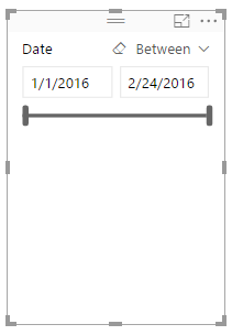
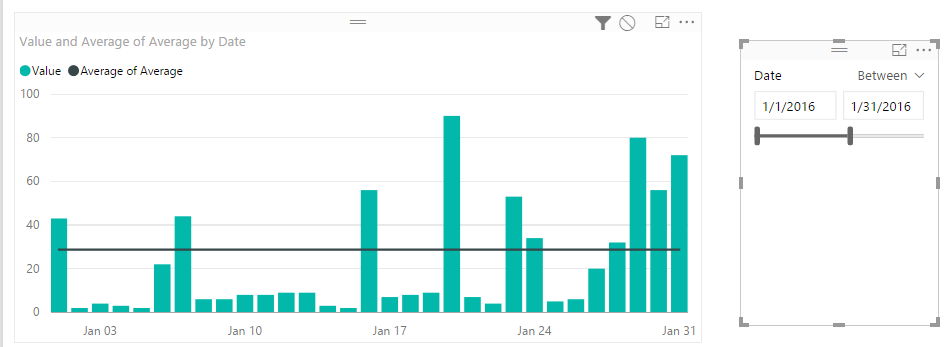
Then, create a Line and Stacked column chart, select the data field as Axis, the Value field as Column values, the Average field as the Line values. Create a slicer including data field. You will get the result as the following screenshot.
Finally, the line don’t change when you select one month.
If you have any question, please feel free to ask.
Best Regards,
Angelia
- Mark as New
- Bookmark
- Subscribe
- Mute
- Subscribe to RSS Feed
- Permalink
- Report Inappropriate Content
Hi @Saba
Any trend line in visualization model will be affected by the values in data model. It will change automatically when you filter the data using slicer. From what I know, you can create a calculated column(Average) in table, then create a Line and Stacked column chart, add the average line as follows.
First, I use the data below to reproduce you scenario, and create a column using the formal below, which will calculate the average of each year.
Average = CALCULATE(AVERAGE(Table7[Value]),ALLEXCEPT(Table7,Table7[Year]))
Then, create a Line and Stacked column chart, select the data field as Axis, the Value field as Column values, the Average field as the Line values. Create a slicer including data field. You will get the result as the following screenshot.
Finally, the line don’t change when you select one month.
If you have any question, please feel free to ask.
Best Regards,
Angelia
Helpful resources

Microsoft Fabric Learn Together
Covering the world! 9:00-10:30 AM Sydney, 4:00-5:30 PM CET (Paris/Berlin), 7:00-8:30 PM Mexico City

Power BI Monthly Update - April 2024
Check out the April 2024 Power BI update to learn about new features.

| User | Count |
|---|---|
| 115 | |
| 99 | |
| 86 | |
| 70 | |
| 62 |
| User | Count |
|---|---|
| 151 | |
| 120 | |
| 103 | |
| 87 | |
| 68 |


