- Power BI forums
- Updates
- News & Announcements
- Get Help with Power BI
- Desktop
- Service
- Report Server
- Power Query
- Mobile Apps
- Developer
- DAX Commands and Tips
- Custom Visuals Development Discussion
- Health and Life Sciences
- Power BI Spanish forums
- Translated Spanish Desktop
- Power Platform Integration - Better Together!
- Power Platform Integrations (Read-only)
- Power Platform and Dynamics 365 Integrations (Read-only)
- Training and Consulting
- Instructor Led Training
- Dashboard in a Day for Women, by Women
- Galleries
- Community Connections & How-To Videos
- COVID-19 Data Stories Gallery
- Themes Gallery
- Data Stories Gallery
- R Script Showcase
- Webinars and Video Gallery
- Quick Measures Gallery
- 2021 MSBizAppsSummit Gallery
- 2020 MSBizAppsSummit Gallery
- 2019 MSBizAppsSummit Gallery
- Events
- Ideas
- Custom Visuals Ideas
- Issues
- Issues
- Events
- Upcoming Events
- Community Blog
- Power BI Community Blog
- Custom Visuals Community Blog
- Community Support
- Community Accounts & Registration
- Using the Community
- Community Feedback
Register now to learn Fabric in free live sessions led by the best Microsoft experts. From Apr 16 to May 9, in English and Spanish.
- Power BI forums
- Forums
- Get Help with Power BI
- Desktop
- Re: compare Sales person sales vs Department Avg s...
- Subscribe to RSS Feed
- Mark Topic as New
- Mark Topic as Read
- Float this Topic for Current User
- Bookmark
- Subscribe
- Printer Friendly Page
- Mark as New
- Bookmark
- Subscribe
- Mute
- Subscribe to RSS Feed
- Permalink
- Report Inappropriate Content
compare Sales person sales vs Department Avg sales in bar chart
Hi all,
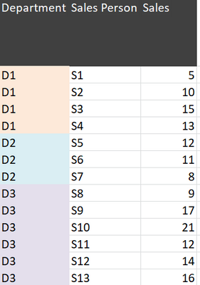
I have Data like below table. i want to compare Sales person sales vs Department Avg sales in bar chart
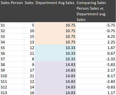
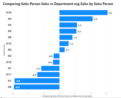
Expected Output.
i have Department & Sales Person Filter
if i selected S5 & S6 from filter it want to show S5 & S6 values only
Data
| Department | Sales Person | Sales |
| D1 | S1 | 5 |
| D1 | S2 | 10 |
| D1 | S3 | 15 |
| D1 | S4 | 13 |
| D2 | S5 | 12 |
| D2 | S6 | 11 |
| D2 | S7 | 8 |
| D3 | S8 | 9 |
| D3 | S9 | 17 |
| D3 | S10 | 21 |
| D3 | S11 | 12 |
| D3 | S12 | 14 |
| D3 | S13 | 16 |
Solved! Go to Solution.
- Mark as New
- Bookmark
- Subscribe
- Mute
- Subscribe to RSS Feed
- Permalink
- Report Inappropriate Content
Hi, @Anonymous
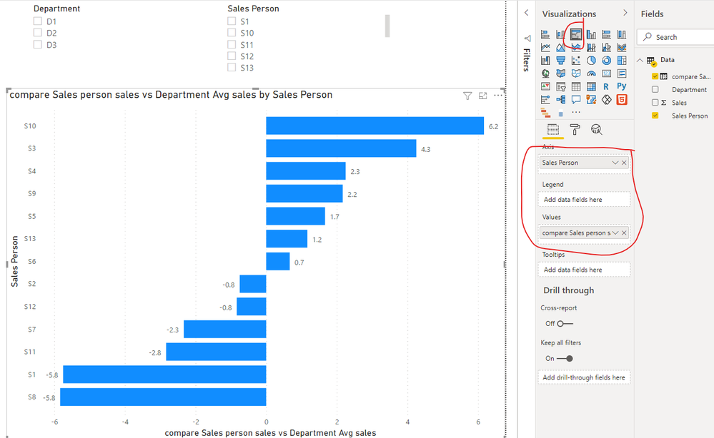
According to your description and output, I think you can calculate the value diff using calculated columns, which can avoid the error value in the chart when data is sliced you can try my steps:
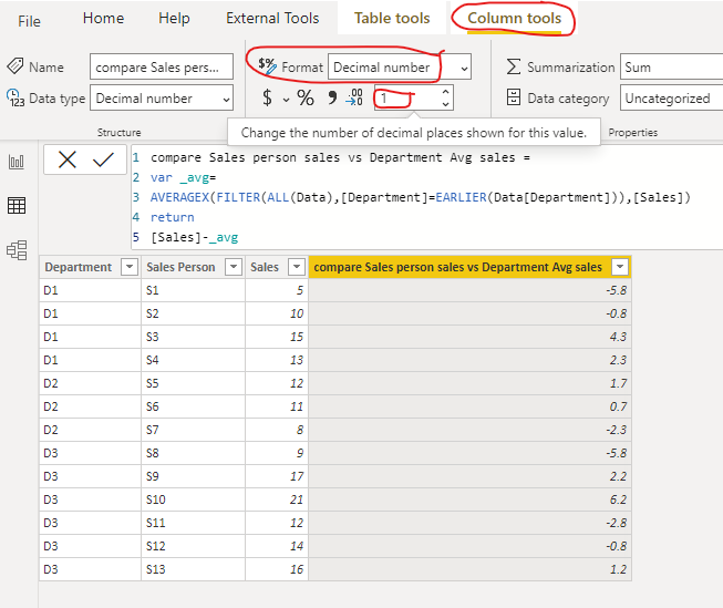
- Create a calculated column like this:
compare Sales person sales vs Department Avg sales =

var _avg=

AVERAGEX(FILTER(ALL(Data),[Department]=EARLIER(Data[Department])),[Sales])

return

[Sales]-_avg
Then set the Format of this column like this:
- Then create a clustered bar chart and two slicers, and place them like this:
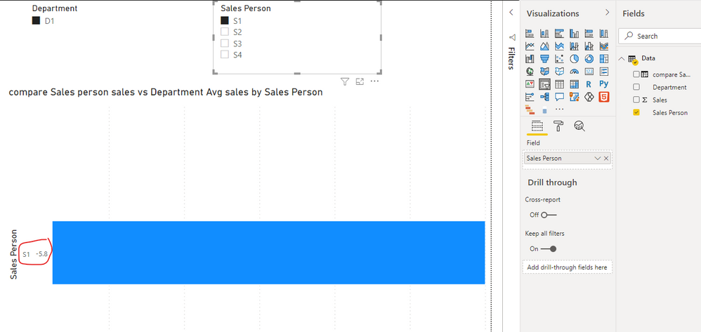
- Then slice the data using the slicer, you can find that the data is correctly displayed:
And you can get what you want.
You can download my test pbix file below
Thank you very much!
Best Regards,
Community Support Team _Robert Qin
If this post helps, then please consider Accept it as the solution to help the other members find it more quickly.
- Mark as New
- Bookmark
- Subscribe
- Mute
- Subscribe to RSS Feed
- Permalink
- Report Inappropriate Content
Hi, @Anonymous
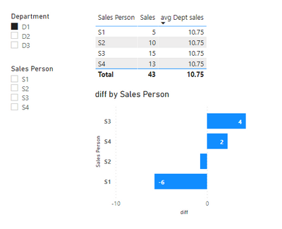
Please check the below picture and the sample pbix file's link down below.
All measures are in the sample pbix file.

https://www.dropbox.com/s/qk2697spd2zhwd0/vengadeshpalani.pbix?dl=0
Hi, My name is Jihwan Kim.
If this post helps, then please consider accept it as the solution to help other members find it faster, and give a big thumbs up.
If this post helps, then please consider accepting it as the solution to help other members find it faster, and give a big thumbs up.
- Mark as New
- Bookmark
- Subscribe
- Mute
- Subscribe to RSS Feed
- Permalink
- Report Inappropriate Content
@Anonymous , if you need new columns
avg Dept sales = averageX(filter(table, [department] =earlier([department])),[sales])
diff = [sales] - [avg Dept sales]
if you need new measures
avg Dept sales = averageX(filter(allselected(table), [department] =max([department])),[sales])
diff = sum([sales]) - [avg Dept sales]
Microsoft Power BI Learning Resources, 2023 !!
Learn Power BI - Full Course with Dec-2022, with Window, Index, Offset, 100+ Topics !!
Did I answer your question? Mark my post as a solution! Appreciate your Kudos !! Proud to be a Super User! !!
- Mark as New
- Bookmark
- Subscribe
- Mute
- Subscribe to RSS Feed
- Permalink
- Report Inappropriate Content
Thanks @amitchandak
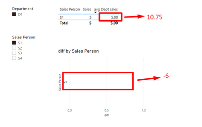
when i click Department filter its working fine
when i select Seles person it show wrong data
Helpful resources

Microsoft Fabric Learn Together
Covering the world! 9:00-10:30 AM Sydney, 4:00-5:30 PM CET (Paris/Berlin), 7:00-8:30 PM Mexico City

Power BI Monthly Update - April 2024
Check out the April 2024 Power BI update to learn about new features.

| User | Count |
|---|---|
| 110 | |
| 94 | |
| 81 | |
| 66 | |
| 58 |
| User | Count |
|---|---|
| 150 | |
| 119 | |
| 104 | |
| 87 | |
| 67 |
