- Power BI forums
- Updates
- News & Announcements
- Get Help with Power BI
- Desktop
- Service
- Report Server
- Power Query
- Mobile Apps
- Developer
- DAX Commands and Tips
- Custom Visuals Development Discussion
- Health and Life Sciences
- Power BI Spanish forums
- Translated Spanish Desktop
- Power Platform Integration - Better Together!
- Power Platform Integrations (Read-only)
- Power Platform and Dynamics 365 Integrations (Read-only)
- Training and Consulting
- Instructor Led Training
- Dashboard in a Day for Women, by Women
- Galleries
- Community Connections & How-To Videos
- COVID-19 Data Stories Gallery
- Themes Gallery
- Data Stories Gallery
- R Script Showcase
- Webinars and Video Gallery
- Quick Measures Gallery
- 2021 MSBizAppsSummit Gallery
- 2020 MSBizAppsSummit Gallery
- 2019 MSBizAppsSummit Gallery
- Events
- Ideas
- Custom Visuals Ideas
- Issues
- Issues
- Events
- Upcoming Events
- Community Blog
- Power BI Community Blog
- Custom Visuals Community Blog
- Community Support
- Community Accounts & Registration
- Using the Community
- Community Feedback
Register now to learn Fabric in free live sessions led by the best Microsoft experts. From Apr 16 to May 9, in English and Spanish.
- Power BI forums
- Forums
- Get Help with Power BI
- Desktop
- column chart with 5 separate pieces of data
- Subscribe to RSS Feed
- Mark Topic as New
- Mark Topic as Read
- Float this Topic for Current User
- Bookmark
- Subscribe
- Printer Friendly Page
- Mark as New
- Bookmark
- Subscribe
- Mute
- Subscribe to RSS Feed
- Permalink
- Report Inappropriate Content
column chart with 5 separate pieces of data
Hi,
I wish to create a column chart with 5 separate pieces of data from a dataset.
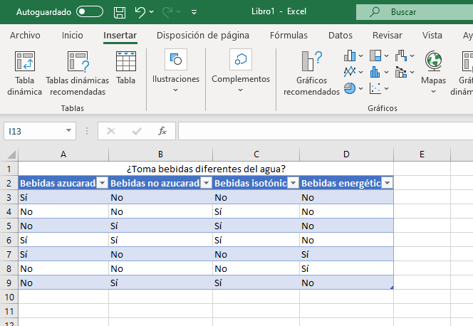
So, I have Fields named: - Bebidas azucaradas, bebidas no azucaradas, bebidas isotónicas, bebidas energéticas. These 5 fields are the answer to a multichoice question (what kind of non-water beveradges do you drink?).
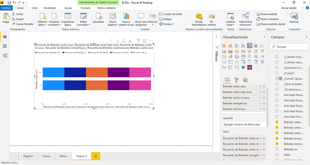
I wish the column chart to show these as 5 separate columns with a gapin-between. Each column should show the recount of "Yes" and "No" answers. Whenever I try, I amb either getting them stacked on top of one another (using the stacke version), or right next to each other (using the clustered), without the headings/tiles below.
Many thanks,
Adrià
Solved! Go to Solution.
- Mark as New
- Bookmark
- Subscribe
- Mute
- Subscribe to RSS Feed
- Permalink
- Report Inappropriate Content
Hi, @adriaXIII
one way of doing this is to unpivot your table, either in the query to the source or in Powerquery/Advanced editor(using the Unpivot Columns-function of the Transform ribbon).
Your table should then look like this
| Attribute | Value |
| question 1 | si |
| question 1 | no |
| question 1 | no |
| and so on |
The columns can be renamed to e.g. Question and Answer.
Now create two measures:
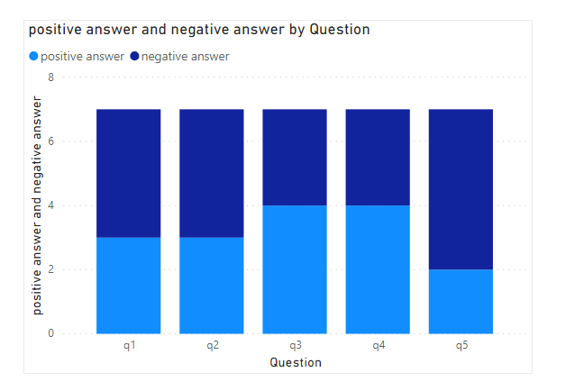
positive answer = CALCULATE(COUNTROWS(answers);filter(answers;answers[Answer]="Si")) Negative answer = CALCULATE(COUNTROWS(answers);filter(answers;answers[Answer]="No"))
and add the questions and the measures to a chart like this:
Cheers,
Sturla
If this post helps, then please consider Accepting it as the solution. Kudos are nice too.
Helpful resources

Microsoft Fabric Learn Together
Covering the world! 9:00-10:30 AM Sydney, 4:00-5:30 PM CET (Paris/Berlin), 7:00-8:30 PM Mexico City

Power BI Monthly Update - April 2024
Check out the April 2024 Power BI update to learn about new features.

| User | Count |
|---|---|
| 107 | |
| 100 | |
| 78 | |
| 64 | |
| 58 |
| User | Count |
|---|---|
| 148 | |
| 113 | |
| 97 | |
| 84 | |
| 67 |


