- Power BI forums
- Updates
- News & Announcements
- Get Help with Power BI
- Desktop
- Service
- Report Server
- Power Query
- Mobile Apps
- Developer
- DAX Commands and Tips
- Custom Visuals Development Discussion
- Health and Life Sciences
- Power BI Spanish forums
- Translated Spanish Desktop
- Power Platform Integration - Better Together!
- Power Platform Integrations (Read-only)
- Power Platform and Dynamics 365 Integrations (Read-only)
- Training and Consulting
- Instructor Led Training
- Dashboard in a Day for Women, by Women
- Galleries
- Community Connections & How-To Videos
- COVID-19 Data Stories Gallery
- Themes Gallery
- Data Stories Gallery
- R Script Showcase
- Webinars and Video Gallery
- Quick Measures Gallery
- 2021 MSBizAppsSummit Gallery
- 2020 MSBizAppsSummit Gallery
- 2019 MSBizAppsSummit Gallery
- Events
- Ideas
- Custom Visuals Ideas
- Issues
- Issues
- Events
- Upcoming Events
- Community Blog
- Power BI Community Blog
- Custom Visuals Community Blog
- Community Support
- Community Accounts & Registration
- Using the Community
- Community Feedback
Register now to learn Fabric in free live sessions led by the best Microsoft experts. From Apr 16 to May 9, in English and Spanish.
- Power BI forums
- Forums
- Get Help with Power BI
- Desktop
- coloring graph based on buckets
- Subscribe to RSS Feed
- Mark Topic as New
- Mark Topic as Read
- Float this Topic for Current User
- Bookmark
- Subscribe
- Printer Friendly Page
- Mark as New
- Bookmark
- Subscribe
- Mute
- Subscribe to RSS Feed
- Permalink
- Report Inappropriate Content
coloring graph based on buckets
Hello everyone,
I am working on sample project and I am trying to color he graph based on sum of percentage. But I can't figure out how to do it. Can anyone please help me out.
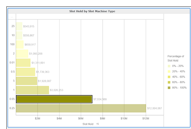
I have attached the graph I am trying to replicate. I have slot hold and slot machine performance columns. I created a new column " Percentage of slot holds" and use color saturation to change the colors of the graphs, but unable to create buckets and change the color of the graphs by assigning the colors to the buckets.
Solved! Go to Solution.
- Mark as New
- Bookmark
- Subscribe
- Mute
- Subscribe to RSS Feed
- Permalink
- Report Inappropriate Content
Hopefully these are the links you are looking for:
https://exceleratorbi.com.au/conditional-formatting-power-bi/
https://docs.microsoft.com/en-us/power-bi/desktop-conditional-table-formatting
- Mark as New
- Bookmark
- Subscribe
- Mute
- Subscribe to RSS Feed
- Permalink
- Report Inappropriate Content
Hi @Anonymous,
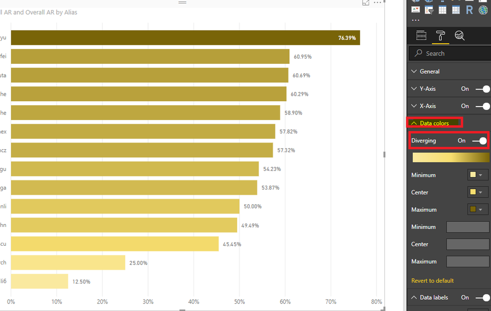
It seems that you want to find this option for changing the color of the graphs. If you have a field under Color saturation, you could find Diverging option under Data color format.
Best Regards,
Cherry
If this post helps, then please consider Accept it as the solution to help the other members find it more quickly.
- Mark as New
- Bookmark
- Subscribe
- Mute
- Subscribe to RSS Feed
- Permalink
- Report Inappropriate Content
@Anonymous Don't think so. Can you do it for a matrix tho by coloring based on alternate value. So perhaps they will introduce it soon for other visualizatons.
- Mark as New
- Bookmark
- Subscribe
- Mute
- Subscribe to RSS Feed
- Permalink
- Report Inappropriate Content
Hopefully these are the links you are looking for:
https://exceleratorbi.com.au/conditional-formatting-power-bi/
https://docs.microsoft.com/en-us/power-bi/desktop-conditional-table-formatting
- Mark as New
- Bookmark
- Subscribe
- Mute
- Subscribe to RSS Feed
- Permalink
- Report Inappropriate Content
@Anonymous Thank you.
- Mark as New
- Bookmark
- Subscribe
- Mute
- Subscribe to RSS Feed
- Permalink
- Report Inappropriate Content
@Anonymous if this is the required solution could you mark it as one.
- Mark as New
- Bookmark
- Subscribe
- Mute
- Subscribe to RSS Feed
- Permalink
- Report Inappropriate Content
@Anonymous the solution is helpful, but its not exactly what I am looking for here. I wanted to know how to perform conditional formating for bar graphs.
Regards,
Jyothi.
- Mark as New
- Bookmark
- Subscribe
- Mute
- Subscribe to RSS Feed
- Permalink
- Report Inappropriate Content
There are a number of ideas on this including this one. Vote or post a more specific idea and share a link and I’ll give it mine.
https://ideas.powerbi.com/forums/265200-power-bi-ideas/suggestions/6518993-set-colors-and-conditiona...
- Mark as New
- Bookmark
- Subscribe
- Mute
- Subscribe to RSS Feed
- Permalink
- Report Inappropriate Content
@Seward12533 I tried for matrix based graph but still have troble doing it.
Is there any link that can explan me how to do it for matrix based graph atlease.
Any help is appreciated.
Thanks,
Jyothi
- Mark as New
- Bookmark
- Subscribe
- Mute
- Subscribe to RSS Feed
- Permalink
- Report Inappropriate Content
Hi @v-piga-msft,
Thanks for the respnose, I did that but I want to color the graph based on the sum of percentage.
Example if sum of percent is between 0-20% i want it to be light yellow and if it is between 20-40% i want it to be different color and so on.
Is there anything I can do for this.
Thanks and Regards,
Jyothi
Helpful resources

Microsoft Fabric Learn Together
Covering the world! 9:00-10:30 AM Sydney, 4:00-5:30 PM CET (Paris/Berlin), 7:00-8:30 PM Mexico City

Power BI Monthly Update - April 2024
Check out the April 2024 Power BI update to learn about new features.

| User | Count |
|---|---|
| 110 | |
| 94 | |
| 80 | |
| 67 | |
| 59 |
| User | Count |
|---|---|
| 150 | |
| 119 | |
| 104 | |
| 87 | |
| 67 |


