- Power BI forums
- Updates
- News & Announcements
- Get Help with Power BI
- Desktop
- Service
- Report Server
- Power Query
- Mobile Apps
- Developer
- DAX Commands and Tips
- Custom Visuals Development Discussion
- Health and Life Sciences
- Power BI Spanish forums
- Translated Spanish Desktop
- Power Platform Integration - Better Together!
- Power Platform Integrations (Read-only)
- Power Platform and Dynamics 365 Integrations (Read-only)
- Training and Consulting
- Instructor Led Training
- Dashboard in a Day for Women, by Women
- Galleries
- Community Connections & How-To Videos
- COVID-19 Data Stories Gallery
- Themes Gallery
- Data Stories Gallery
- R Script Showcase
- Webinars and Video Gallery
- Quick Measures Gallery
- 2021 MSBizAppsSummit Gallery
- 2020 MSBizAppsSummit Gallery
- 2019 MSBizAppsSummit Gallery
- Events
- Ideas
- Custom Visuals Ideas
- Issues
- Issues
- Events
- Upcoming Events
- Community Blog
- Power BI Community Blog
- Custom Visuals Community Blog
- Community Support
- Community Accounts & Registration
- Using the Community
- Community Feedback
Register now to learn Fabric in free live sessions led by the best Microsoft experts. From Apr 16 to May 9, in English and Spanish.
- Power BI forums
- Forums
- Get Help with Power BI
- Desktop
- clustered chart scaling
- Subscribe to RSS Feed
- Mark Topic as New
- Mark Topic as Read
- Float this Topic for Current User
- Bookmark
- Subscribe
- Printer Friendly Page
- Mark as New
- Bookmark
- Subscribe
- Mute
- Subscribe to RSS Feed
- Permalink
- Report Inappropriate Content
clustered chart scaling
Can anyone explain to me why when using this clustered chart a line total, which is many cases is higher than the bar, is shown LOWER than the bar? I can tell it must have something to do with scaling between each (actual vs budget) but I can't for the life of me figure out why it's shown this way or worse - how to fix it?!? Any help would be greatly appreciated!!!
Also, I wanted to upload a picture of the chart but could not figure out how one can do that? The chart basically looks like this:
Yr-Mth
Type 2016-01 2016-02 2016-03
Actual 13606 13052 13357
Budget 13547 13110 13547
^ in this post denotes 'greater than'
Result Act>Bgt Bgt>Act Bgt>Act
Chart Act>Bgt Act>Bgt Act>Bgt
As mentioned, I think the issue may be scaling because actual shows scaling of 0-14K while budget shows scaling o 12-14K. I gather that maybe it's related to underlying data but I have not found any data in actuals that are zero.
Thanks in advance for any help you can give to me.
Rich
Solved! Go to Solution.
- Mark as New
- Bookmark
- Subscribe
- Mute
- Subscribe to RSS Feed
- Permalink
- Report Inappropriate Content
The first Y-Axis of Line and column chart always starts from 0(default) or some other fixed number as you input in the Start Textbox. It is not dynamic as the secondary Y-Axis in current version.
You can vote this idea here to push it become possible in future release.
Best Regards,
Herbert
- Mark as New
- Bookmark
- Subscribe
- Mute
- Subscribe to RSS Feed
- Permalink
- Report Inappropriate Content
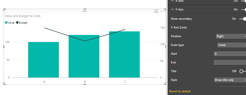
In Format of the visual you can indicate that Secdondary axis start at 0 (Equal to your primary Y Axis)
Lima - Peru
- Mark as New
- Bookmark
- Subscribe
- Mute
- Subscribe to RSS Feed
- Permalink
- Report Inappropriate Content
Hello Victor-
Thanks for getting back to me! What i would actually like is for both axis to be on a variable scale that is equivalent to the values being displayed. As you can see from my example, both actuals and budgets are relatively close for this location but I can't hard code the axis scale since depending on which location I would select, the range can be quite different. I.e. one location can have actuals/budgets around 13500 while another location can have actuals/budgets of 5000 or so.
Thanks,
Rich
- Mark as New
- Bookmark
- Subscribe
- Mute
- Subscribe to RSS Feed
- Permalink
- Report Inappropriate Content
- Mark as New
- Bookmark
- Subscribe
- Mute
- Subscribe to RSS Feed
- Permalink
- Report Inappropriate Content
That works, kind of. I don't want the scale to start at 0 since it then really doesn't show variances/variations very well. I want both axis' to be dynamic to the data but as mentioned it's not working that way for me. Thanks again.
- Mark as New
- Bookmark
- Subscribe
- Mute
- Subscribe to RSS Feed
- Permalink
- Report Inappropriate Content
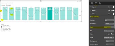
Here's another example where/when I leave the Start field blank on the secondary axis. Notice how the 2nd axis is dynamic while the primary axis is not (i.e. it starts at zero). I have 2 pics here with the chart itself being the same. The only difference is I show the setting for the primary Y-axis in the first pic and the secondary axis settings in the second pic.
- Mark as New
- Bookmark
- Subscribe
- Mute
- Subscribe to RSS Feed
- Permalink
- Report Inappropriate Content
Figured out a little bit more and determined that it may be related to the chart itself. If I select the 'line and clustered column chart,' the scale/start value on the y-axis is zero. If I use a 'line chart,' the scale/start value on the y-axis is dynamic. I prefer the line and clustered column chart though I'm thinking I might not to be able to unfortunately since the chart scaling doesn't work properly.
- Mark as New
- Bookmark
- Subscribe
- Mute
- Subscribe to RSS Feed
- Permalink
- Report Inappropriate Content
- Mark as New
- Bookmark
- Subscribe
- Mute
- Subscribe to RSS Feed
- Permalink
- Report Inappropriate Content
Thanks for the reply Herbert. Unfortunately, that was not the answer I was looking/hoping for. Anyway, I did as you mentioned and voted for that functionality to be added. It's really unfortunate it does not already work that way.
Thanks again.
Rich
Helpful resources

Microsoft Fabric Learn Together
Covering the world! 9:00-10:30 AM Sydney, 4:00-5:30 PM CET (Paris/Berlin), 7:00-8:30 PM Mexico City

Power BI Monthly Update - April 2024
Check out the April 2024 Power BI update to learn about new features.

| User | Count |
|---|---|
| 115 | |
| 99 | |
| 88 | |
| 70 | |
| 62 |
| User | Count |
|---|---|
| 151 | |
| 120 | |
| 103 | |
| 87 | |
| 68 |


