- Power BI forums
- Updates
- News & Announcements
- Get Help with Power BI
- Desktop
- Service
- Report Server
- Power Query
- Mobile Apps
- Developer
- DAX Commands and Tips
- Custom Visuals Development Discussion
- Health and Life Sciences
- Power BI Spanish forums
- Translated Spanish Desktop
- Power Platform Integration - Better Together!
- Power Platform Integrations (Read-only)
- Power Platform and Dynamics 365 Integrations (Read-only)
- Training and Consulting
- Instructor Led Training
- Dashboard in a Day for Women, by Women
- Galleries
- Community Connections & How-To Videos
- COVID-19 Data Stories Gallery
- Themes Gallery
- Data Stories Gallery
- R Script Showcase
- Webinars and Video Gallery
- Quick Measures Gallery
- 2021 MSBizAppsSummit Gallery
- 2020 MSBizAppsSummit Gallery
- 2019 MSBizAppsSummit Gallery
- Events
- Ideas
- Custom Visuals Ideas
- Issues
- Issues
- Events
- Upcoming Events
- Community Blog
- Power BI Community Blog
- Custom Visuals Community Blog
- Community Support
- Community Accounts & Registration
- Using the Community
- Community Feedback
Register now to learn Fabric in free live sessions led by the best Microsoft experts. From Apr 16 to May 9, in English and Spanish.
- Power BI forums
- Forums
- Get Help with Power BI
- Desktop
- clustered bar chart - multiple columns from two so...
- Subscribe to RSS Feed
- Mark Topic as New
- Mark Topic as Read
- Float this Topic for Current User
- Bookmark
- Subscribe
- Printer Friendly Page
- Mark as New
- Bookmark
- Subscribe
- Mute
- Subscribe to RSS Feed
- Permalink
- Report Inappropriate Content
clustered bar chart - multiple columns from two sources
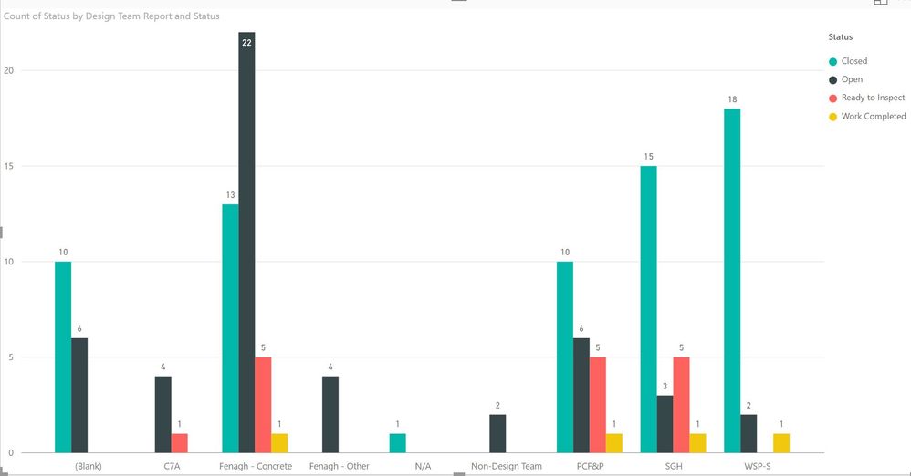
I have a bar chart that shows the number of items of a particular status by Design team (see chart below). I would like to had columns by Design team that counts items by of a particular type as well. For each team, it would show a column for each of the following:
- Open
- Closed
- Ready to Inspect
- Work Completed
- Non-Conforming
- RFI
Is there a way to do this?
Solved! Go to Solution.
- Mark as New
- Bookmark
- Subscribe
- Mute
- Subscribe to RSS Feed
- Permalink
- Report Inappropriate Content
Hi @thehowlerr,
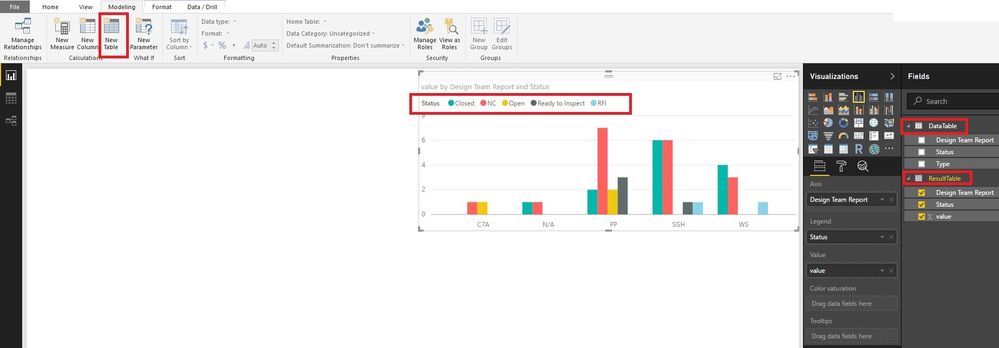
You could create a new table, which will summarize the table by "type" and "status". Then you can create visuals with the new table. Any new data added into the old table will be updated in the new table automatically. Please have a try.
ResultTable =
UNION (
    SUMMARIZE (
        'DataTable',
        'DataTable'[Status],
        'DataTable'[Design Team Report],
        "value", COUNT ( 'DataTable'[Status] )
    ),
    SUMMARIZE (
        'DataTable',
        'DataTable'[Type],
        'DataTable'[Design Team Report],
        "value", COUNT ( 'DataTable'[Type] )
    )
)
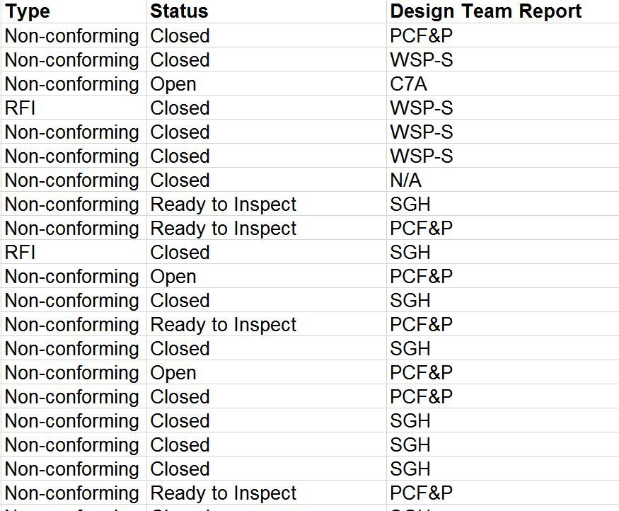
I paste your data in text mode in case somebody wants to have a try.
Type	Status	Design Team Report
NC	Open	C7A
NC	Closed	N/A
NC	Closed	PP
RFI	Closed	WS
NC	Ready to Inspect	PP
NC	Open	PP
NC	Ready to Inspect	PP
NC	Open	PP
NC	Closed	PP
RFI	Closed	SGH
NC	Ready to Inspect	PP
NC	Ready to Inspect	SGH
NC	Closed	SGH
NC	Closed	SGH
NC	Closed	SGH
NC	Closed	SGH
NC	Closed	SGH
NC	Closed	WS
NC	Closed	WS
NC	Closed	WS
Best Regards!
Dale
If this post helps, then please consider Accept it as the solution to help the other members find it more quickly.
Helpful resources

Microsoft Fabric Learn Together
Covering the world! 9:00-10:30 AM Sydney, 4:00-5:30 PM CET (Paris/Berlin), 7:00-8:30 PM Mexico City

Power BI Monthly Update - April 2024
Check out the April 2024 Power BI update to learn about new features.

| User | Count |
|---|---|
| 110 | |
| 99 | |
| 80 | |
| 64 | |
| 57 |
| User | Count |
|---|---|
| 145 | |
| 110 | |
| 91 | |
| 84 | |
| 66 |


