- Power BI forums
- Updates
- News & Announcements
- Get Help with Power BI
- Desktop
- Service
- Report Server
- Power Query
- Mobile Apps
- Developer
- DAX Commands and Tips
- Custom Visuals Development Discussion
- Health and Life Sciences
- Power BI Spanish forums
- Translated Spanish Desktop
- Power Platform Integration - Better Together!
- Power Platform Integrations (Read-only)
- Power Platform and Dynamics 365 Integrations (Read-only)
- Training and Consulting
- Instructor Led Training
- Dashboard in a Day for Women, by Women
- Galleries
- Community Connections & How-To Videos
- COVID-19 Data Stories Gallery
- Themes Gallery
- Data Stories Gallery
- R Script Showcase
- Webinars and Video Gallery
- Quick Measures Gallery
- 2021 MSBizAppsSummit Gallery
- 2020 MSBizAppsSummit Gallery
- 2019 MSBizAppsSummit Gallery
- Events
- Ideas
- Custom Visuals Ideas
- Issues
- Issues
- Events
- Upcoming Events
- Community Blog
- Power BI Community Blog
- Custom Visuals Community Blog
- Community Support
- Community Accounts & Registration
- Using the Community
- Community Feedback
Register now to learn Fabric in free live sessions led by the best Microsoft experts. From Apr 16 to May 9, in English and Spanish.
- Power BI forums
- Forums
- Get Help with Power BI
- Desktop
- circle gauge / donut
- Subscribe to RSS Feed
- Mark Topic as New
- Mark Topic as Read
- Float this Topic for Current User
- Bookmark
- Subscribe
- Printer Friendly Page
- Mark as New
- Bookmark
- Subscribe
- Mute
- Subscribe to RSS Feed
- Permalink
- Report Inappropriate Content
circle gauge / donut
Hi,
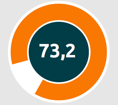
I'm looking for a visual like in the picture. I also want to color te circle, conditional on het value. Is this posible?
Solved! Go to Solution.
- Mark as New
- Bookmark
- Subscribe
- Mute
- Subscribe to RSS Feed
- Permalink
- Report Inappropriate Content
@jaspijk You're welcome! If it's solved you can mark it as the solution too 🙂
Respectfully,
Zoe Douglas (DataZoe)
Follow me on LinkedIn at https://www.linkedin.com/in/zoedouglas-data
See my reports and blog at https://www.datazoepowerbi.com/
- Mark as New
- Bookmark
- Subscribe
- Mute
- Subscribe to RSS Feed
- Permalink
- Report Inappropriate Content
Hello @jaspijk ,
Please check Circular Gauge by MAQ Software and Ring Chart by MAQ Software
Let us know if it meet your requirements.
For any further queries or enhancement requests, please contact us at support@maqsoftware.com
Thanks
- Mark as New
- Bookmark
- Subscribe
- Mute
- Subscribe to RSS Feed
- Permalink
- Report Inappropriate Content
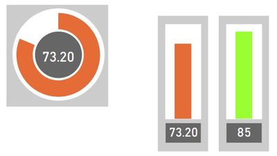
I was able to get it pretty close without a custom visual:
It's just a donut with additional measure for the whitespace and some shapes that are grouped togther. You can resize it if you click once and hold shift (to keep it square).
https://github.com/DataZoe/PBIX/blob/master/DonutShape.pbix
Respectfully,
Zoe Douglas (DataZoe)
Follow me on LinkedIn at https://www.linkedin.com/in/zoedouglas-data
See my reports and blog at https://www.datazoepowerbi.com/
- Mark as New
- Bookmark
- Subscribe
- Mute
- Subscribe to RSS Feed
- Permalink
- Report Inappropriate Content
- Mark as New
- Bookmark
- Subscribe
- Mute
- Subscribe to RSS Feed
- Permalink
- Report Inappropriate Content
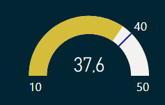
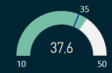
Thanks!!! Very nice. Is it also posible to color the circle conditional on a target value. Above target green and below target orange. I managed that with another visual (meter) But there the colors can be set conditional on a masure. See images.
- Mark as New
- Bookmark
- Subscribe
- Mute
- Subscribe to RSS Feed
- Permalink
- Report Inappropriate Content
I did try to get the donut to do conditional formatting, but I wasn't able to get it to do it. You can do conditional formatting on a column chart though. I like the circle graphic too but if you really need that color change, you may consider a similar set up with column or bar (sideways instead) chart:
I've update the PBIX too: https://github.com/DataZoe/PBIX/blob/master/DonutShape.pbix
Respectfully,
Zoe Douglas (DataZoe)
Follow me on LinkedIn at https://www.linkedin.com/in/zoedouglas-data
See my reports and blog at https://www.datazoepowerbi.com/
- Mark as New
- Bookmark
- Subscribe
- Mute
- Subscribe to RSS Feed
- Permalink
- Report Inappropriate Content
@jaspijk I saw another post from @v-zhenbw-msft where they did conditional formatting on a line chart, and that would also work for your donut!
You create a measure for each of the colors you want:
Measure Green = if([Measure]>80,[Measure],blank())

Measure Yellow = if([Measure]>50&&[Measure]<=80,[Measure],blank())

Measure Red = if([Measure]<=50, [Measure],blank())
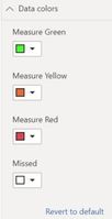
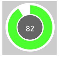
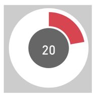
then put them all in the donut values. Change the colors for each to the right color:
Updated PBIX: https://github.com/DataZoe/PBIX/blob/master/DonutShape.pbix
Respectfully,
Zoe Douglas (DataZoe)
Follow me on LinkedIn at https://www.linkedin.com/in/zoedouglas-data
See my reports and blog at https://www.datazoepowerbi.com/
- Mark as New
- Bookmark
- Subscribe
- Mute
- Subscribe to RSS Feed
- Permalink
- Report Inappropriate Content
'm so thankfull! Can I ask one last question. I've to make the visual 36 times on 36 measerments. Di I've tot make all the measerments 36 times or is there a way to simplify that, to change only the measerment on witch the score is based. Thanks.
- Mark as New
- Bookmark
- Subscribe
- Mute
- Subscribe to RSS Feed
- Permalink
- Report Inappropriate Content
@jaspijk Yes, you can have [Measure] be based on multiple measures this way:
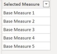
1. Create a table (Enter Data) with all your base measure names:
2. Modify your [Measure] to switch between what is selected:
Measure =
if(HASONEFILTER('Base Measures'[Selected Measure]),
    switch(SELECTEDVALUE('Base Measures'[Selected Measure]),
        "Base Measure 1",[Base Measure 1],
        "Base Measure 2",[Base Measure 2],
        "Base Measure 3",[Base Measure 3],
        "Base Measure 4",[Base Measure 4],
        "Base Measure 5",[Base Measure 5],
        blank())
    ,blank()
)
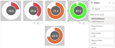
3. Now you have 2 options, you can put a visual level filter that picks which measure is on the card/donut for each visual:
4. Or you could control one with a slicer:
I've updated the PBIX too: https://github.com/DataZoe/PBIX/blob/master/DonutShape.pbix
Respectfully,
Zoe Douglas (DataZoe)
Follow me on LinkedIn at https://www.linkedin.com/in/zoedouglas-data
See my reports and blog at https://www.datazoepowerbi.com/
- Mark as New
- Bookmark
- Subscribe
- Mute
- Subscribe to RSS Feed
- Permalink
- Report Inappropriate Content
Hi. Ik don't know how to thank You!!! Thanks!!!!!!
- Mark as New
- Bookmark
- Subscribe
- Mute
- Subscribe to RSS Feed
- Permalink
- Report Inappropriate Content
@jaspijk You're welcome! If it's solved you can mark it as the solution too 🙂
Respectfully,
Zoe Douglas (DataZoe)
Follow me on LinkedIn at https://www.linkedin.com/in/zoedouglas-data
See my reports and blog at https://www.datazoepowerbi.com/
- Mark as New
- Bookmark
- Subscribe
- Mute
- Subscribe to RSS Feed
- Permalink
- Report Inappropriate Content
Wow. Thank You very much. This is great!!!
- Mark as New
- Bookmark
- Subscribe
- Mute
- Subscribe to RSS Feed
- Permalink
- Report Inappropriate Content
@jaspijk , See if this can help https://www.youtube.com/watch?v=jQ0Q6hlq1_8
Microsoft Power BI Learning Resources, 2023 !!
Learn Power BI - Full Course with Dec-2022, with Window, Index, Offset, 100+ Topics !!
Did I answer your question? Mark my post as a solution! Appreciate your Kudos !! Proud to be a Super User! !!
- Mark as New
- Bookmark
- Subscribe
- Mute
- Subscribe to RSS Feed
- Permalink
- Report Inappropriate Content
Hi,
Thanks for your mesaage. I know that one. But I mean exactely the image I've showed. Only one color at the time (red, orange or green)
- Mark as New
- Bookmark
- Subscribe
- Mute
- Subscribe to RSS Feed
- Permalink
- Report Inappropriate Content
Hi @jaspijk ,
I serched a few similar visuals. Hope they work for you.😉
Circular Gauge by MAQ Software - Power BI Visual Introduction
Power BI Custom Visuals- Circle KPI Gauge
Xue Ding
If this post helps, then please consider Accept it as the solution to help the other members find it more quickly.
Helpful resources

Microsoft Fabric Learn Together
Covering the world! 9:00-10:30 AM Sydney, 4:00-5:30 PM CET (Paris/Berlin), 7:00-8:30 PM Mexico City

Power BI Monthly Update - April 2024
Check out the April 2024 Power BI update to learn about new features.

| User | Count |
|---|---|
| 109 | |
| 98 | |
| 77 | |
| 66 | |
| 54 |
| User | Count |
|---|---|
| 144 | |
| 104 | |
| 101 | |
| 86 | |
| 64 |
