- Power BI forums
- Updates
- News & Announcements
- Get Help with Power BI
- Desktop
- Service
- Report Server
- Power Query
- Mobile Apps
- Developer
- DAX Commands and Tips
- Custom Visuals Development Discussion
- Health and Life Sciences
- Power BI Spanish forums
- Translated Spanish Desktop
- Power Platform Integration - Better Together!
- Power Platform Integrations (Read-only)
- Power Platform and Dynamics 365 Integrations (Read-only)
- Training and Consulting
- Instructor Led Training
- Dashboard in a Day for Women, by Women
- Galleries
- Community Connections & How-To Videos
- COVID-19 Data Stories Gallery
- Themes Gallery
- Data Stories Gallery
- R Script Showcase
- Webinars and Video Gallery
- Quick Measures Gallery
- 2021 MSBizAppsSummit Gallery
- 2020 MSBizAppsSummit Gallery
- 2019 MSBizAppsSummit Gallery
- Events
- Ideas
- Custom Visuals Ideas
- Issues
- Issues
- Events
- Upcoming Events
- Community Blog
- Power BI Community Blog
- Custom Visuals Community Blog
- Community Support
- Community Accounts & Registration
- Using the Community
- Community Feedback
Register now to learn Fabric in free live sessions led by the best Microsoft experts. From Apr 16 to May 9, in English and Spanish.
- Power BI forums
- Forums
- Get Help with Power BI
- Desktop
- Re: choose the column based on the current date
- Subscribe to RSS Feed
- Mark Topic as New
- Mark Topic as Read
- Float this Topic for Current User
- Bookmark
- Subscribe
- Printer Friendly Page
- Mark as New
- Bookmark
- Subscribe
- Mute
- Subscribe to RSS Feed
- Permalink
- Report Inappropriate Content
choose the column based on the current date
Hello gurus
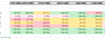
I would like to create a report that would show a diagram similar to
those 3 bars represent the values of Previous week, This week and Next week against the left column.
Does Power BI offer any functionality to be able to check the current date and determine which column represents the column for the Current week and use the previous column and the next column to come up with those bar graphs?
If so please point me in the right direction
Source of data is a CSV file.
Thanks
Solved! Go to Solution.
- Mark as New
- Bookmark
- Subscribe
- Mute
- Subscribe to RSS Feed
- Permalink
- Report Inappropriate Content
Once you have your CSV imported, right-click on the table and choose New Column and type the code in from above for Diff, replacing DateField with whatever your column name is for the date.
When you make your visual - if you're doing a Clustered Bar Chart, choose Diff as your Axis and then put the other column(s) in the Values field. Then set the filter on Diff to Advanced Filtering - is less than or equal to 7, and is more than or equal to 0.
By putting the calculated field in the Axis, you're ensuring that the reports you get are all based on the timeframe you decide from today's date.
- Mark as New
- Bookmark
- Subscribe
- Mute
- Subscribe to RSS Feed
- Permalink
- Report Inappropriate Content
You can create a calculated column to get the difference between today's date and the date in your table. For example:
- Mark as New
- Bookmark
- Subscribe
- Mute
- Subscribe to RSS Feed
- Permalink
- Report Inappropriate Content
please point me into how I can do all this scripting in my power bi report. Thanks
- Mark as New
- Bookmark
- Subscribe
- Mute
- Subscribe to RSS Feed
- Permalink
- Report Inappropriate Content
Once you have your CSV imported, right-click on the table and choose New Column and type the code in from above for Diff, replacing DateField with whatever your column name is for the date.
When you make your visual - if you're doing a Clustered Bar Chart, choose Diff as your Axis and then put the other column(s) in the Values field. Then set the filter on Diff to Advanced Filtering - is less than or equal to 7, and is more than or equal to 0.
By putting the calculated field in the Axis, you're ensuring that the reports you get are all based on the timeframe you decide from today's date.
Helpful resources

Microsoft Fabric Learn Together
Covering the world! 9:00-10:30 AM Sydney, 4:00-5:30 PM CET (Paris/Berlin), 7:00-8:30 PM Mexico City

Power BI Monthly Update - April 2024
Check out the April 2024 Power BI update to learn about new features.

| User | Count |
|---|---|
| 114 | |
| 101 | |
| 78 | |
| 75 | |
| 49 |
| User | Count |
|---|---|
| 145 | |
| 108 | |
| 107 | |
| 89 | |
| 61 |


