- Power BI forums
- Updates
- News & Announcements
- Get Help with Power BI
- Desktop
- Service
- Report Server
- Power Query
- Mobile Apps
- Developer
- DAX Commands and Tips
- Custom Visuals Development Discussion
- Health and Life Sciences
- Power BI Spanish forums
- Translated Spanish Desktop
- Power Platform Integration - Better Together!
- Power Platform Integrations (Read-only)
- Power Platform and Dynamics 365 Integrations (Read-only)
- Training and Consulting
- Instructor Led Training
- Dashboard in a Day for Women, by Women
- Galleries
- Community Connections & How-To Videos
- COVID-19 Data Stories Gallery
- Themes Gallery
- Data Stories Gallery
- R Script Showcase
- Webinars and Video Gallery
- Quick Measures Gallery
- 2021 MSBizAppsSummit Gallery
- 2020 MSBizAppsSummit Gallery
- 2019 MSBizAppsSummit Gallery
- Events
- Ideas
- Custom Visuals Ideas
- Issues
- Issues
- Events
- Upcoming Events
- Community Blog
- Power BI Community Blog
- Custom Visuals Community Blog
- Community Support
- Community Accounts & Registration
- Using the Community
- Community Feedback
Register now to learn Fabric in free live sessions led by the best Microsoft experts. From Apr 16 to May 9, in English and Spanish.
- Power BI forums
- Forums
- Get Help with Power BI
- Desktop
- Re: change the legend labels dynamically based on ...
- Subscribe to RSS Feed
- Mark Topic as New
- Mark Topic as Read
- Float this Topic for Current User
- Bookmark
- Subscribe
- Printer Friendly Page
- Mark as New
- Bookmark
- Subscribe
- Mute
- Subscribe to RSS Feed
- Permalink
- Report Inappropriate Content
change the legend labels dynamically based on the value selected in the slicer.
I have the below table.
ID	   Pname     DeliveredDate	   Level  Model
100	   Mobile    9/22/2018      	    A1	  2018
109	   PC	     9/23/2018	            A1	  2018
188	   Mobile    7/11/2018	            A2	  2018
190	   Laptop     8/11/2018    	    A2	  2016
200	   TV	      4/18/2018	            A3	  2016
333	   PC	      4/24/2018	            A1	  2017
377	  Laptop      4/20/2018	            A2	  2018
399	  Mobile      4/18/2018              A3	  2017
400	  Mobile      9/19/2018	            A3	  2016
403	  Laptop      4/22/2018	            A1	  2017
404	  Laptop      7/17/2018       	    A3	  2018
405	  Laptop      7/19/2018	            A3	  2017
406	  TV	      7/11/2018	            A1	  2017
407	  TV   	      9/21/2018	            A1	  2017
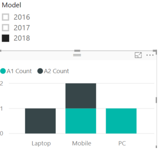
I am displaying count of level A1,A2(Created using measures) using stacked column chart.
I have a slicer which shows the Model, based on the selection of the model the chart is changing..
Below are the measures created to count A1, A2.
A1 Count =
CALCULATE(
COUNTAX(
FILTER ( 'ProdData', 'ProdData'[Level] = "A1"),
'ProdData'[Level]
))
A2 Count =
CALCULATE(
COUNTAX(
FILTER ( 'ProdData', 'ProdData'[Level] = "A2"),
'ProdData'[Level]
))
The chart is as shown in the below picture.
When user selects the Model 2016 from slicer, i want to dynamically change the legends shown on the chart.
currently the chart is showing A1 count and A2 Count as legend titles/labels, i want to change the legend labels dynamically based on the value selected in the slicer.
When 2016 is selected from slicer - i want to show the legend labels on the chart as Product(A1-16) and Product(A2-17) in place of A1 Count and A2 Count..
When 2017 is selected from slicer - I want to show the legend titles on the chart as Product(A1-17) and Product(A2-18)
When 2018 is selected from slicer - I want to show the legend titles on the chart as Product(A1-18) and Product(A2-19)
Any inputs on how to change the legend titles dynamically based on the user selection on the slicer?Thanks.
- Mark as New
- Bookmark
- Subscribe
- Mute
- Subscribe to RSS Feed
- Permalink
- Report Inappropriate Content
Changing the legend is not possible, however you need to work on dynamic card to get your results. MCSA Power BI 70-778 exam can help you to solve this
- Mark as New
- Bookmark
- Subscribe
- Mute
- Subscribe to RSS Feed
- Permalink
- Report Inappropriate Content
You can't change the legend but we could add a dynamic card on top of the chart if you're open to it
Did I answer your question correctly? Mark my answer as a solution!
Proud to be a Datanaut!
- Mark as New
- Bookmark
- Subscribe
- Mute
- Subscribe to RSS Feed
- Permalink
- Report Inappropriate Content
- Mark as New
- Bookmark
- Subscribe
- Mute
- Subscribe to RSS Feed
- Permalink
- Report Inappropriate Content
@LivioLanzo - On the dynamic card,can we show the small circle's with colors as shown in the legend followed by the dynamic label? If it can be shown then i can hide the legend on the chart and users can see the card visualzation instead labels.Need help.
- Mark as New
- Bookmark
- Subscribe
- Mute
- Subscribe to RSS Feed
- Permalink
- Report Inappropriate Content
Hi Dexter, you cannot show the small circle with colors if that is what you are after
Did I answer your question correctly? Mark my answer as a solution!
Proud to be a Datanaut!
Helpful resources

Microsoft Fabric Learn Together
Covering the world! 9:00-10:30 AM Sydney, 4:00-5:30 PM CET (Paris/Berlin), 7:00-8:30 PM Mexico City

Power BI Monthly Update - April 2024
Check out the April 2024 Power BI update to learn about new features.

| User | Count |
|---|---|
| 111 | |
| 100 | |
| 80 | |
| 64 | |
| 58 |
| User | Count |
|---|---|
| 148 | |
| 111 | |
| 93 | |
| 84 | |
| 66 |

