- Power BI forums
- Updates
- News & Announcements
- Get Help with Power BI
- Desktop
- Service
- Report Server
- Power Query
- Mobile Apps
- Developer
- DAX Commands and Tips
- Custom Visuals Development Discussion
- Health and Life Sciences
- Power BI Spanish forums
- Translated Spanish Desktop
- Power Platform Integration - Better Together!
- Power Platform Integrations (Read-only)
- Power Platform and Dynamics 365 Integrations (Read-only)
- Training and Consulting
- Instructor Led Training
- Dashboard in a Day for Women, by Women
- Galleries
- Community Connections & How-To Videos
- COVID-19 Data Stories Gallery
- Themes Gallery
- Data Stories Gallery
- R Script Showcase
- Webinars and Video Gallery
- Quick Measures Gallery
- 2021 MSBizAppsSummit Gallery
- 2020 MSBizAppsSummit Gallery
- 2019 MSBizAppsSummit Gallery
- Events
- Ideas
- Custom Visuals Ideas
- Issues
- Issues
- Events
- Upcoming Events
- Community Blog
- Power BI Community Blog
- Custom Visuals Community Blog
- Community Support
- Community Accounts & Registration
- Using the Community
- Community Feedback
Register now to learn Fabric in free live sessions led by the best Microsoft experts. From Apr 16 to May 9, in English and Spanish.
- Power BI forums
- Forums
- Get Help with Power BI
- Desktop
- bar chart
- Subscribe to RSS Feed
- Mark Topic as New
- Mark Topic as Read
- Float this Topic for Current User
- Bookmark
- Subscribe
- Printer Friendly Page
- Mark as New
- Bookmark
- Subscribe
- Mute
- Subscribe to RSS Feed
- Permalink
- Report Inappropriate Content
bar chart
Hello Power BI community,
I've been trying to find an answer to the issue that I'm facing. It would be great if someone can assist me with this.
I'm working with energy consumption data from 2017 to 2022 and I am showing the current consumption as per the filtered date using a slicer and showing last year's consumption using SAMEPERIODLASTYEAR.
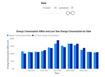
The following is a visual of my bar chart which is working properly for FY2019, FY 2021, FY2022
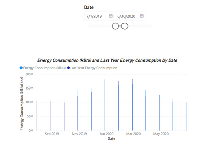
Everything seems to work well, except when I'm showing the data for FY2019. The same issue for FY2019 is with any type of bar chart.
The barchart shows thin bars as follows:
Solved! Go to Solution.
- Mark as New
- Bookmark
- Subscribe
- Mute
- Subscribe to RSS Feed
- Permalink
- Report Inappropriate Content
What about the related date field in the Consumption_Cost table? Is the date format of that field consistent?
- Mark as New
- Bookmark
- Subscribe
- Mute
- Subscribe to RSS Feed
- Permalink
- Report Inappropriate Content
Hi @cpearson, I just used the Date field from the Consumption_Cost table in the bar chart and the slicer and it worked properly for FY2019. I don't know why it was not working when using Date from the Calendar table.
Thank you for following up!!
- Mark as New
- Bookmark
- Subscribe
- Mute
- Subscribe to RSS Feed
- Permalink
- Report Inappropriate Content
What about the related date field in the Consumption_Cost table? Is the date format of that field consistent?
- Mark as New
- Bookmark
- Subscribe
- Mute
- Subscribe to RSS Feed
- Permalink
- Report Inappropriate Content
Hi @cpearson and thank you for your response!
The current date has a date format and not date time because the underlying data doesn't have date times.
This is a screenshot of that field.
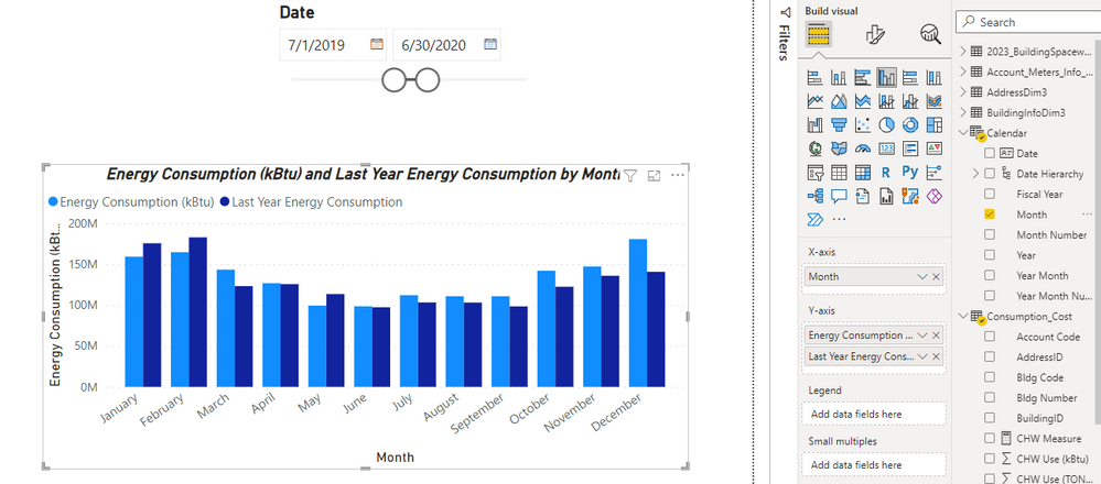
However, if I changed the date field from Date into Month, the bar chart shows properly. It is shown in the following image:
- Mark as New
- Bookmark
- Subscribe
- Mute
- Subscribe to RSS Feed
- Permalink
- Report Inappropriate Content
Is your data for that period any different? It's a strange one but the thin bars could be happening because the data is not getting aggregated into months. Is your date field a date or a datetime? Can you share a screenshot of that field?
If your data is formatted to something like this:
but the underlying data has date times it might be causing the issue. Change the column format so you can see the dd/mm/yyyy hh:mm and see if there is any variance in the formatting across the FYs.
Helpful resources

Microsoft Fabric Learn Together
Covering the world! 9:00-10:30 AM Sydney, 4:00-5:30 PM CET (Paris/Berlin), 7:00-8:30 PM Mexico City

Power BI Monthly Update - April 2024
Check out the April 2024 Power BI update to learn about new features.

| User | Count |
|---|---|
| 110 | |
| 95 | |
| 76 | |
| 65 | |
| 51 |
| User | Count |
|---|---|
| 146 | |
| 109 | |
| 106 | |
| 88 | |
| 61 |


