- Power BI forums
- Updates
- News & Announcements
- Get Help with Power BI
- Desktop
- Service
- Report Server
- Power Query
- Mobile Apps
- Developer
- DAX Commands and Tips
- Custom Visuals Development Discussion
- Health and Life Sciences
- Power BI Spanish forums
- Translated Spanish Desktop
- Power Platform Integration - Better Together!
- Power Platform Integrations (Read-only)
- Power Platform and Dynamics 365 Integrations (Read-only)
- Training and Consulting
- Instructor Led Training
- Dashboard in a Day for Women, by Women
- Galleries
- Community Connections & How-To Videos
- COVID-19 Data Stories Gallery
- Themes Gallery
- Data Stories Gallery
- R Script Showcase
- Webinars and Video Gallery
- Quick Measures Gallery
- 2021 MSBizAppsSummit Gallery
- 2020 MSBizAppsSummit Gallery
- 2019 MSBizAppsSummit Gallery
- Events
- Ideas
- Custom Visuals Ideas
- Issues
- Issues
- Events
- Upcoming Events
- Community Blog
- Power BI Community Blog
- Custom Visuals Community Blog
- Community Support
- Community Accounts & Registration
- Using the Community
- Community Feedback
Register now to learn Fabric in free live sessions led by the best Microsoft experts. From Apr 16 to May 9, in English and Spanish.
- Power BI forums
- Forums
- Get Help with Power BI
- Desktop
- Re: a true dot plot please !
- Subscribe to RSS Feed
- Mark Topic as New
- Mark Topic as Read
- Float this Topic for Current User
- Bookmark
- Subscribe
- Printer Friendly Page
- Mark as New
- Bookmark
- Subscribe
- Mute
- Subscribe to RSS Feed
- Permalink
- Report Inappropriate Content
a true dot plot please !
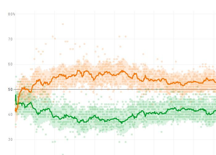
When I start analyzing a one-dimensional set of data, the first thing I do is always to look at ALL THE DOTS of the population.
And if I want to analyze time variation I want to see all the dots with date on the X-axis and measured value on the Y-axis
This dot plot with individual values is the most basic graph in excel, and the most usual graph in media, see for instance below, an example of poll results over time, with all the polls as individual dots and moving average as a continuous line
How can this basic of the basics not be available in PowerBI ?
we have zillions of fancy graphs with more or less usefull features at hand, and not the one everybody should start with
what is wrong in developing this diagram ?
- Mark as New
- Bookmark
- Subscribe
- Mute
- Subscribe to RSS Feed
- Permalink
- Report Inappropriate Content
You mean the Scatter plot chart?
@ me in replies or I'll lose your thread!!!
Instead of a Kudo, please vote for this idea
Become an expert!: Enterprise DNA
External Tools: MSHGQM
YouTube Channel!: Microsoft Hates Greg
Latest book!: The Definitive Guide to Power Query (M)
DAX is easy, CALCULATE makes DAX hard...
- Mark as New
- Bookmark
- Subscribe
- Mute
- Subscribe to RSS Feed
- Permalink
- Report Inappropriate Content
Yes, the correct english wording is probably scatter chart. I may have been misled by the french designation "nuage de points"
However, the key point is that all engineers all taught to first look at their data, and start plotting the individual values to vizualize the population. Then they add some lines characterizing variation, such as in the classical control charts of SPC.
This is really a big, big, lack in the default visuals of Power BI. Customers from the engineering community will want to see SPC charts, in particular because the quality system asks for it.
Regards
- Mark as New
- Bookmark
- Subscribe
- Mute
- Subscribe to RSS Feed
- Permalink
- Report Inappropriate Content
Hey,
unfortunately, this is not possible using the default visuals, if you are familiar with R this link might be helpful:
http://library.open.oregonstate.edu/computationalbiology/chapter/plotting-data-and-ggplot2/
If you are more on the python side, then this maybe helpful: https://python-graph-gallery.com/scatter-plot/
Be aware that not all python packages that you are used to use are also supported in combination with Power BI service, this link lists the currently supported python packages (since the February 2019 release).
Hopefully, this helps a little,
Regards,
Tom
Did I answer your question? Mark my post as a solution, this will help others!
Proud to be a Super User!
I accept Kudos 😉
Hamburg, Germany
Helpful resources

Microsoft Fabric Learn Together
Covering the world! 9:00-10:30 AM Sydney, 4:00-5:30 PM CET (Paris/Berlin), 7:00-8:30 PM Mexico City

Power BI Monthly Update - April 2024
Check out the April 2024 Power BI update to learn about new features.

| User | Count |
|---|---|
| 113 | |
| 97 | |
| 79 | |
| 74 | |
| 56 |
| User | Count |
|---|---|
| 145 | |
| 105 | |
| 104 | |
| 90 | |
| 63 |

