- Power BI forums
- Updates
- News & Announcements
- Get Help with Power BI
- Desktop
- Service
- Report Server
- Power Query
- Mobile Apps
- Developer
- DAX Commands and Tips
- Custom Visuals Development Discussion
- Health and Life Sciences
- Power BI Spanish forums
- Translated Spanish Desktop
- Power Platform Integration - Better Together!
- Power Platform Integrations (Read-only)
- Power Platform and Dynamics 365 Integrations (Read-only)
- Training and Consulting
- Instructor Led Training
- Dashboard in a Day for Women, by Women
- Galleries
- Community Connections & How-To Videos
- COVID-19 Data Stories Gallery
- Themes Gallery
- Data Stories Gallery
- R Script Showcase
- Webinars and Video Gallery
- Quick Measures Gallery
- 2021 MSBizAppsSummit Gallery
- 2020 MSBizAppsSummit Gallery
- 2019 MSBizAppsSummit Gallery
- Events
- Ideas
- Custom Visuals Ideas
- Issues
- Issues
- Events
- Upcoming Events
- Community Blog
- Power BI Community Blog
- Custom Visuals Community Blog
- Community Support
- Community Accounts & Registration
- Using the Community
- Community Feedback
Register now to learn Fabric in free live sessions led by the best Microsoft experts. From Apr 16 to May 9, in English and Spanish.
- Power BI forums
- Forums
- Get Help with Power BI
- Desktop
- Year over year comparison
- Subscribe to RSS Feed
- Mark Topic as New
- Mark Topic as Read
- Float this Topic for Current User
- Bookmark
- Subscribe
- Printer Friendly Page
- Mark as New
- Bookmark
- Subscribe
- Mute
- Subscribe to RSS Feed
- Permalink
- Report Inappropriate Content
Year over year comparison
Hello,
I have a data set like this:
| Year | Program name | Has curriculum map | use of results |
| 2014 | A | yes | yes |
| 2014 | B | yes | yes |
| 2014 | C | no | yes |
| 2014 | D | no | yes |
| 2014 | E | yes | yes |
| 2014 | F | no report | no report |
| 2015 | A | yes | yes |
| 2015 | B | no | yes |
| 2015 | C | no | yes |
| 2015 | D | no | yes |
| 2015 | E | no | yes |
I'm struggling with creating a bar chart to compare the percentage of programs with curriculum map/SLOs each year (so only count yeses in column 3 and 4). Right now when I drag "Year" to Axis and "curriculum map" to "Value", the percentage is calculated over the total number of yeses in the whole table and filter doesn't seem to work. Please help. I am new to Power BI and not familiar with DAX.
Thanks a lot!
Solved! Go to Solution.
- Mark as New
- Bookmark
- Subscribe
- Mute
- Subscribe to RSS Feed
- Permalink
- Report Inappropriate Content
Hi @clairethnguyen,
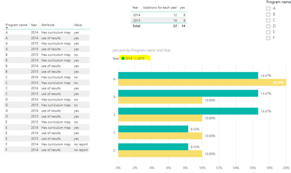
For your desired output, it seems that you want to get the output like this.
If you want to get the output above, please follow the steps below.
1. Unpivot Has curriculum map and use of results columns in Query Editor.
2. Create the measures below.
yes = CALCULATE(COUNTROWS('Table2'),FILTER('Table2','Table2'[Value]="yes"))

totalrows for each year = CALCULATE(COUNT(Table2[Program name]),ALLEXCEPT(Table2,Table2[Year]))

percent = [yes]/ [totalrows for each year]
3. Create the bar chart.
More details, you could refer to the attachment.
Best Regards,
Cherry
If this post helps, then please consider Accept it as the solution to help the other members find it more quickly.
- Mark as New
- Bookmark
- Subscribe
- Mute
- Subscribe to RSS Feed
- Permalink
- Report Inappropriate Content
Hi @clairethnguyen,
I'm not clear about your output.
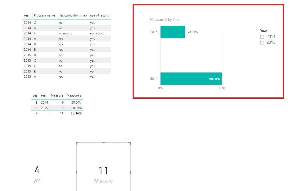
Do you want to have the output like below highlight in red?
If it is, you could create the measures below.
count_product_each_year = CALCULATE(COUNTROWS('Table1'),ALLEXCEPT(Table1,Table1[Year]))

yes = CALCULATE(COUNT(Table1[Has curriculum map]),FILTER(ALLEXCEPT(Table1,Table1[Year]),'Table1'[Has curriculum map]="yes"))

Percent= [yes]/[count_product_each_year]
If you still need help, please share your desired output.
Best Regards,
Cherry
If this post helps, then please consider Accept it as the solution to help the other members find it more quickly.
- Mark as New
- Bookmark
- Subscribe
- Mute
- Subscribe to RSS Feed
- Permalink
- Report Inappropriate Content
Hi Cherry @v-piga-msft
Thank you so much for your answer. Yes, it is what I want but I also want to put other categories into the same chart (in this case both column 3 and column 4 data for each year: in 2014: x % of the programs has a curriculum map, y% of the program use the results). Is it possible? What should I do if it is?
Thanks,
Claire
- Mark as New
- Bookmark
- Subscribe
- Mute
- Subscribe to RSS Feed
- Permalink
- Report Inappropriate Content
Hi @clairethnguyen,
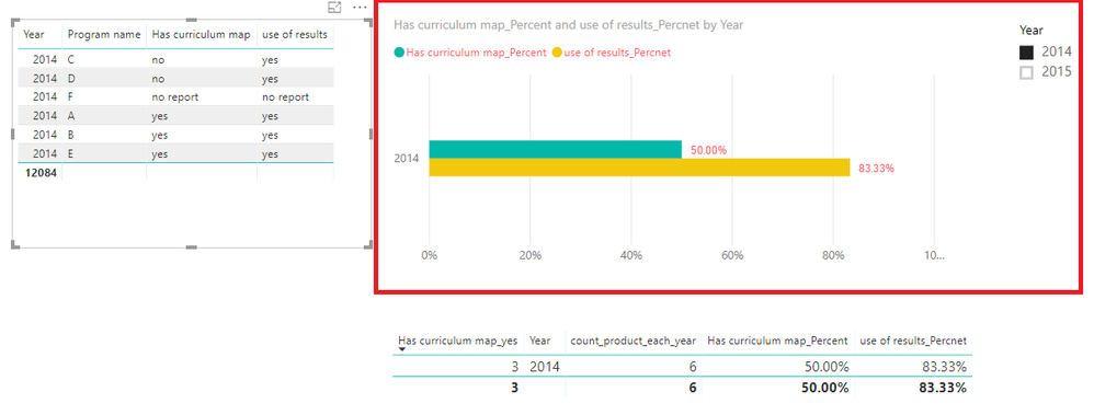
Do you want to get the output like this?
If it is, please create another two measures like below.
Has curriculum map_yes =
CALCULATE (
    COUNT ( Table1[Has curriculum map] ),
    FILTER (
        ALLEXCEPT ( Table1, Table1[Year] ),
        'Table1'[Has curriculum map] = "yes"
    )
)

Has curriculum map_Percent = [Has curriculum map_yes]/[count_product_each_year]
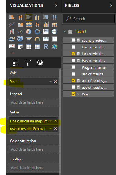
Then create the bar chart like blow.
Best Regards,
Cherry
If this post helps, then please consider Accept it as the solution to help the other members find it more quickly.
- Mark as New
- Bookmark
- Subscribe
- Mute
- Subscribe to RSS Feed
- Permalink
- Report Inappropriate Content
Hi Cherry @v-piga-msft
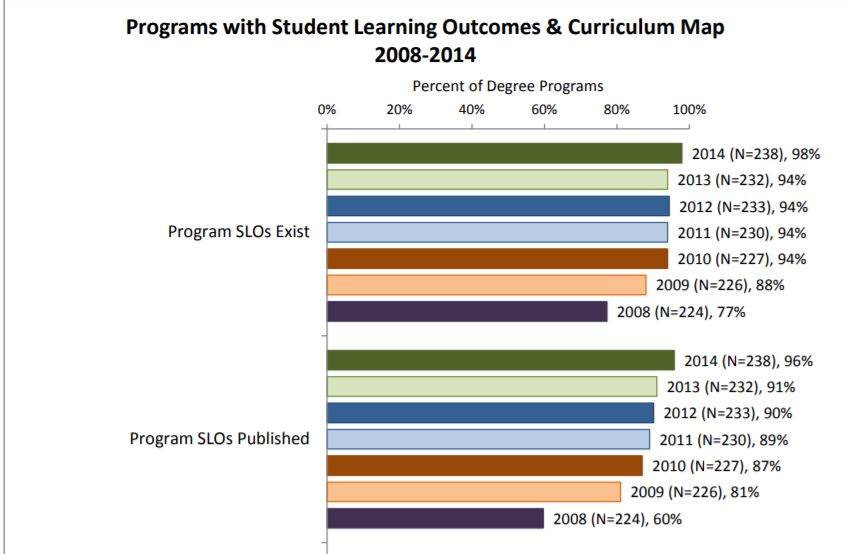
I actually want to see how the values change over the year. It's similar to this report:
Is there a way to do this?
Thank you very much.
C
- Mark as New
- Bookmark
- Subscribe
- Mute
- Subscribe to RSS Feed
- Permalink
- Report Inappropriate Content
Hi @clairethnguyen,
For your desired output, it seems that you want to get the output like this.
If you want to get the output above, please follow the steps below.
1. Unpivot Has curriculum map and use of results columns in Query Editor.
2. Create the measures below.
yes = CALCULATE(COUNTROWS('Table2'),FILTER('Table2','Table2'[Value]="yes"))

totalrows for each year = CALCULATE(COUNT(Table2[Program name]),ALLEXCEPT(Table2,Table2[Year]))

percent = [yes]/ [totalrows for each year]
3. Create the bar chart.
More details, you could refer to the attachment.
Best Regards,
Cherry
If this post helps, then please consider Accept it as the solution to help the other members find it more quickly.
- Mark as New
- Bookmark
- Subscribe
- Mute
- Subscribe to RSS Feed
- Permalink
- Report Inappropriate Content
Hi Cherry @v-piga-msft
Thanks a bunch for your help. This is what I want. I just dragged "Attribute" into the axis. I guess now I need to figure out how to make it work for my complete data set.
Helpful resources

Microsoft Fabric Learn Together
Covering the world! 9:00-10:30 AM Sydney, 4:00-5:30 PM CET (Paris/Berlin), 7:00-8:30 PM Mexico City

Power BI Monthly Update - April 2024
Check out the April 2024 Power BI update to learn about new features.

| User | Count |
|---|---|
| 110 | |
| 99 | |
| 80 | |
| 64 | |
| 57 |
| User | Count |
|---|---|
| 145 | |
| 110 | |
| 91 | |
| 84 | |
| 66 |
