- Power BI forums
- Updates
- News & Announcements
- Get Help with Power BI
- Desktop
- Service
- Report Server
- Power Query
- Mobile Apps
- Developer
- DAX Commands and Tips
- Custom Visuals Development Discussion
- Health and Life Sciences
- Power BI Spanish forums
- Translated Spanish Desktop
- Power Platform Integration - Better Together!
- Power Platform Integrations (Read-only)
- Power Platform and Dynamics 365 Integrations (Read-only)
- Training and Consulting
- Instructor Led Training
- Dashboard in a Day for Women, by Women
- Galleries
- Community Connections & How-To Videos
- COVID-19 Data Stories Gallery
- Themes Gallery
- Data Stories Gallery
- R Script Showcase
- Webinars and Video Gallery
- Quick Measures Gallery
- 2021 MSBizAppsSummit Gallery
- 2020 MSBizAppsSummit Gallery
- 2019 MSBizAppsSummit Gallery
- Events
- Ideas
- Custom Visuals Ideas
- Issues
- Issues
- Events
- Upcoming Events
- Community Blog
- Power BI Community Blog
- Custom Visuals Community Blog
- Community Support
- Community Accounts & Registration
- Using the Community
- Community Feedback
Register now to learn Fabric in free live sessions led by the best Microsoft experts. From Apr 16 to May 9, in English and Spanish.
- Power BI forums
- Forums
- Get Help with Power BI
- Desktop
- Year/Quarter/Month/Day not showing up on X axis fo...
- Subscribe to RSS Feed
- Mark Topic as New
- Mark Topic as Read
- Float this Topic for Current User
- Bookmark
- Subscribe
- Printer Friendly Page
- Mark as New
- Bookmark
- Subscribe
- Mute
- Subscribe to RSS Feed
- Permalink
- Report Inappropriate Content
Year/Quarter/Month/Day not showing up on X axis for my dataset
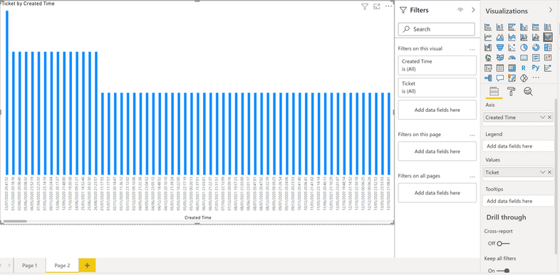
I have a Date/Time dataset (which is a custom column I've converted so I'm guessing that's the reason why it's not working) that isn't showing a Year/Quarter/Month/Day for the x axis. At the moment it's showing every single ticket date by the specific date, which is obviously not what I want since I have over a 1000, I want to see a monthly record otherwise it's a mess, as you can see here below:
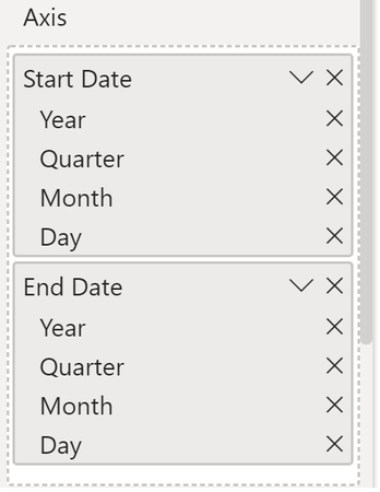
For the x axis there should be a choice to filter your dates into a Year/Quarter/Month/Day measurement. Like it is here for another Date/Time dataset that I have:
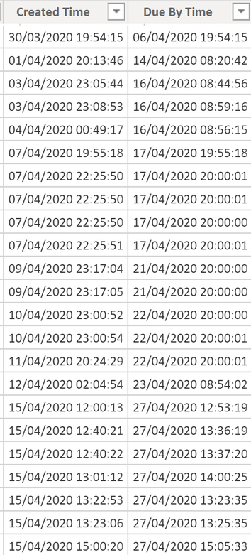
I just want my new converted datasets to have the same features the other Date/Time datasets have. The new Custom Columns that I created for the converted datasets were because the original datasets were millisecond 13-digit Time Stamps that I converted into an original Date/Time format. As you can see below, they converted perfectly just as intended:
So what could be the issue here for why it doesn't have the same graph features as a standard Date/Time dataset has?
Solved! Go to Solution.
- Mark as New
- Bookmark
- Subscribe
- Mute
- Subscribe to RSS Feed
- Permalink
- Report Inappropriate Content
Hi @Anonymous ,
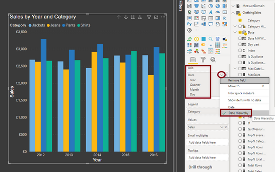
Whenever you move a DATE type column to a chart's x-axis, then you should select the following option to make the hierarchy work:
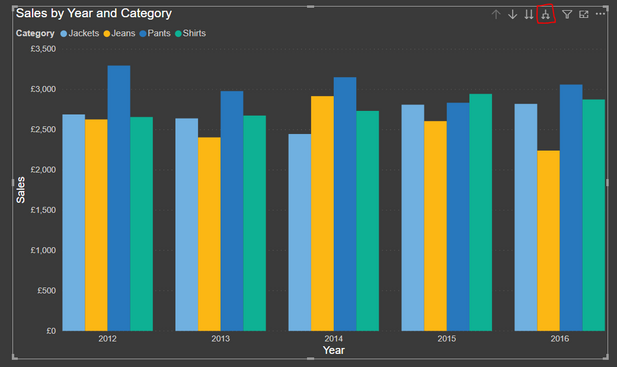
Once you do this you get a drill-down icon on the top right of your chart which you can use to drill to the month level:
Thanks,
Pragati
- Mark as New
- Bookmark
- Subscribe
- Mute
- Subscribe to RSS Feed
- Permalink
- Report Inappropriate Content
Thank you guys, such a simple solution, It was really puzzling me for a while now and I couldn't find a solution. Appreciate it!
- Mark as New
- Bookmark
- Subscribe
- Mute
- Subscribe to RSS Feed
- Permalink
- Report Inappropriate Content
I would say couple of things to check-
1. Please check if the time intelligence is enabled for the report.
2. The Created Time filed on the axis of the visual, you can see a downward arrow , click over there and see if there is an option for date hierarchy.
3. Create a date hieracrcy for the Created Time field.
- Mark as New
- Bookmark
- Subscribe
- Mute
- Subscribe to RSS Feed
- Permalink
- Report Inappropriate Content
Hi @Anonymous ,
Whenever you move a DATE type column to a chart's x-axis, then you should select the following option to make the hierarchy work:
Once you do this you get a drill-down icon on the top right of your chart which you can use to drill to the month level:
Thanks,
Pragati
Helpful resources

Microsoft Fabric Learn Together
Covering the world! 9:00-10:30 AM Sydney, 4:00-5:30 PM CET (Paris/Berlin), 7:00-8:30 PM Mexico City

Power BI Monthly Update - April 2024
Check out the April 2024 Power BI update to learn about new features.

| User | Count |
|---|---|
| 110 | |
| 97 | |
| 77 | |
| 63 | |
| 55 |
| User | Count |
|---|---|
| 143 | |
| 109 | |
| 89 | |
| 84 | |
| 66 |
