- Power BI forums
- Updates
- News & Announcements
- Get Help with Power BI
- Desktop
- Service
- Report Server
- Power Query
- Mobile Apps
- Developer
- DAX Commands and Tips
- Custom Visuals Development Discussion
- Health and Life Sciences
- Power BI Spanish forums
- Translated Spanish Desktop
- Power Platform Integration - Better Together!
- Power Platform Integrations (Read-only)
- Power Platform and Dynamics 365 Integrations (Read-only)
- Training and Consulting
- Instructor Led Training
- Dashboard in a Day for Women, by Women
- Galleries
- Community Connections & How-To Videos
- COVID-19 Data Stories Gallery
- Themes Gallery
- Data Stories Gallery
- R Script Showcase
- Webinars and Video Gallery
- Quick Measures Gallery
- 2021 MSBizAppsSummit Gallery
- 2020 MSBizAppsSummit Gallery
- 2019 MSBizAppsSummit Gallery
- Events
- Ideas
- Custom Visuals Ideas
- Issues
- Issues
- Events
- Upcoming Events
- Community Blog
- Power BI Community Blog
- Custom Visuals Community Blog
- Community Support
- Community Accounts & Registration
- Using the Community
- Community Feedback
Register now to learn Fabric in free live sessions led by the best Microsoft experts. From Apr 16 to May 9, in English and Spanish.
- Power BI forums
- Forums
- Get Help with Power BI
- Desktop
- Re: YTD line chart
- Subscribe to RSS Feed
- Mark Topic as New
- Mark Topic as Read
- Float this Topic for Current User
- Bookmark
- Subscribe
- Printer Friendly Page
- Mark as New
- Bookmark
- Subscribe
- Mute
- Subscribe to RSS Feed
- Permalink
- Report Inappropriate Content
YTD line chart
Hi,
I have monthly data with 30 June year end back to July 2014 (so 3 fiscal years worth). I want a YTD line chart with each fiscal year a separate colour line.
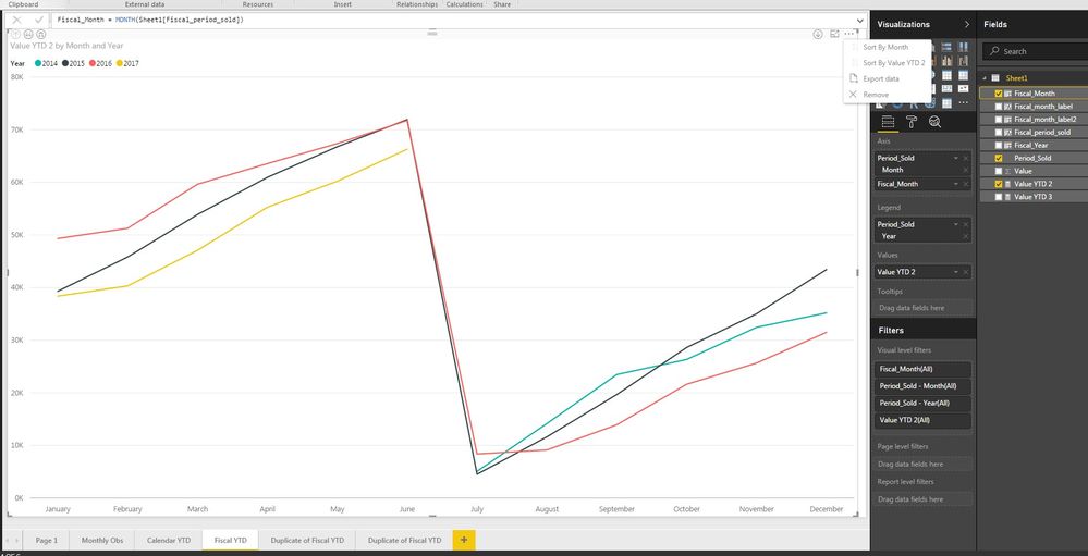
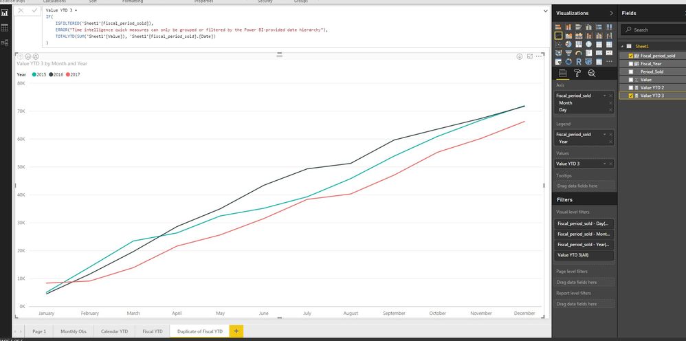
I have created a quick measure, and produced a graph with Axis as Month and Legend as Year per the attached.
The calculation is working correctly - the lowest value in each year is in July (period 1) and the highest value is in June (period 12).
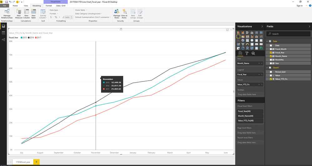
However, both the axis and legend are based on the calendar year rather than the 30 june fiscal year end. I want july to be the first month on the axis and june to be the last. Likewise, there should only be 3 colours on the legend (2015, 16 & 17), not 4.

Solved! Go to Solution.
- Mark as New
- Bookmark
- Subscribe
- Mute
- Subscribe to RSS Feed
- Permalink
- Report Inappropriate Content
Hi @mbegg
I would suggest creating a YTD measure where you use a Date Table also. This will ensure that you can then get the right values for your measures.
YTD = TOTALYTD(sum('TableName'[ColumnName]),'Date'[Calendar Date],ALL('Date'),"06/30")And here is a blog post around why you need a date table and how to create one.
- Mark as New
- Bookmark
- Subscribe
- Mute
- Subscribe to RSS Feed
- Permalink
- Report Inappropriate Content
Hi @mbegg,
As @GilbertQ mentioned above, an individual Calendar table is needed in this case. You can use CALENDARAUTO function to create it, and then create a relationship between your fact table and this Date table with the date column.
Date = CALENDARAUTO()
And the formula below is for the new YTD measure using Date[Date] column.
Value_YTD_Fis =
IF(
	ISFILTERED('Date'[Date]),
	ERROR("Time intelligence quick measures can only be grouped or filtered by the Power BI-provided date hierarchy"),
	TOTALYTD(SUM('Sheet1'[Value]), 'Date'[Date],"30/6")
)
Here is the modified pbix file for your reference. ![]()
Regards
- Mark as New
- Bookmark
- Subscribe
- Mute
- Subscribe to RSS Feed
- Permalink
- Report Inappropriate Content
@mbegg Hi, you can think of creating a new calculated column using DAX (switch/if) which states that July = 1 ....June = 12 so that later you can sort your month column using this new calculated column and probably you can see your axis properly sorted & in requried format. Hope this helps!
- Mark as New
- Bookmark
- Subscribe
- Mute
- Subscribe to RSS Feed
- Permalink
- Report Inappropriate Content
Hi @ashishrj, thank you for the suggestion, I have tried that without success.
- Do I add the new calculated column (call it Fiscal_Month) as another axis?
- If so, when you said "so that later you can sort your month column using this new calculated column" - is this within the data window or on the actual chart?
If I do (1) above, I am not given the option to sort the chart by Fiscal_Month. See Picture 3.
I know other BI software allows users to set a default sort of a particular column but I can't see that functionality in Power BI anywhere.
My only other thought is how can I change the format of Month on the horizontal axis in the below picture to appear as 01 to 12?

- Mark as New
- Bookmark
- Subscribe
- Mute
- Subscribe to RSS Feed
- Permalink
- Report Inappropriate Content
Hi @mbegg,
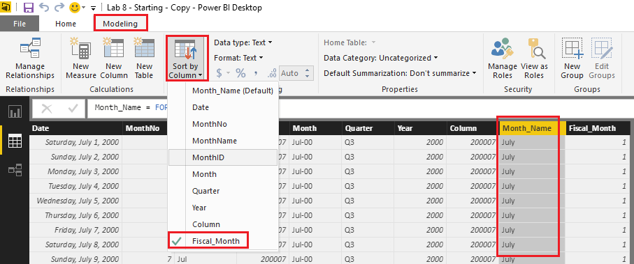
I know other BI software allows users to set a default sort of a particular column but I can't see that functionality in Power BI anywhere.
The Sort by Column option is under Modeling tab in Power BI Desktop. For more details about how to use this option, you can refer to this similar thread. ![]()
Regards
- Mark as New
- Bookmark
- Subscribe
- Mute
- Subscribe to RSS Feed
- Permalink
- Report Inappropriate Content
Hi @v-ljerr-msft,
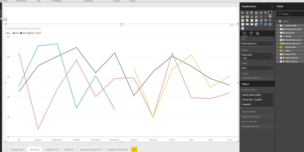
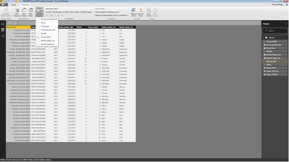
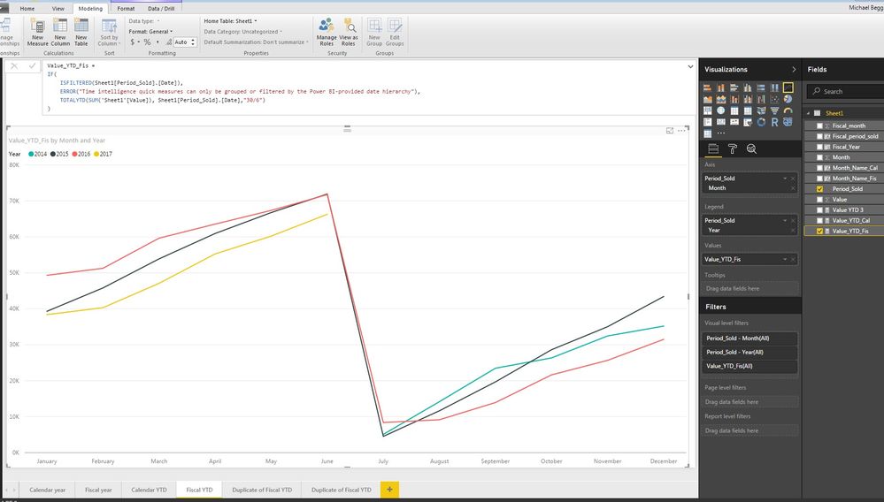
Thank you for the guidance, that is helpful. I can replicate for monthly data, but unfortunately it doesn't solve my YTD problem (yet). I am not sure but I think it is because the YTD calculation requires the Power BI-provided data heirarchy on the horizontal axis rather than another field such as your Month_Name.
I can sort the date field (Period_sold in my photos) by my Fiscal_Month but this doesn't seem to apply to the YTD chart.
See below photos.
- Mark as New
- Bookmark
- Subscribe
- Mute
- Subscribe to RSS Feed
- Permalink
- Report Inappropriate Content
Hi @mbegg,
Could you share a sample pbix file which can reproduce the issue, so that we can further assistant on it? You can upload it to OneDrive or Dropbox and post the link here. Do mask sensitive data before uploading. ![]()
Regards
- Mark as New
- Bookmark
- Subscribe
- Mute
- Subscribe to RSS Feed
- Permalink
- Report Inappropriate Content
- Mark as New
- Bookmark
- Subscribe
- Mute
- Subscribe to RSS Feed
- Permalink
- Report Inappropriate Content
Hi @mbegg,
As @GilbertQ mentioned above, an individual Calendar table is needed in this case. You can use CALENDARAUTO function to create it, and then create a relationship between your fact table and this Date table with the date column.
Date = CALENDARAUTO()
And the formula below is for the new YTD measure using Date[Date] column.
Value_YTD_Fis =
IF(
	ISFILTERED('Date'[Date]),
	ERROR("Time intelligence quick measures can only be grouped or filtered by the Power BI-provided date hierarchy"),
	TOTALYTD(SUM('Sheet1'[Value]), 'Date'[Date],"30/6")
)
Here is the modified pbix file for your reference. ![]()
Regards
- Mark as New
- Bookmark
- Subscribe
- Mute
- Subscribe to RSS Feed
- Permalink
- Report Inappropriate Content
Hi @mbegg
I would suggest creating a YTD measure where you use a Date Table also. This will ensure that you can then get the right values for your measures.
YTD = TOTALYTD(sum('TableName'[ColumnName]),'Date'[Calendar Date],ALL('Date'),"06/30")And here is a blog post around why you need a date table and how to create one.
Helpful resources

Microsoft Fabric Learn Together
Covering the world! 9:00-10:30 AM Sydney, 4:00-5:30 PM CET (Paris/Berlin), 7:00-8:30 PM Mexico City

Power BI Monthly Update - April 2024
Check out the April 2024 Power BI update to learn about new features.

| User | Count |
|---|---|
| 111 | |
| 95 | |
| 80 | |
| 68 | |
| 59 |
| User | Count |
|---|---|
| 150 | |
| 119 | |
| 104 | |
| 87 | |
| 67 |
