- Power BI forums
- Updates
- News & Announcements
- Get Help with Power BI
- Desktop
- Service
- Report Server
- Power Query
- Mobile Apps
- Developer
- DAX Commands and Tips
- Custom Visuals Development Discussion
- Health and Life Sciences
- Power BI Spanish forums
- Translated Spanish Desktop
- Power Platform Integration - Better Together!
- Power Platform Integrations (Read-only)
- Power Platform and Dynamics 365 Integrations (Read-only)
- Training and Consulting
- Instructor Led Training
- Dashboard in a Day for Women, by Women
- Galleries
- Community Connections & How-To Videos
- COVID-19 Data Stories Gallery
- Themes Gallery
- Data Stories Gallery
- R Script Showcase
- Webinars and Video Gallery
- Quick Measures Gallery
- 2021 MSBizAppsSummit Gallery
- 2020 MSBizAppsSummit Gallery
- 2019 MSBizAppsSummit Gallery
- Events
- Ideas
- Custom Visuals Ideas
- Issues
- Issues
- Events
- Upcoming Events
- Community Blog
- Power BI Community Blog
- Custom Visuals Community Blog
- Community Support
- Community Accounts & Registration
- Using the Community
- Community Feedback
Register now to learn Fabric in free live sessions led by the best Microsoft experts. From Apr 16 to May 9, in English and Spanish.
- Power BI forums
- Forums
- Get Help with Power BI
- Desktop
- YOY Line Chart
- Subscribe to RSS Feed
- Mark Topic as New
- Mark Topic as Read
- Float this Topic for Current User
- Bookmark
- Subscribe
- Printer Friendly Page
- Mark as New
- Bookmark
- Subscribe
- Mute
- Subscribe to RSS Feed
- Permalink
- Report Inappropriate Content
YOY Line Chart
Hi,
I have a table similar to below structure, let's call it Raw_Data.
My data has complete booking date values and contains duplicate booking dates.
Now, I want a line chart with MMM-DD as X-axis and Total Revenue as Y-axis.
The chart should contain 2 lines (2018 vs 2017).
It should be filterable by Payment Method, Product and Pax.
I created a calculated table using YoY = CALENDAR (DATE (YEAR (TODAY ()), 1, 1), TODAY ()) and added the calculated columns on the YoY table using below formulas:
Revenue (2018) = CALCULATE (SUM (Raw_Data[Revenue]), FILTER (ALL (Raw_Data), Raw_Data[Booking Date] = 'YoY'[Date]))
Revenue (2017) = CALCULATE (SUM (Raw_Data[REvenue]), FILTER (ALL (Raw_Data), Raw_Data[Booking Date] = DATE (2017, MONTH ('YoY'[Date]), DAY ('YoY'[Date]))))
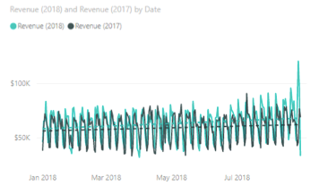
Now I can chart the 2018 vs 2017 (as shown below) using above values but my problem is whenever I add "Payment Method" and "Product" as slicer, it doesn't work.
Need help in making the slicer work or finding a better way to present above data.
- Mark as New
- Bookmark
- Subscribe
- Mute
- Subscribe to RSS Feed
- Permalink
- Report Inappropriate Content
Hi @Anonymous
As tested, You need to add a column called "year"
year = YEAR([booking date])
Then add "year" in the Legend field and set the data format "mm/dd" for "booking date"
Best Regards
Maggie
- Mark as New
- Bookmark
- Subscribe
- Mute
- Subscribe to RSS Feed
- Permalink
- Report Inappropriate Content
Hi @v-juanli-msft,
Thank you for your response.
I followed your instructions but something is different with my Power BI.
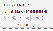
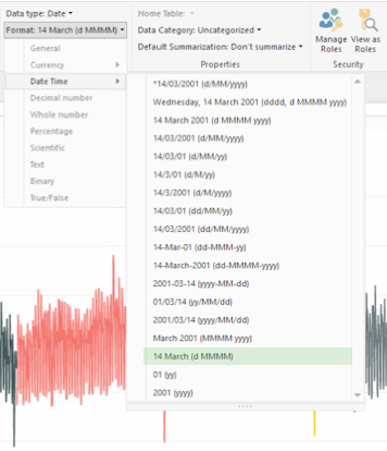
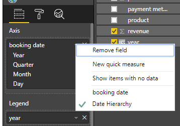
I added the "year" column to the main table then set the BookingDate data format to "d MMMM" since I can't find the format you suggested on the selection as shown below.
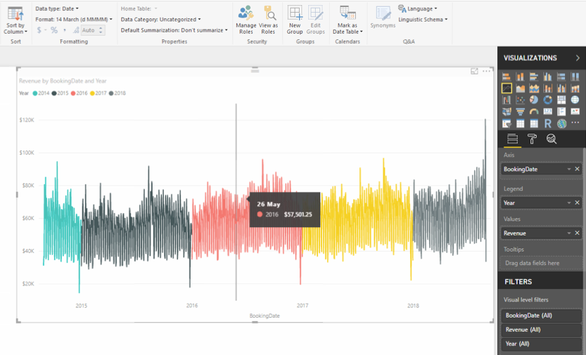
I then add the "BookingDate" as axis and "year" as legend but the axis still shows the complete date even after changing the format as shown below. Also noticed that the BookingDate didn't show the heirarchy under Axis.
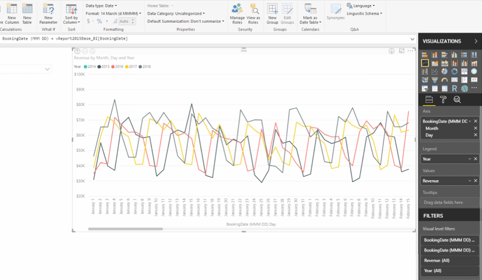
I was able to somewhat achieve the desired chart by creating a new column "BookingDate (MMM DD)" which is just equal to "BookingDate" and is formatted to "d MMMM". Also, it shows heirarchy when added as Axis.
The issue with above chart is that it does not show the entire 1 year data, you need to scroll horizontally to view the other data. I want to show the entire 1 year data same as 2nd image above.
Also, there is no option to add a trendline for each year which is important to me.
Additional Notes:
A date filter will be added so the date range can be shorten.
Using "BookingDate (MMM DD)" as filter is not possible since it still contains years data and shortening the range will remove the years that is not part of the range.
- Mark as New
- Bookmark
- Subscribe
- Mute
- Subscribe to RSS Feed
- Permalink
- Report Inappropriate Content
Hi @Anonymous
I then add the "BookingDate" as axis and "year" as legend but the axis still shows the complete date even after changing the format as shown below. Also noticed that the BookingDate didn't show the heirarchy under Axis.
Click on dwon arrow of the "BookingDate", then you would see two options, "date" and "date hierachy".
As tested, if setting as above, it is not possible to add a trend line.
Best Regards
Maggie
- Mark as New
- Bookmark
- Subscribe
- Mute
- Subscribe to RSS Feed
- Permalink
- Report Inappropriate Content
Hi @v-juanli-msft,
Thank you for the suggestions.
The date heirarchy has been resolved but my main issue right now is the missing trendline option and the horizontal scrollbar.
It looks like the issue was caused by "Categorical" data type on X-axis but currently it does not allow me to change the data type to "Continuous".
The first approach mentioned above which shows 2017 vs 2018 in full view (without a horizontal scroll bar) and has a trendline is the ideal view but what is missing is the filter functionality.
Hopefully someone could provide a better way to show the desired YoY line chart in full view, with trendline and filter functionality.
- Mark as New
- Bookmark
- Subscribe
- Mute
- Subscribe to RSS Feed
- Permalink
- Report Inappropriate Content
Hi @Anonymous
How about copying the [date] column which is added to the axis of chart, then add this copied column in the silcer.
Best Regards
Maggie
- Mark as New
- Bookmark
- Subscribe
- Mute
- Subscribe to RSS Feed
- Permalink
- Report Inappropriate Content
@v-juanli-msft, thanks for the help but find a workaround on this issue and below is the solution that works for me.
Here's the solution that works for me.
Added a New Measure using this formula
Total Revenue = SUM (Raw_Data[Revenue])
Then added another New Measure for sameperiodlast year
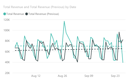
Total Revenue (Previous) = CALCULATE([Total Revenue], SAMEPERIODLASTYEAR('Date'[Date]))Below shows YOY Line Chart with trendline and is filterable by dimensions in the table.
Remaining issue is how can I offset the last year's data so the peaks and lows fall on the same day.
Tried creating a New Column for offset date and use it to calculate last year's revenue but it can't be plotted against 'Date'[Date].
Helpful resources

Microsoft Fabric Learn Together
Covering the world! 9:00-10:30 AM Sydney, 4:00-5:30 PM CET (Paris/Berlin), 7:00-8:30 PM Mexico City

Power BI Monthly Update - April 2024
Check out the April 2024 Power BI update to learn about new features.

| User | Count |
|---|---|
| 107 | |
| 99 | |
| 78 | |
| 64 | |
| 58 |
| User | Count |
|---|---|
| 148 | |
| 111 | |
| 94 | |
| 84 | |
| 67 |

