- Power BI forums
- Updates
- News & Announcements
- Get Help with Power BI
- Desktop
- Service
- Report Server
- Power Query
- Mobile Apps
- Developer
- DAX Commands and Tips
- Custom Visuals Development Discussion
- Health and Life Sciences
- Power BI Spanish forums
- Translated Spanish Desktop
- Power Platform Integration - Better Together!
- Power Platform Integrations (Read-only)
- Power Platform and Dynamics 365 Integrations (Read-only)
- Training and Consulting
- Instructor Led Training
- Dashboard in a Day for Women, by Women
- Galleries
- Community Connections & How-To Videos
- COVID-19 Data Stories Gallery
- Themes Gallery
- Data Stories Gallery
- R Script Showcase
- Webinars and Video Gallery
- Quick Measures Gallery
- 2021 MSBizAppsSummit Gallery
- 2020 MSBizAppsSummit Gallery
- 2019 MSBizAppsSummit Gallery
- Events
- Ideas
- Custom Visuals Ideas
- Issues
- Issues
- Events
- Upcoming Events
- Community Blog
- Power BI Community Blog
- Custom Visuals Community Blog
- Community Support
- Community Accounts & Registration
- Using the Community
- Community Feedback
Register now to learn Fabric in free live sessions led by the best Microsoft experts. From Apr 16 to May 9, in English and Spanish.
- Power BI forums
- Forums
- Get Help with Power BI
- Desktop
- Re: X axis start from different places
- Subscribe to RSS Feed
- Mark Topic as New
- Mark Topic as Read
- Float this Topic for Current User
- Bookmark
- Subscribe
- Printer Friendly Page
- Mark as New
- Bookmark
- Subscribe
- Mute
- Subscribe to RSS Feed
- Permalink
- Report Inappropriate Content
X axis start from different places
Hi all,
I have two questions regarding the below:
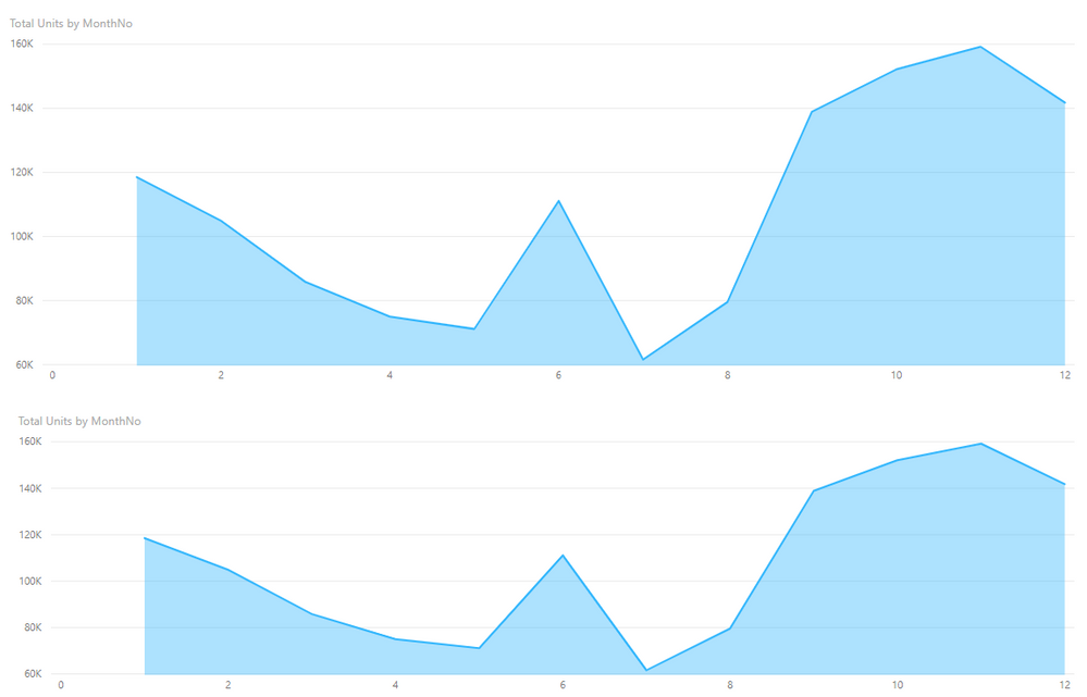
(top graph is Area Chart, bottom graph is Line with stacked column chart)
1. In the lower graph, the line represent an average of the blue category, and sometimes rolls over the data labels.
As this is a stacked column chart, I cannot put the data labels on the outside end (too much to ask from PBI, even when leaving it as the only category with data label...).
Any was around this? Understndably, this is unacceptable to the client.
2. X-axis of both graphs don't start, end or show all hours one above the other.
You can see that the bottom stacked column chart X-axis starts a bit more to the right than the upper grpah, ends a bit more to the left, and the middle hours are not aligned.
This happens despite both graphs being the same exact X position, height, width and X-axis values and settings (Categorical, Minimum category width 35, maximum size 15%).
I tried playing around with minimum category width (don't make any difference, until suddenly at 39 is jumps to scroll size) or inner padding in the lower graph (slightly improves when maxing at 50% but still far from being on same scale).
Font is exactly the same, responsiveness is set to active (tried off, all hell broke lose).
Any suggestions?
thanks in advance!
- Mark as New
- Bookmark
- Subscribe
- Mute
- Subscribe to RSS Feed
- Permalink
- Report Inappropriate Content
Hi @Anonymous ,
1. It seems that you have problems about data label for line and stacked column chart.
I have a little confused about your requirement. What is your desired data lable position? If it is convenient, could you share your expected position?
2. For the problem you mentioned , the X axis start from different places, I'm afraid that may be by design for different visuals.
As we can see, if you create the same visual with same data, there will not have this issue.
Best Regards,
Cherry
If this post helps, then please consider Accept it as the solution to help the other members find it more quickly.
- Mark as New
- Bookmark
- Subscribe
- Mute
- Subscribe to RSS Feed
- Permalink
- Report Inappropriate Content
Hi,
1. It would be nice if I could add a header or short legend only for the line itself, let the users know what they are seeing.
Like a short header "Average" right above the line on the top left.
As it stands- I can only add full legend for all values, or a header for static line.
2. I realize that with the same visual type the axis would be the same, I'm just puzzled as to what's the logic of designing the axis to act differently on different visuals. Never had this problem in Excel, and it makes using two different graphs on same page look ridiculous.
Helpful resources

Microsoft Fabric Learn Together
Covering the world! 9:00-10:30 AM Sydney, 4:00-5:30 PM CET (Paris/Berlin), 7:00-8:30 PM Mexico City

Power BI Monthly Update - April 2024
Check out the April 2024 Power BI update to learn about new features.

| User | Count |
|---|---|
| 118 | |
| 107 | |
| 70 | |
| 70 | |
| 43 |
| User | Count |
|---|---|
| 148 | |
| 104 | |
| 104 | |
| 89 | |
| 66 |


