- Power BI forums
- Updates
- News & Announcements
- Get Help with Power BI
- Desktop
- Service
- Report Server
- Power Query
- Mobile Apps
- Developer
- DAX Commands and Tips
- Custom Visuals Development Discussion
- Health and Life Sciences
- Power BI Spanish forums
- Translated Spanish Desktop
- Power Platform Integration - Better Together!
- Power Platform Integrations (Read-only)
- Power Platform and Dynamics 365 Integrations (Read-only)
- Training and Consulting
- Instructor Led Training
- Dashboard in a Day for Women, by Women
- Galleries
- Community Connections & How-To Videos
- COVID-19 Data Stories Gallery
- Themes Gallery
- Data Stories Gallery
- R Script Showcase
- Webinars and Video Gallery
- Quick Measures Gallery
- 2021 MSBizAppsSummit Gallery
- 2020 MSBizAppsSummit Gallery
- 2019 MSBizAppsSummit Gallery
- Events
- Ideas
- Custom Visuals Ideas
- Issues
- Issues
- Events
- Upcoming Events
- Community Blog
- Power BI Community Blog
- Custom Visuals Community Blog
- Community Support
- Community Accounts & Registration
- Using the Community
- Community Feedback
Register now to learn Fabric in free live sessions led by the best Microsoft experts. From Apr 16 to May 9, in English and Spanish.
- Power BI forums
- Forums
- Get Help with Power BI
- Desktop
- Why would a KPI show a different result from the m...
- Subscribe to RSS Feed
- Mark Topic as New
- Mark Topic as Read
- Float this Topic for Current User
- Bookmark
- Subscribe
- Printer Friendly Page
- Mark as New
- Bookmark
- Subscribe
- Mute
- Subscribe to RSS Feed
- Permalink
- Report Inappropriate Content
Why would a KPI show a different result from the measure used as the Indicator?
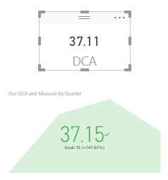
I am trying to create a KPI to show whether or not a value is above the stated goal. However, the value displayed by the KPI (37.15) is different from the value displayed when I drag the same measure onto the page and make it a card (37.11).

What could account for this? I also noticed that the value changes depending on what I set as the Trend Axis, so I'm not sure what I need to do to correct this.
Solved! Go to Solution.
- Mark as New
- Bookmark
- Subscribe
- Mute
- Subscribe to RSS Feed
- Permalink
- Report Inappropriate Content
Hi @Anonymous
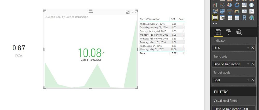
See attached image.
The reason you see a difference is that the KPI visual is a trend KPI and shows the latest value of the date item you place in the 'Trend Axis'. The 0.87 is an overall value of your data.
Hope that helps.
Thanks
shebr
- Mark as New
- Bookmark
- Subscribe
- Mute
- Subscribe to RSS Feed
- Permalink
- Report Inappropriate Content
Hi @Anonymous,
With current information, it is hard to say where the issue is.
Could you please share us your pbix file with One Drive or Google Drive if possible? So that we can dig deeper and make some tests.
Thanks,
Xi Jin.
- Mark as New
- Bookmark
- Subscribe
- Mute
- Subscribe to RSS Feed
- Permalink
- Report Inappropriate Content
- Mark as New
- Bookmark
- Subscribe
- Mute
- Subscribe to RSS Feed
- Permalink
- Report Inappropriate Content
Hi @Anonymous
See attached image.
The reason you see a difference is that the KPI visual is a trend KPI and shows the latest value of the date item you place in the 'Trend Axis'. The 0.87 is an overall value of your data.
Hope that helps.
Thanks
shebr
- Mark as New
- Bookmark
- Subscribe
- Mute
- Subscribe to RSS Feed
- Permalink
- Report Inappropriate Content
Hi, I am still quite unable to understand this. A person in my community has suggested using the max of goals for each cell value to negate the KPI visual to take the current value of the latest month. But I don't understand this intricacy. Would appreciate your help with this. Thanks.
- Mark as New
- Bookmark
- Subscribe
- Mute
- Subscribe to RSS Feed
- Permalink
- Report Inappropriate Content
That makes total sense! I knew it had to be something simple. Is it possible to get the overall value displayed instead?
- Mark as New
- Bookmark
- Subscribe
- Mute
- Subscribe to RSS Feed
- Permalink
- Report Inappropriate Content
Remove the date value? ![]()
No, unfortunately this particular visual uses the trend axis, if you were to have a slicer or filter on the page that would use that and default to that particular date, but without any other selection it would use the data set available for the Trend Axis.
Perhaps check the custom visuals for alternative KPI visuals, or what you could do is put the KPI in the table and use conditional formatting to show the trend status?
Let me know how you get on.
Thanks
shebr
Helpful resources

Microsoft Fabric Learn Together
Covering the world! 9:00-10:30 AM Sydney, 4:00-5:30 PM CET (Paris/Berlin), 7:00-8:30 PM Mexico City

Power BI Monthly Update - April 2024
Check out the April 2024 Power BI update to learn about new features.

| User | Count |
|---|---|
| 107 | |
| 93 | |
| 77 | |
| 65 | |
| 53 |
| User | Count |
|---|---|
| 147 | |
| 106 | |
| 104 | |
| 87 | |
| 61 |


