- Power BI forums
- Updates
- News & Announcements
- Get Help with Power BI
- Desktop
- Service
- Report Server
- Power Query
- Mobile Apps
- Developer
- DAX Commands and Tips
- Custom Visuals Development Discussion
- Health and Life Sciences
- Power BI Spanish forums
- Translated Spanish Desktop
- Power Platform Integration - Better Together!
- Power Platform Integrations (Read-only)
- Power Platform and Dynamics 365 Integrations (Read-only)
- Training and Consulting
- Instructor Led Training
- Dashboard in a Day for Women, by Women
- Galleries
- Community Connections & How-To Videos
- COVID-19 Data Stories Gallery
- Themes Gallery
- Data Stories Gallery
- R Script Showcase
- Webinars and Video Gallery
- Quick Measures Gallery
- 2021 MSBizAppsSummit Gallery
- 2020 MSBizAppsSummit Gallery
- 2019 MSBizAppsSummit Gallery
- Events
- Ideas
- Custom Visuals Ideas
- Issues
- Issues
- Events
- Upcoming Events
- Community Blog
- Power BI Community Blog
- Custom Visuals Community Blog
- Community Support
- Community Accounts & Registration
- Using the Community
- Community Feedback
Register now to learn Fabric in free live sessions led by the best Microsoft experts. From Apr 16 to May 9, in English and Spanish.
- Power BI forums
- Forums
- Get Help with Power BI
- Desktop
- Why does each series in my clustered bar chart get...
- Subscribe to RSS Feed
- Mark Topic as New
- Mark Topic as Read
- Float this Topic for Current User
- Bookmark
- Subscribe
- Printer Friendly Page
- Mark as New
- Bookmark
- Subscribe
- Mute
- Subscribe to RSS Feed
- Permalink
- Report Inappropriate Content
Why does each series in my clustered bar chart get the same values?
Hi,
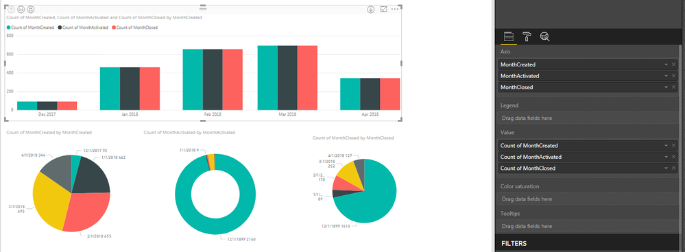
I'm trying to create a clustered bar chart where each cluster corresponds to a month, and then each bar in the cluster shows the value of a different field for that month. But I've ended up with all the bars in each cluster getting the value of the first bar:
The pie charts underneath show the values that should be coming through, so the bar chart should show, for january, Created - 462, Activated - 9, Closed - 89.
The three fields I'm using each take a date and convert it into the 1st of that month, eg:
MonthCreated = DATE(YEAR('Work Items - Today'[Created Date]), MONTH('Work Items - Today'[Created Date]),1)Any advice please on how I can get one bar chart to effectively show the data from the 3 pies?
Thanks,
Sarah
- Mark as New
- Bookmark
- Subscribe
- Mute
- Subscribe to RSS Feed
- Permalink
- Report Inappropriate Content
Hi @srhsloan
There are a couple of things that need to be done here I think.
First of all, do you have a date table? If not, see this video to create one in seconds! https://youtu.be/vJ7xNUK8sQE
Secondly, you need to create measures for your counts, and incorporate the USERRELATIONSHIP() function. This video shows how to do that. https://youtu.be/-d_v3B8gmvI
At the moment you're only using one date value in the chart and thats showing the same count for all of your counts as its from the same dataset i assume. Watch the videos above and let me know if you're getting anywhere.
If you can send a snap of your data set that may be useful also.
Thanks
shebr
- Mark as New
- Bookmark
- Subscribe
- Mute
- Subscribe to RSS Feed
- Permalink
- Report Inappropriate Content
@shebr thanks! I'll watch that video and get back to you next week if I have any more issues.
- Mark as New
- Bookmark
- Subscribe
- Mute
- Subscribe to RSS Feed
- Permalink
- Report Inappropriate Content
So I appear to have fixed it, but I still don't understand why I had the problem in the first place.. After making my original post I went back to the column definitions for the 3 columns I was using, to make the closed date of items that have not yet been closed blank instead of 1/1/1899. I did this for activated too and now my graph shows what I was expecting. Pleased but confused...
New column definition:
MonthActivated = IF('Work Items - Today'[Activated Date] = BLANK(),
BLANK(),
DATE(YEAR('Work Items - Today'[Activated Date]), MONTH('Work Items - Today'[Activated Date]),1))
New graphs:
Helpful resources

Microsoft Fabric Learn Together
Covering the world! 9:00-10:30 AM Sydney, 4:00-5:30 PM CET (Paris/Berlin), 7:00-8:30 PM Mexico City

Power BI Monthly Update - April 2024
Check out the April 2024 Power BI update to learn about new features.

| User | Count |
|---|---|
| 114 | |
| 97 | |
| 86 | |
| 70 | |
| 62 |
| User | Count |
|---|---|
| 151 | |
| 120 | |
| 103 | |
| 87 | |
| 68 |


