- Power BI forums
- Updates
- News & Announcements
- Get Help with Power BI
- Desktop
- Service
- Report Server
- Power Query
- Mobile Apps
- Developer
- DAX Commands and Tips
- Custom Visuals Development Discussion
- Health and Life Sciences
- Power BI Spanish forums
- Translated Spanish Desktop
- Power Platform Integration - Better Together!
- Power Platform Integrations (Read-only)
- Power Platform and Dynamics 365 Integrations (Read-only)
- Training and Consulting
- Instructor Led Training
- Dashboard in a Day for Women, by Women
- Galleries
- Community Connections & How-To Videos
- COVID-19 Data Stories Gallery
- Themes Gallery
- Data Stories Gallery
- R Script Showcase
- Webinars and Video Gallery
- Quick Measures Gallery
- 2021 MSBizAppsSummit Gallery
- 2020 MSBizAppsSummit Gallery
- 2019 MSBizAppsSummit Gallery
- Events
- Ideas
- Custom Visuals Ideas
- Issues
- Issues
- Events
- Upcoming Events
- Community Blog
- Power BI Community Blog
- Custom Visuals Community Blog
- Community Support
- Community Accounts & Registration
- Using the Community
- Community Feedback
Register now to learn Fabric in free live sessions led by the best Microsoft experts. From Apr 16 to May 9, in English and Spanish.
- Power BI forums
- Forums
- Get Help with Power BI
- Desktop
- Why can't I produce my visualizations the same way...
- Subscribe to RSS Feed
- Mark Topic as New
- Mark Topic as Read
- Float this Topic for Current User
- Bookmark
- Subscribe
- Printer Friendly Page
- Mark as New
- Bookmark
- Subscribe
- Mute
- Subscribe to RSS Feed
- Permalink
- Report Inappropriate Content
Why can't I produce my visualizations the same way as in another Power's file?
Hi there
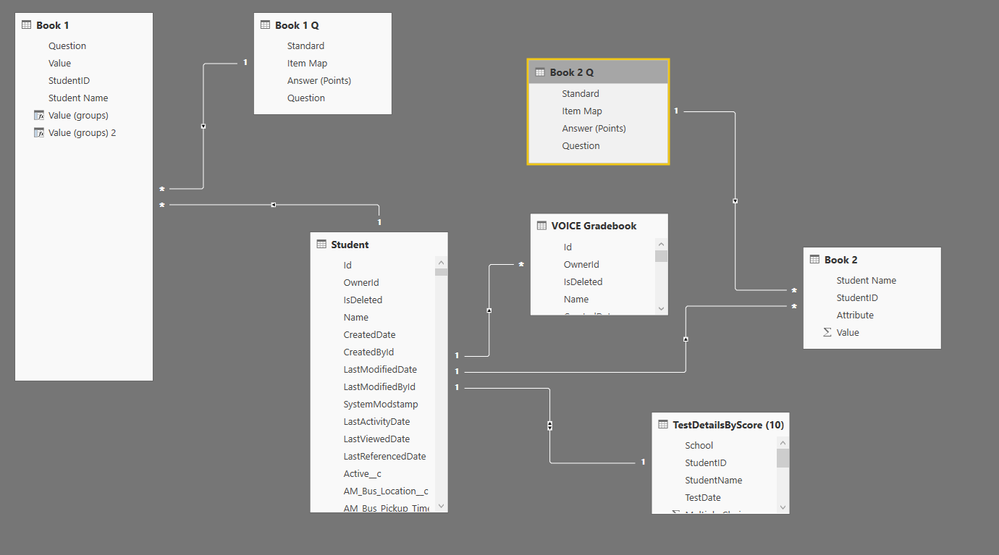
OK hopefully this is not super tricky to explain. I created a relationship between two datasets in powerbi (used salesforce objects) The data came out great! I wanted to add the same visualizations to another powerbi file so imported the missing dataset as I normally do, linked them exactly the same way. I went to produce the visualization and its just not working, whatever I try.
This is an image of the visualization that I want to achieve
Heres its relationship
Now heres the bad graph made the same way
Heres the relationship. tehres others here but the link is exactly the same
if anyone can help I'd really appreciate it I' just can't work it out.
Solved! Go to Solution.
- Mark as New
- Bookmark
- Subscribe
- Mute
- Subscribe to RSS Feed
- Permalink
- Report Inappropriate Content
OK so after a while I worked out the issue. Thanks for everyones tips but the issue was in thre relationship pane I had to double click the connection line and change the relationship direction to both, that fixed it! Not sure how I worked that out but glad I did.
- Mark as New
- Bookmark
- Subscribe
- Mute
- Subscribe to RSS Feed
- Permalink
- Report Inappropriate Content
your bad visual has the vertical Y axis is in % and therefore max is 100; while in your original it is an absolute value up to 250.
- Mark as New
- Bookmark
- Subscribe
- Mute
- Subscribe to RSS Feed
- Permalink
- Report Inappropriate Content
OK so after a while I worked out the issue. Thanks for everyones tips but the issue was in thre relationship pane I had to double click the connection line and change the relationship direction to both, that fixed it! Not sure how I worked that out but glad I did.
- Mark as New
- Bookmark
- Subscribe
- Mute
- Subscribe to RSS Feed
- Permalink
- Report Inappropriate Content
Hi @Ayupchap
The field you drag to the Axis needs to have a relationship (or be in the same table) to the fields you drag to the axis.
Can you please let us know the TableName.Field for what you have used in your bad graph. We can then suggest maybe a better alternative,
Helpful resources

Microsoft Fabric Learn Together
Covering the world! 9:00-10:30 AM Sydney, 4:00-5:30 PM CET (Paris/Berlin), 7:00-8:30 PM Mexico City

Power BI Monthly Update - April 2024
Check out the April 2024 Power BI update to learn about new features.

| User | Count |
|---|---|
| 106 | |
| 94 | |
| 77 | |
| 65 | |
| 53 |
| User | Count |
|---|---|
| 145 | |
| 105 | |
| 104 | |
| 90 | |
| 63 |


