- Power BI forums
- Updates
- News & Announcements
- Get Help with Power BI
- Desktop
- Service
- Report Server
- Power Query
- Mobile Apps
- Developer
- DAX Commands and Tips
- Custom Visuals Development Discussion
- Health and Life Sciences
- Power BI Spanish forums
- Translated Spanish Desktop
- Power Platform Integration - Better Together!
- Power Platform Integrations (Read-only)
- Power Platform and Dynamics 365 Integrations (Read-only)
- Training and Consulting
- Instructor Led Training
- Dashboard in a Day for Women, by Women
- Galleries
- Community Connections & How-To Videos
- COVID-19 Data Stories Gallery
- Themes Gallery
- Data Stories Gallery
- R Script Showcase
- Webinars and Video Gallery
- Quick Measures Gallery
- 2021 MSBizAppsSummit Gallery
- 2020 MSBizAppsSummit Gallery
- 2019 MSBizAppsSummit Gallery
- Events
- Ideas
- Custom Visuals Ideas
- Issues
- Issues
- Events
- Upcoming Events
- Community Blog
- Power BI Community Blog
- Custom Visuals Community Blog
- Community Support
- Community Accounts & Registration
- Using the Community
- Community Feedback
Register now to learn Fabric in free live sessions led by the best Microsoft experts. From Apr 16 to May 9, in English and Spanish.
- Power BI forums
- Forums
- Get Help with Power BI
- Desktop
- Re: Why Power BI visualization shows constant line...
- Subscribe to RSS Feed
- Mark Topic as New
- Mark Topic as Read
- Float this Topic for Current User
- Bookmark
- Subscribe
- Printer Friendly Page
- Mark as New
- Bookmark
- Subscribe
- Mute
- Subscribe to RSS Feed
- Permalink
- Report Inappropriate Content
Why Power BI visualization shows constant line graph of sum when table values are different
I can't seem to figure out why my Power BI visualization for 3 tables, has two of the tables showing as constant lines, when the values in those tables are different and not constant values.
I thought Power BI was doing some type of conversion or formatting but it seems not to be the case. The other 2 tables that I have are done in the same way as the first table. It seems that this constant value is the sum of all the values in my table. I've noticed that for my column, the property shows as a sum, but for the first table, it also shows as a sum but does not sum the values in that table.
Any ideas why?
Thanks.
Solved! Go to Solution.
- Mark as New
- Bookmark
- Subscribe
- Mute
- Subscribe to RSS Feed
- Permalink
- Report Inappropriate Content
Hi @gadgetman4u,
In your scenario, I would suggest you to merge the 3 tables into a single table with the Merge Queries option in Query Editor first, then it should work as expected. For more details about how to use Merge Queries option in Power BI Desktop, you can refer to this article.
In addition, understanding relationships and filter propagation is important to build reports with Power BI Desktop as Matt mentioned above. The following article is for your reference![]()
Create and manage relationships in Power BI Desktop
Regards
- Mark as New
- Bookmark
- Subscribe
- Mute
- Subscribe to RSS Feed
- Permalink
- Report Inappropriate Content
have you joined the tables? Do you have a lookup table and data tables? you need to understand relationships and filter propagation before you can understand how it works. here is some reading for you.
http://exceleratorbi.com.au/the-optimal-shape-for-power-pivot-data/
- Mark as New
- Bookmark
- Subscribe
- Mute
- Subscribe to RSS Feed
- Permalink
- Report Inappropriate Content
I just have a regular table where my SQL script writes to this table. I don't have any lookup tables or any other tables. It looks like it is taking the sum of all the values in the column of the table, but I can't see in the Power BI Desktop query properties where I have that selected.
I even tried to create another Power BI Desktop file and read this table, and it also is showing the sum of all the values in the column of the table.
Any ideas on how to solve?
Thanks.
- Mark as New
- Bookmark
- Subscribe
- Mute
- Subscribe to RSS Feed
- Permalink
- Report Inappropriate Content
What column are you dragging to the axis?
- Mark as New
- Bookmark
- Subscribe
- Mute
- Subscribe to RSS Feed
- Permalink
- Report Inappropriate Content
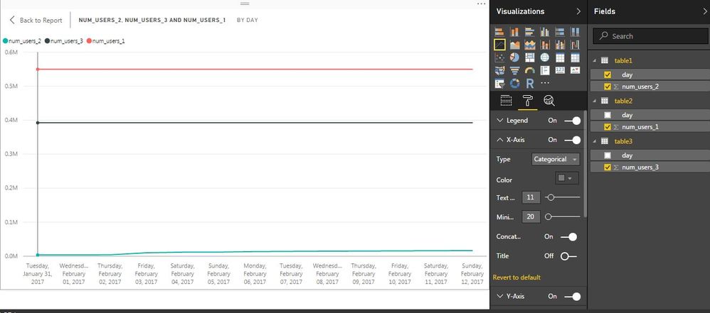
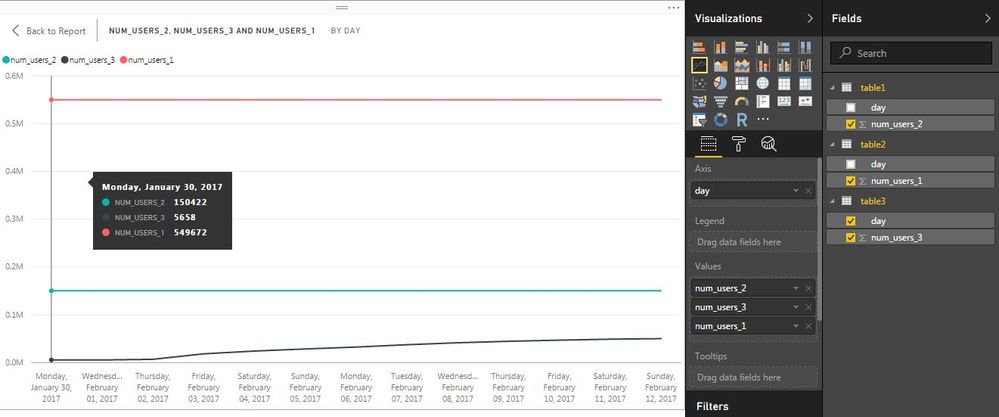
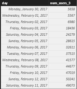
I have 3 tables, table1, table2, and table3. I want to visualize the num_users for each table together on a line graph. The first screenshot shows what happens when I visualize the data. You can see that num_users_1 from table2 is correct, but num_users_3 and num_users_2 from table3 and table1 respectively, are constant values. From the second screenshot, if I select the day and the num_users for the visualization to be another table, then that table will show properly, but adding the other tables will also be constant values. In fact, these constant values are exactly the sum of the values in that column.
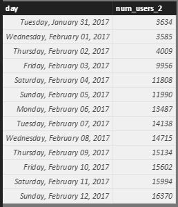
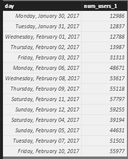
I have also attached screenshots showing the data in the 3 tables.
What is happening that causes this visualization to behave in this manner?
Thanks.
- Mark as New
- Bookmark
- Subscribe
- Mute
- Subscribe to RSS Feed
- Permalink
- Report Inappropriate Content
Hi @gadgetman4u,
In your scenario, I would suggest you to merge the 3 tables into a single table with the Merge Queries option in Query Editor first, then it should work as expected. For more details about how to use Merge Queries option in Power BI Desktop, you can refer to this article.
In addition, understanding relationships and filter propagation is important to build reports with Power BI Desktop as Matt mentioned above. The following article is for your reference![]()
Create and manage relationships in Power BI Desktop
Regards
- Mark as New
- Bookmark
- Subscribe
- Mute
- Subscribe to RSS Feed
- Permalink
- Report Inappropriate Content
Thanks. This worked.
- Mark as New
- Bookmark
- Subscribe
- Mute
- Subscribe to RSS Feed
- Permalink
- Report Inappropriate Content
Gadgetman4u, hoy do you fix that issue? I have the same problem, I join two tables, but when try to display in the same chart, one of them it shows like constant line.
Helpful resources

Microsoft Fabric Learn Together
Covering the world! 9:00-10:30 AM Sydney, 4:00-5:30 PM CET (Paris/Berlin), 7:00-8:30 PM Mexico City

Power BI Monthly Update - April 2024
Check out the April 2024 Power BI update to learn about new features.

| User | Count |
|---|---|
| 117 | |
| 104 | |
| 77 | |
| 73 | |
| 50 |
| User | Count |
|---|---|
| 145 | |
| 109 | |
| 108 | |
| 90 | |
| 64 |
