- Power BI forums
- Updates
- News & Announcements
- Get Help with Power BI
- Desktop
- Service
- Report Server
- Power Query
- Mobile Apps
- Developer
- DAX Commands and Tips
- Custom Visuals Development Discussion
- Health and Life Sciences
- Power BI Spanish forums
- Translated Spanish Desktop
- Power Platform Integration - Better Together!
- Power Platform Integrations (Read-only)
- Power Platform and Dynamics 365 Integrations (Read-only)
- Training and Consulting
- Instructor Led Training
- Dashboard in a Day for Women, by Women
- Galleries
- Community Connections & How-To Videos
- COVID-19 Data Stories Gallery
- Themes Gallery
- Data Stories Gallery
- R Script Showcase
- Webinars and Video Gallery
- Quick Measures Gallery
- 2021 MSBizAppsSummit Gallery
- 2020 MSBizAppsSummit Gallery
- 2019 MSBizAppsSummit Gallery
- Events
- Ideas
- Custom Visuals Ideas
- Issues
- Issues
- Events
- Upcoming Events
- Community Blog
- Power BI Community Blog
- Custom Visuals Community Blog
- Community Support
- Community Accounts & Registration
- Using the Community
- Community Feedback
Register now to learn Fabric in free live sessions led by the best Microsoft experts. From Apr 16 to May 9, in English and Spanish.
- Power BI forums
- Forums
- Get Help with Power BI
- Desktop
- Re: What is the better way to visualize running to...
- Subscribe to RSS Feed
- Mark Topic as New
- Mark Topic as Read
- Float this Topic for Current User
- Bookmark
- Subscribe
- Printer Friendly Page
- Mark as New
- Bookmark
- Subscribe
- Mute
- Subscribe to RSS Feed
- Permalink
- Report Inappropriate Content
What is the better way to visualize running total?
Hello Guys,
Hope you all are doing well. I am trying to get an idea from you all.
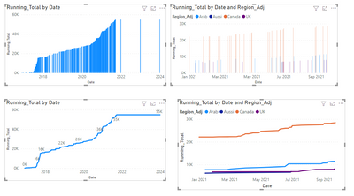
I have a chart with the running total by region. I am trying to show it better? I mean currently, it is pretty hard to read. Is there any better way to visualize it? Any idea will really appreciate it? I tried line chart and ribbon chart and no luck. I just need some fresh ideas.
You can see below, it is not very clear and can't read well. Any idea to improve this will be really appreciated.
Sample file - https://drive.google.com/file/d/1O3qOBKSblMHwOo7XfvS0lR0DlDSQS4Ai/view?usp=sharing
Thank you so much
Solved! Go to Solution.
- Mark as New
- Bookmark
- Subscribe
- Mute
- Subscribe to RSS Feed
- Permalink
- Report Inappropriate Content
Hi @bikelley ,
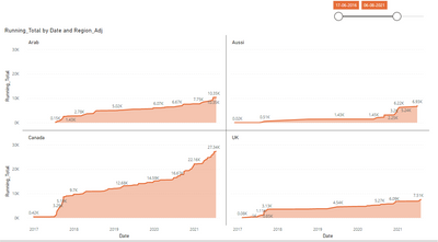
Believe that the best option is the line chart:
You can also add the labels has I put it on the first chart or make some measure to pick up the highest and lowest value.
Also on the second chart instead of having the legend you can turn on series label.
PBIX attach.
Regards
Miguel Félix
Did I answer your question? Mark my post as a solution!
Proud to be a Super User!
Check out my blog: Power BI em Português- Mark as New
- Bookmark
- Subscribe
- Mute
- Subscribe to RSS Feed
- Permalink
- Report Inappropriate Content
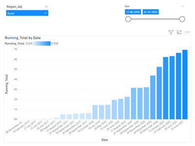
If you really want to show the data in bar mode than you can go to x axis and change type to categorical which will give you streamlined data with no gaps.
Other way would be to use a continuous line chart and use region in small multiple field (use lastest power bi desktop version). Since many users have'nt used it so it would be refreshing.
If this post helps, please consider accepting it as the solution to help the other members find it more quickly.
Appreciate your Kudos!!
- Mark as New
- Bookmark
- Subscribe
- Mute
- Subscribe to RSS Feed
- Permalink
- Report Inappropriate Content
@Anonymous & @MFelix Thank you so much for the ideas. I really appreciate your help and time.
- Mark as New
- Bookmark
- Subscribe
- Mute
- Subscribe to RSS Feed
- Permalink
- Report Inappropriate Content
If you really want to show the data in bar mode than you can go to x axis and change type to categorical which will give you streamlined data with no gaps.
Other way would be to use a continuous line chart and use region in small multiple field (use lastest power bi desktop version). Since many users have'nt used it so it would be refreshing.
If this post helps, please consider accepting it as the solution to help the other members find it more quickly.
Appreciate your Kudos!!
- Mark as New
- Bookmark
- Subscribe
- Mute
- Subscribe to RSS Feed
- Permalink
- Report Inappropriate Content
Hi @bikelley ,
Believe that the best option is the line chart:
You can also add the labels has I put it on the first chart or make some measure to pick up the highest and lowest value.
Also on the second chart instead of having the legend you can turn on series label.
PBIX attach.
Regards
Miguel Félix
Did I answer your question? Mark my post as a solution!
Proud to be a Super User!
Check out my blog: Power BI em PortuguêsHelpful resources

Microsoft Fabric Learn Together
Covering the world! 9:00-10:30 AM Sydney, 4:00-5:30 PM CET (Paris/Berlin), 7:00-8:30 PM Mexico City

Power BI Monthly Update - April 2024
Check out the April 2024 Power BI update to learn about new features.

| User | Count |
|---|---|
| 111 | |
| 95 | |
| 80 | |
| 68 | |
| 59 |
| User | Count |
|---|---|
| 150 | |
| 119 | |
| 104 | |
| 87 | |
| 67 |


