- Power BI forums
- Updates
- News & Announcements
- Get Help with Power BI
- Desktop
- Service
- Report Server
- Power Query
- Mobile Apps
- Developer
- DAX Commands and Tips
- Custom Visuals Development Discussion
- Health and Life Sciences
- Power BI Spanish forums
- Translated Spanish Desktop
- Power Platform Integration - Better Together!
- Power Platform Integrations (Read-only)
- Power Platform and Dynamics 365 Integrations (Read-only)
- Training and Consulting
- Instructor Led Training
- Dashboard in a Day for Women, by Women
- Galleries
- Community Connections & How-To Videos
- COVID-19 Data Stories Gallery
- Themes Gallery
- Data Stories Gallery
- R Script Showcase
- Webinars and Video Gallery
- Quick Measures Gallery
- 2021 MSBizAppsSummit Gallery
- 2020 MSBizAppsSummit Gallery
- 2019 MSBizAppsSummit Gallery
- Events
- Ideas
- Custom Visuals Ideas
- Issues
- Issues
- Events
- Upcoming Events
- Community Blog
- Power BI Community Blog
- Custom Visuals Community Blog
- Community Support
- Community Accounts & Registration
- Using the Community
- Community Feedback
Register now to learn Fabric in free live sessions led by the best Microsoft experts. From Apr 16 to May 9, in English and Spanish.
- Power BI forums
- Forums
- Get Help with Power BI
- Desktop
- Re: Weighted Average Rate of Percentage as a strai...
- Subscribe to RSS Feed
- Mark Topic as New
- Mark Topic as Read
- Float this Topic for Current User
- Bookmark
- Subscribe
- Printer Friendly Page
- Mark as New
- Bookmark
- Subscribe
- Mute
- Subscribe to RSS Feed
- Permalink
- Report Inappropriate Content
Weighted Average Rate of Percentage as a straight line in graph
Hi,
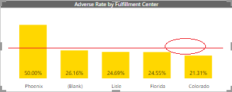
I am trying to calculate Weighted avergae of Adverse Rate which should appear as straight line. In the cluster chart, we can find Analytics Pane where We get average line but that’s giving Regular average. We need weighted average and that too in the form of straight line of Adverse Rate.
Solved! Go to Solution.
- Mark as New
- Bookmark
- Subscribe
- Mute
- Subscribe to RSS Feed
- Permalink
- Report Inappropriate Content
Hey,
I think you have to change the DAX of your Weighted Average to this:
Weighted Avg =
--VAR __CATEGORY_VALUES = VALUES('Sheet1'[Fulfillment Center])
VAR __CATEGORY_VALUES = ALLSELECTED('Sheet1'[Fulfillment Center])
RETURN
	DIVIDE(
		SUMX(
			--KEEPFILTERS(__CATEGORY_VALUES),
            __CATEGORY_VALUES,
			CALCULATE([Adverse Rate] * SUM('Sheet1'[Adverse]))
		),
		SUMX(
			--KEEPFILTERS(__CATEGORY_VALUES),
            __CATEGORY_VALUES,
			CALCULATE(SUM('Sheet1'[Adverse]))
		)
	)
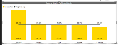
Then your chart looks like this:
Hopefully, this is what you are looking for.
Regards,
Tom
Did I answer your question? Mark my post as a solution, this will help others!
Proud to be a Super User!
I accept Kudos 😉
Hamburg, Germany
- Mark as New
- Bookmark
- Subscribe
- Mute
- Subscribe to RSS Feed
- Permalink
- Report Inappropriate Content
Hey,
you have to create a measure that reflects the weighted average, then you can use the "Line and stacked column chart" or the "Line and clustered column chart" and use the measure for the Line value well
If you need help to create a measure, please consider to create a pbix or xlsx file that contains sample data and reflects your data model, upload the file to onedrive or Dropbox, and share the link.
Hopefully, this is what you are looking for.
Regards,
Tom
Did I answer your question? Mark my post as a solution, this will help others!
Proud to be a Super User!
I accept Kudos 😉
Hamburg, Germany
- Mark as New
- Bookmark
- Subscribe
- Mute
- Subscribe to RSS Feed
- Permalink
- Report Inappropriate Content
I already tried to pull the avg measure in Line Values however this is not constant line. It's dynamic. If you see in the pic below.
My problem is:
1. It should consider weighted avg not regular average.
2. The Weighted Avg line should be constant.
Link of PBIX file and source file are as follows:
https://1drv.ms/f/s!Ao3I1Gsi9dPuiFYx1XozRsY_HGSg
- Mark as New
- Bookmark
- Subscribe
- Mute
- Subscribe to RSS Feed
- Permalink
- Report Inappropriate Content
Hey,
I think you have to change the DAX of your Weighted Average to this:
Weighted Avg =
--VAR __CATEGORY_VALUES = VALUES('Sheet1'[Fulfillment Center])
VAR __CATEGORY_VALUES = ALLSELECTED('Sheet1'[Fulfillment Center])
RETURN
	DIVIDE(
		SUMX(
			--KEEPFILTERS(__CATEGORY_VALUES),
            __CATEGORY_VALUES,
			CALCULATE([Adverse Rate] * SUM('Sheet1'[Adverse]))
		),
		SUMX(
			--KEEPFILTERS(__CATEGORY_VALUES),
            __CATEGORY_VALUES,
			CALCULATE(SUM('Sheet1'[Adverse]))
		)
	)
Then your chart looks like this:
Hopefully, this is what you are looking for.
Regards,
Tom
Did I answer your question? Mark my post as a solution, this will help others!
Proud to be a Super User!
I accept Kudos 😉
Hamburg, Germany
- Mark as New
- Bookmark
- Subscribe
- Mute
- Subscribe to RSS Feed
- Permalink
- Report Inappropriate Content
Yes. This was exactly what I was looking for,
Thanks a lor for quick resolution.
-Ashish
Helpful resources

Microsoft Fabric Learn Together
Covering the world! 9:00-10:30 AM Sydney, 4:00-5:30 PM CET (Paris/Berlin), 7:00-8:30 PM Mexico City

Power BI Monthly Update - April 2024
Check out the April 2024 Power BI update to learn about new features.

| User | Count |
|---|---|
| 117 | |
| 107 | |
| 70 | |
| 70 | |
| 43 |
| User | Count |
|---|---|
| 148 | |
| 106 | |
| 104 | |
| 89 | |
| 65 |


