- Power BI forums
- Updates
- News & Announcements
- Get Help with Power BI
- Desktop
- Service
- Report Server
- Power Query
- Mobile Apps
- Developer
- DAX Commands and Tips
- Custom Visuals Development Discussion
- Health and Life Sciences
- Power BI Spanish forums
- Translated Spanish Desktop
- Power Platform Integration - Better Together!
- Power Platform Integrations (Read-only)
- Power Platform and Dynamics 365 Integrations (Read-only)
- Training and Consulting
- Instructor Led Training
- Dashboard in a Day for Women, by Women
- Galleries
- Community Connections & How-To Videos
- COVID-19 Data Stories Gallery
- Themes Gallery
- Data Stories Gallery
- R Script Showcase
- Webinars and Video Gallery
- Quick Measures Gallery
- 2021 MSBizAppsSummit Gallery
- 2020 MSBizAppsSummit Gallery
- 2019 MSBizAppsSummit Gallery
- Events
- Ideas
- Custom Visuals Ideas
- Issues
- Issues
- Events
- Upcoming Events
- Community Blog
- Power BI Community Blog
- Custom Visuals Community Blog
- Community Support
- Community Accounts & Registration
- Using the Community
- Community Feedback
Register now to learn Fabric in free live sessions led by the best Microsoft experts. From Apr 16 to May 9, in English and Spanish.
- Power BI forums
- Forums
- Get Help with Power BI
- Desktop
- Weekly graph data and YTD data in one chart
- Subscribe to RSS Feed
- Mark Topic as New
- Mark Topic as Read
- Float this Topic for Current User
- Bookmark
- Subscribe
- Printer Friendly Page
- Mark as New
- Bookmark
- Subscribe
- Mute
- Subscribe to RSS Feed
- Permalink
- Report Inappropriate Content
Weekly graph data and YTD data in one chart
Hello,
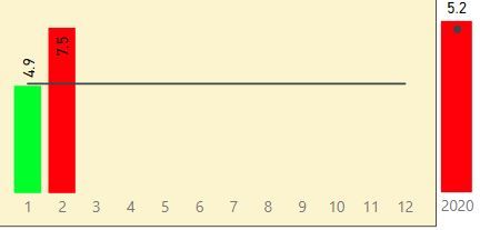
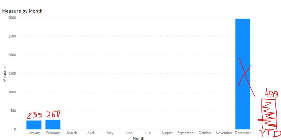
I am having one monthly measure refelected in bar chart and target shown as line. That measure1 is calculated based on data in table1.
at the end of the same graph I would like to have YearToDate data. As I do not know how to do that currently I am using second graph that is showing the data on a yearly basis.Unfortunately it does not look nice. Could you please advice me how to incorporate both bars in one graph?
Thanks
Solved! Go to Solution.
- Mark as New
- Bookmark
- Subscribe
- Mute
- Subscribe to RSS Feed
- Permalink
- Report Inappropriate Content
Hi,
Please try to create a new table by Enter Data:
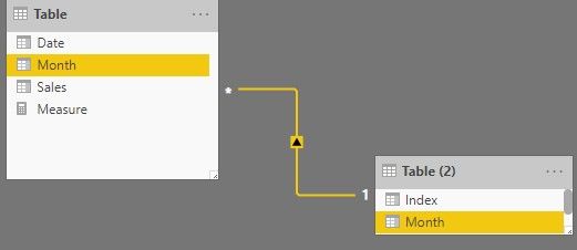
Create the relationship with original table by one-to-many:
Then create a measure:
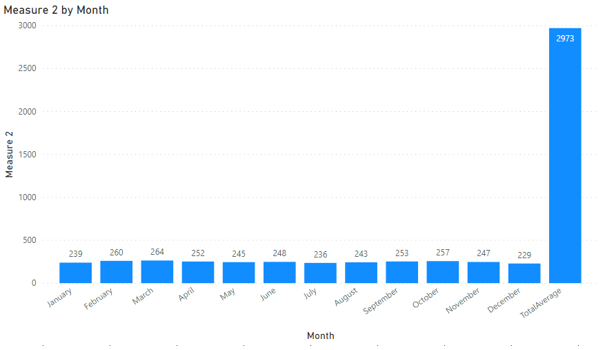
Measure 2 = IF(MAX('Table (2)'[Month])="TotalAverage",CALCULATE(SUM('Table'[Sales]),ALLSELECTED('Table')),SUM('Table'[Sales]))Choose the new table's [Month] and this measure as clustered column chart.
If you want to sort Month from 'January' to 'December', please add an index column in Query Editor.
After Apply&Close, sort [Month] by [Index], the result shows:
Here is my test pbix file:
Hope this helps.
Best Regards,
Giotto Zhi
- Mark as New
- Bookmark
- Subscribe
- Mute
- Subscribe to RSS Feed
- Permalink
- Report Inappropriate Content
Hi,
According to your description, i create a table to test:
Then create a measure:
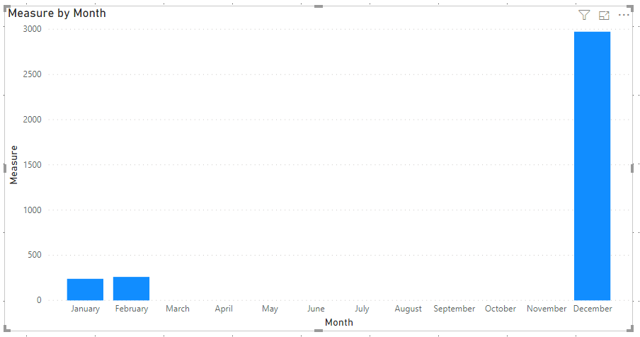
Measure = IF(MAX('Table'[Date].[Month])="January"||MAX('Table'[Date].[Month])="February",SUM('Table'[Sales]),IF(MAX('Table'[Date].[Month])="December",CALCULATE(SUM('Table'[Sales]),ALLSELECTED('Table')),0))Choose Clustered Column Chart, and it shows:
Here is my test pbix file:
Hope this helps.
Best Regards,
Giotto Zhi
- Mark as New
- Bookmark
- Subscribe
- Mute
- Subscribe to RSS Feed
- Permalink
- Report Inappropriate Content
Hello,
Thanks for the hint but it should be altered slighly. What I need is cummulative data to be shown AFTER December. So if we have data for Jan (239) and Feb (260) at the end after Dec. There should be new YTD column showing 499. like in the pic below:
- Mark as New
- Bookmark
- Subscribe
- Mute
- Subscribe to RSS Feed
- Permalink
- Report Inappropriate Content
Hi,
Please try to create a new table by Enter Data:
Create the relationship with original table by one-to-many:
Then create a measure:
Measure 2 = IF(MAX('Table (2)'[Month])="TotalAverage",CALCULATE(SUM('Table'[Sales]),ALLSELECTED('Table')),SUM('Table'[Sales]))Choose the new table's [Month] and this measure as clustered column chart.
If you want to sort Month from 'January' to 'December', please add an index column in Query Editor.
After Apply&Close, sort [Month] by [Index], the result shows:
Here is my test pbix file:
Hope this helps.
Best Regards,
Giotto Zhi
- Mark as New
- Bookmark
- Subscribe
- Mute
- Subscribe to RSS Feed
- Permalink
- Report Inappropriate Content
can i get video of steps how its done
- Mark as New
- Bookmark
- Subscribe
- Mute
- Subscribe to RSS Feed
- Permalink
- Report Inappropriate Content
Not a direct way I am away of, But you can try a new table using summarize and do it
new table = union(summarize(table,table[Month],"Value",sum(table[Value])),summarize(table,table[Month],"Value",[YTD Value]))
Assumed you have ytd formula outside
Use this to display that chart
Microsoft Power BI Learning Resources, 2023 !!
Learn Power BI - Full Course with Dec-2022, with Window, Index, Offset, 100+ Topics !!
Did I answer your question? Mark my post as a solution! Appreciate your Kudos !! Proud to be a Super User! !!
Helpful resources

Microsoft Fabric Learn Together
Covering the world! 9:00-10:30 AM Sydney, 4:00-5:30 PM CET (Paris/Berlin), 7:00-8:30 PM Mexico City

Power BI Monthly Update - April 2024
Check out the April 2024 Power BI update to learn about new features.

| User | Count |
|---|---|
| 110 | |
| 94 | |
| 82 | |
| 66 | |
| 58 |
| User | Count |
|---|---|
| 151 | |
| 121 | |
| 104 | |
| 87 | |
| 67 |
