- Power BI forums
- Updates
- News & Announcements
- Get Help with Power BI
- Desktop
- Service
- Report Server
- Power Query
- Mobile Apps
- Developer
- DAX Commands and Tips
- Custom Visuals Development Discussion
- Health and Life Sciences
- Power BI Spanish forums
- Translated Spanish Desktop
- Power Platform Integration - Better Together!
- Power Platform Integrations (Read-only)
- Power Platform and Dynamics 365 Integrations (Read-only)
- Training and Consulting
- Instructor Led Training
- Dashboard in a Day for Women, by Women
- Galleries
- Community Connections & How-To Videos
- COVID-19 Data Stories Gallery
- Themes Gallery
- Data Stories Gallery
- R Script Showcase
- Webinars and Video Gallery
- Quick Measures Gallery
- 2021 MSBizAppsSummit Gallery
- 2020 MSBizAppsSummit Gallery
- 2019 MSBizAppsSummit Gallery
- Events
- Ideas
- Custom Visuals Ideas
- Issues
- Issues
- Events
- Upcoming Events
- Community Blog
- Power BI Community Blog
- Custom Visuals Community Blog
- Community Support
- Community Accounts & Registration
- Using the Community
- Community Feedback
Register now to learn Fabric in free live sessions led by the best Microsoft experts. From Apr 16 to May 9, in English and Spanish.
- Power BI forums
- Forums
- Get Help with Power BI
- Desktop
- Waterfall chart start valu
- Subscribe to RSS Feed
- Mark Topic as New
- Mark Topic as Read
- Float this Topic for Current User
- Bookmark
- Subscribe
- Printer Friendly Page
- Mark as New
- Bookmark
- Subscribe
- Mute
- Subscribe to RSS Feed
- Permalink
- Report Inappropriate Content
Waterfall chart start valu
Hello
I am attempting to use PBI waterfall chart to show begin values, changes = that add up to the end value. My base measure is Cost$/unit, which is an annual value. For example, 2018 $/unit = $400, and ending value 2019 is $525/unit, I do have a measure reflecting the YOY change by ledger - but would now like to transition to a waterfall chart, with the inital bar = $400, and then with all the +/- end up at $525. I have a year slicer, so the starting point would be selected value - 1.
There are multiple similar questions already posted - with one solution being a measure. The other responses are purchasing a commercial visual (probably not likely). The solution with a measure assumes the initial value is in the dataset - I was unable to make work, as the beginning value was included on allowed dates within the slicer. My initial value is prior years calculated $/unit.
Appreciate your reponses!
- Mark as New
- Bookmark
- Subscribe
- Mute
- Subscribe to RSS Feed
- Permalink
- Report Inappropriate Content
Hi @Dellis81 ,
I cant simply create a sample data based on your description,so would you pls upload your .pbix file to onedrive business and share the link with us?
Kelly
- Mark as New
- Bookmark
- Subscribe
- Mute
- Subscribe to RSS Feed
- Permalink
- Report Inappropriate Content
Thank you for taking time to help. Here is a link to OneDrive with a simple example.
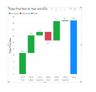
I would like the initial bar, representing 2019 for value of $13.30, and then for each category (Labor, Fuel, Supplies) show the YOY change, with the ending bar totaling $16.96.
I sure hope this can be done! Thank you!
- Mark as New
- Bookmark
- Subscribe
- Mute
- Subscribe to RSS Feed
- Permalink
- Report Inappropriate Content
- Mark as New
- Bookmark
- Subscribe
- Mute
- Subscribe to RSS Feed
- Permalink
- Report Inappropriate Content
thanks. is the pbx still available?
- Mark as New
- Bookmark
- Subscribe
- Mute
- Subscribe to RSS Feed
- Permalink
- Report Inappropriate Content
Hi Kelly, I got an email from you asking if the waterfall question had been answered. I appreciate your reviewing what I had done, but... Not quite yet. In a followup, I responded with an example showing a begin value.
I have been doing additional reading - and I think this is a limitation of PBI. I found a reference, asking to vote on it - and as I dug, there were multiple like kind requests. So, unless something new has recently transpired - I'm not hopeful. But - maybe you have some magic 🙂
thank you@
- Mark as New
- Bookmark
- Subscribe
- Mute
- Subscribe to RSS Feed
- Permalink
- Report Inappropriate Content
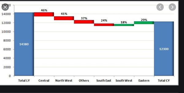
Thanks, but not quite... I found an WF image with the concept I want to shoot for. In my example, the first bar would be the 2018 value of 13.33 and the red/green bars represents the 2019 changes in Labor, Supplies, and fuel. The ending bar would add up to $17.
Thank you again!
Helpful resources

Microsoft Fabric Learn Together
Covering the world! 9:00-10:30 AM Sydney, 4:00-5:30 PM CET (Paris/Berlin), 7:00-8:30 PM Mexico City

Power BI Monthly Update - April 2024
Check out the April 2024 Power BI update to learn about new features.

| User | Count |
|---|---|
| 112 | |
| 97 | |
| 85 | |
| 67 | |
| 59 |
| User | Count |
|---|---|
| 150 | |
| 120 | |
| 99 | |
| 87 | |
| 68 |


