- Power BI forums
- Updates
- News & Announcements
- Get Help with Power BI
- Desktop
- Service
- Report Server
- Power Query
- Mobile Apps
- Developer
- DAX Commands and Tips
- Custom Visuals Development Discussion
- Health and Life Sciences
- Power BI Spanish forums
- Translated Spanish Desktop
- Power Platform Integration - Better Together!
- Power Platform Integrations (Read-only)
- Power Platform and Dynamics 365 Integrations (Read-only)
- Training and Consulting
- Instructor Led Training
- Dashboard in a Day for Women, by Women
- Galleries
- Community Connections & How-To Videos
- COVID-19 Data Stories Gallery
- Themes Gallery
- Data Stories Gallery
- R Script Showcase
- Webinars and Video Gallery
- Quick Measures Gallery
- 2021 MSBizAppsSummit Gallery
- 2020 MSBizAppsSummit Gallery
- 2019 MSBizAppsSummit Gallery
- Events
- Ideas
- Custom Visuals Ideas
- Issues
- Issues
- Events
- Upcoming Events
- Community Blog
- Power BI Community Blog
- Custom Visuals Community Blog
- Community Support
- Community Accounts & Registration
- Using the Community
- Community Feedback
Register now to learn Fabric in free live sessions led by the best Microsoft experts. From Apr 16 to May 9, in English and Spanish.
- Power BI forums
- Forums
- Get Help with Power BI
- Desktop
- Re: Waterfall chart scale
- Subscribe to RSS Feed
- Mark Topic as New
- Mark Topic as Read
- Float this Topic for Current User
- Bookmark
- Subscribe
- Printer Friendly Page
- Mark as New
- Bookmark
- Subscribe
- Mute
- Subscribe to RSS Feed
- Permalink
- Report Inappropriate Content
Waterfall chart scale
Hello !
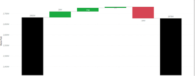
I have made the following waterfall charts and I have added as an exemple one measure, using the following blog for that
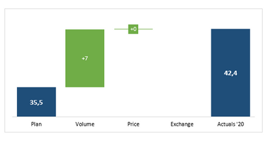
Is there a way to change the scale of the volume and price so that I have a chart where even for a small variance of volume and price, I manage to represent them in different scale then the actual values (category values) to get at the end something like the picture below
Thank you in advance,
Mariem,
- Mark as New
- Bookmark
- Subscribe
- Mute
- Subscribe to RSS Feed
- Permalink
- Report Inappropriate Content
Hi @Anonymous
Could you show me more details about your tables?
In your last visual is Actual = Plan+volumn+Price. It seems that 42.4 = 35.5+7+0
Please show me your calculcate logic for volumn and price measure.
This may make it easier for me to understand your requirement.
Best Regards,
Rico Zhou
If this post helps, then please consider Accept it as the solution to help the other members find it more quickly.
- Mark as New
- Bookmark
- Subscribe
- Mute
- Subscribe to RSS Feed
- Permalink
- Report Inappropriate Content
Hello @v-rzhou-msft !
So my price is actually the substruction of the end value (Actuals Current Year) from the start value (Actuals Last Y, Budget,...) and the volume is the same just usign the volume attribute instead of the sales ttribute
The calculation of last visual are actually wrong, but it gives the correct "shape" that I'm looking for, meaning that at the end of the volume bar I get also the end of the actuals'20 and not in my case where there is a gap between the end value and the price bar.
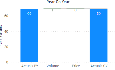
When I set the start of Y axis from 0, i get the following graph but I would like to have the 1 bar bigger compared to the rest of the bars. It's like it have a different scale eventhough I'm just showing one
I hope I managed to explain what I want,
Best Regards,
Mariem
- Mark as New
- Bookmark
- Subscribe
- Mute
- Subscribe to RSS Feed
- Permalink
- Report Inappropriate Content
Did you ever find a solution? I'm going through the same thing. I'd like the spacing of the Y-Axis to be much smaller, which can easily be done in Excel, so the breakdown categories aren't as extreme.
- Mark as New
- Bookmark
- Subscribe
- Mute
- Subscribe to RSS Feed
- Permalink
- Report Inappropriate Content
No 😕 I didn't find anything that allows me to control that.
Not sure it's possible
- Mark as New
- Bookmark
- Subscribe
- Mute
- Subscribe to RSS Feed
- Permalink
- Report Inappropriate Content
Hi - I had the same issue and solved it by creating a simple measure. It works fine. I did this:
WF_label = Starting point * (starting point/end point) - .1)
Changed the Y-Axis Range from auto to conditional formatting.
If I switch to auto, my starting and end points are in Billions, and the variances are in K or M.
I hope this helps.
Thanks
Helpful resources

Microsoft Fabric Learn Together
Covering the world! 9:00-10:30 AM Sydney, 4:00-5:30 PM CET (Paris/Berlin), 7:00-8:30 PM Mexico City

Power BI Monthly Update - April 2024
Check out the April 2024 Power BI update to learn about new features.

| User | Count |
|---|---|
| 109 | |
| 98 | |
| 77 | |
| 66 | |
| 54 |
| User | Count |
|---|---|
| 144 | |
| 104 | |
| 102 | |
| 88 | |
| 63 |


