- Power BI forums
- Updates
- News & Announcements
- Get Help with Power BI
- Desktop
- Service
- Report Server
- Power Query
- Mobile Apps
- Developer
- DAX Commands and Tips
- Custom Visuals Development Discussion
- Health and Life Sciences
- Power BI Spanish forums
- Translated Spanish Desktop
- Power Platform Integration - Better Together!
- Power Platform Integrations (Read-only)
- Power Platform and Dynamics 365 Integrations (Read-only)
- Training and Consulting
- Instructor Led Training
- Dashboard in a Day for Women, by Women
- Galleries
- Community Connections & How-To Videos
- COVID-19 Data Stories Gallery
- Themes Gallery
- Data Stories Gallery
- R Script Showcase
- Webinars and Video Gallery
- Quick Measures Gallery
- 2021 MSBizAppsSummit Gallery
- 2020 MSBizAppsSummit Gallery
- 2019 MSBizAppsSummit Gallery
- Events
- Ideas
- Custom Visuals Ideas
- Issues
- Issues
- Events
- Upcoming Events
- Community Blog
- Power BI Community Blog
- Custom Visuals Community Blog
- Community Support
- Community Accounts & Registration
- Using the Community
- Community Feedback
Register now to learn Fabric in free live sessions led by the best Microsoft experts. From Apr 16 to May 9, in English and Spanish.
- Power BI forums
- Forums
- Get Help with Power BI
- Desktop
- Re: Waterfall chart query - show absolute numbers
- Subscribe to RSS Feed
- Mark Topic as New
- Mark Topic as Read
- Float this Topic for Current User
- Bookmark
- Subscribe
- Printer Friendly Page
- Mark as New
- Bookmark
- Subscribe
- Mute
- Subscribe to RSS Feed
- Permalink
- Report Inappropriate Content
Waterfall chart query - show absolute numbers
Hi,
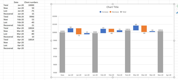
I am looking to build a waterfall chart in Power BI that shows the total number of clients each month, with a breakdown of the specific number of new, recovered and lost clients that occurred between each month. This was achieved in Excel, as the image below shows, with some sample data for each category:
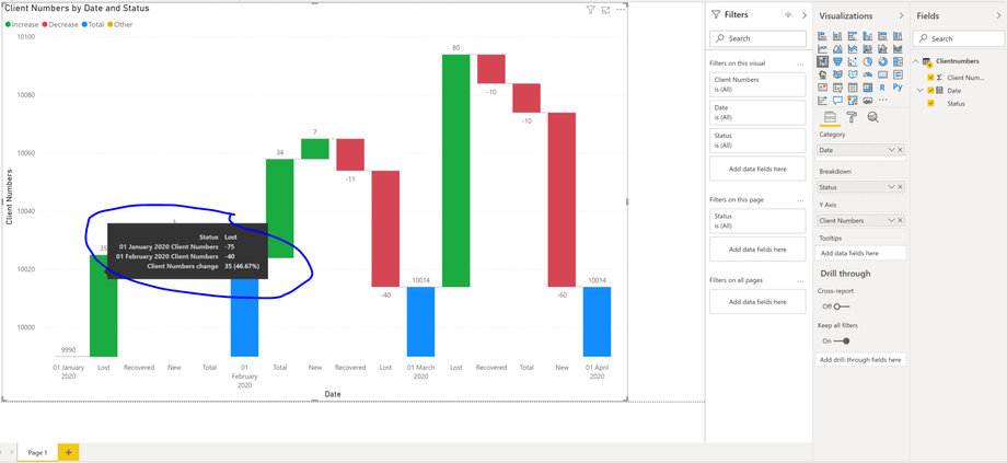
When I do the same thing in Power BI though, I can't get the absolute values of new, lost and recovered clients to show but the change in their values month to month. E.g. if the number of lost clients was -75 in Janary 2020 and -40 in February 2020, the value of the breakdown for lost clients would be +35, which represents the change in value between the two months (as the image below shows). How do I fix this so that only the absolute value for the month in question is shown, as per the Excel chart, rather than the month to month change? Am I missing something obvious or is using the Status (New, Lost or Recovered) as the breakdown not correct? Many thanks in advance and please let me know if anything isn't clear. As stated above, I've only used sample data to try and get what I want, so there's no data set to share here.
- Mark as New
- Bookmark
- Subscribe
- Mute
- Subscribe to RSS Feed
- Permalink
- Report Inappropriate Content
@tjhoolahan , I doubt I got. See if this can help
https://www.youtube.com/watch?v=7DW5wD2j1xw
Microsoft Power BI Learning Resources, 2023 !!
Learn Power BI - Full Course with Dec-2022, with Window, Index, Offset, 100+ Topics !!
Did I answer your question? Mark my post as a solution! Appreciate your Kudos !! Proud to be a Super User! !!
- Mark as New
- Bookmark
- Subscribe
- Mute
- Subscribe to RSS Feed
- Permalink
- Report Inappropriate Content
@amitchandak - unfortunately, this video does not help. I've already applied those steps and because it is summing the client numbers for each date and comparing them to the next date, you don't see any of the individual decrease, caused by losing clients. This is where the "breakdown" should come into play but, as I mentioned before, when you add the client status, which shows whether it is lost, new or recovered, it compares the month to month change in the values for that status, which is not what is displayed in the Excel (i.e. when comparing Jan to Feb, it looks at the difference between the number of new clients in each month, rather than displaying the number of new clients in Jan and how that contributes to the Feb client total). Any ideas on this? Maybe you could quickly replicate the table I've shown in the image in Excel and play around with it in Power BI to try and get the exact same waterfall chart as in Excel?
- Mark as New
- Bookmark
- Subscribe
- Mute
- Subscribe to RSS Feed
- Permalink
- Report Inappropriate Content
@tjhoolahan , share some sample data in table format
Microsoft Power BI Learning Resources, 2023 !!
Learn Power BI - Full Course with Dec-2022, with Window, Index, Offset, 100+ Topics !!
Did I answer your question? Mark my post as a solution! Appreciate your Kudos !! Proud to be a Super User! !!
- Mark as New
- Bookmark
- Subscribe
- Mute
- Subscribe to RSS Feed
- Permalink
- Report Inappropriate Content
@amitchandak hope this works for you?
Status Date Client Numbers
| Total | 01 January 2020 | 10000 |
| New | 01 January 2020 | 50 |
| Lost | 01 January 2020 | -75 |
| Recovered | 01 January 2020 | 15 |
| Total | 01 February 2020 | 9990 |
| New | 01 February 2020 | 53 |
| Lost | 01 February 2020 | -40 |
| Recovered | 01 February 2020 | 21 |
| Total | 01 March 2020 | 10024 |
| New | 01 March 2020 | 60 |
| Lost | 01 March 2020 | -80 |
| Recovered | 01 March 2020 | 10 |
| Total | 01 April 2020 | 10014 |
- Mark as New
- Bookmark
- Subscribe
- Mute
- Subscribe to RSS Feed
- Permalink
- Report Inappropriate Content
Helpful resources

Microsoft Fabric Learn Together
Covering the world! 9:00-10:30 AM Sydney, 4:00-5:30 PM CET (Paris/Berlin), 7:00-8:30 PM Mexico City

Power BI Monthly Update - April 2024
Check out the April 2024 Power BI update to learn about new features.

| User | Count |
|---|---|
| 107 | |
| 100 | |
| 80 | |
| 63 | |
| 58 |
| User | Count |
|---|---|
| 148 | |
| 111 | |
| 94 | |
| 84 | |
| 67 |


