- Power BI forums
- Updates
- News & Announcements
- Get Help with Power BI
- Desktop
- Service
- Report Server
- Power Query
- Mobile Apps
- Developer
- DAX Commands and Tips
- Custom Visuals Development Discussion
- Health and Life Sciences
- Power BI Spanish forums
- Translated Spanish Desktop
- Power Platform Integration - Better Together!
- Power Platform Integrations (Read-only)
- Power Platform and Dynamics 365 Integrations (Read-only)
- Training and Consulting
- Instructor Led Training
- Dashboard in a Day for Women, by Women
- Galleries
- Community Connections & How-To Videos
- COVID-19 Data Stories Gallery
- Themes Gallery
- Data Stories Gallery
- R Script Showcase
- Webinars and Video Gallery
- Quick Measures Gallery
- 2021 MSBizAppsSummit Gallery
- 2020 MSBizAppsSummit Gallery
- 2019 MSBizAppsSummit Gallery
- Events
- Ideas
- Custom Visuals Ideas
- Issues
- Issues
- Events
- Upcoming Events
- Community Blog
- Power BI Community Blog
- Custom Visuals Community Blog
- Community Support
- Community Accounts & Registration
- Using the Community
- Community Feedback
Register now to learn Fabric in free live sessions led by the best Microsoft experts. From Apr 16 to May 9, in English and Spanish.
- Power BI forums
- Forums
- Get Help with Power BI
- Desktop
- Waterfall chart based on two columns
- Subscribe to RSS Feed
- Mark Topic as New
- Mark Topic as Read
- Float this Topic for Current User
- Bookmark
- Subscribe
- Printer Friendly Page
- Mark as New
- Bookmark
- Subscribe
- Mute
- Subscribe to RSS Feed
- Permalink
- Report Inappropriate Content
Waterfall chart based on two columns
Hello,
I want to have waterfall chart it should represent three columns value one with total activities and two other columns should be showing increase and decrease column data all these will be based on date as axis. I am attaching my table below as well.
| Month | Total Active | Opened accounts (**bleep**) | Closed accounts (**bleep**) | Increase | Decrease | Difference |
| Sep-19 | 9665 | |||||
| Apr-21 | 8299 | 1852 | 3218 | 1852 | 3218 | -1366 |
| Jun-21 | 8255 | 1896 | 3306 | 44 | -88 | -44 |
| Sep-21 | 7993 | 1938 | 3609 | 42 | -303 | -262 |
Solved! Go to Solution.
- Mark as New
- Bookmark
- Subscribe
- Mute
- Subscribe to RSS Feed
- Permalink
- Report Inappropriate Content
Hi @Hamdan1234 ,
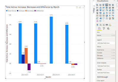
Based on the test data you provided, I don't think it's possible to create the corresponding waterfall chart. I think the choice of clustered column chart can show the change of increase or decrease more visually.
For waterfall visual details, you can read related document link.
Waterfall charts in Power BI - Power BI | Microsoft Docs
If the problem is still not resolved, please provide effective data models and desired results. Looking forward to your feedback.
Best Regards,
Henry
If this post helps, then please consider Accept it as the solution to help the other members find it more quickly.
- Mark as New
- Bookmark
- Subscribe
- Mute
- Subscribe to RSS Feed
- Permalink
- Report Inappropriate Content
Hello @lbendlin ,
Actually I have the column for Total acive so I want Total active as big bar then increase and decrease values as per column. So as you can see for total active firt value it would be 9665 but it does not have increase and decrease so it would be zero increase and decrease, then when total active in second row woulde 8299 then increase and decrease value would be 1852 and 3218 as column increase and decrease
- Mark as New
- Bookmark
- Subscribe
- Mute
- Subscribe to RSS Feed
- Permalink
- Report Inappropriate Content
How do you get from 9665 to 8299 without a decrease? Can you show a sample chart?
- Mark as New
- Bookmark
- Subscribe
- Mute
- Subscribe to RSS Feed
- Permalink
- Report Inappropriate Content
We don't have data for September before 2019 so we don't know how much cases were closed or opened.
- Mark as New
- Bookmark
- Subscribe
- Mute
- Subscribe to RSS Feed
- Permalink
- Report Inappropriate Content
A waterfall chart needs to have a baseline (starting) value. Maybe use a different visual.
- Mark as New
- Bookmark
- Subscribe
- Mute
- Subscribe to RSS Feed
- Permalink
- Report Inappropriate Content
Like this?
Helpful resources

Microsoft Fabric Learn Together
Covering the world! 9:00-10:30 AM Sydney, 4:00-5:30 PM CET (Paris/Berlin), 7:00-8:30 PM Mexico City

Power BI Monthly Update - April 2024
Check out the April 2024 Power BI update to learn about new features.

| User | Count |
|---|---|
| 113 | |
| 97 | |
| 79 | |
| 74 | |
| 56 |
| User | Count |
|---|---|
| 145 | |
| 105 | |
| 104 | |
| 90 | |
| 63 |


