- Power BI forums
- Updates
- News & Announcements
- Get Help with Power BI
- Desktop
- Service
- Report Server
- Power Query
- Mobile Apps
- Developer
- DAX Commands and Tips
- Custom Visuals Development Discussion
- Health and Life Sciences
- Power BI Spanish forums
- Translated Spanish Desktop
- Power Platform Integration - Better Together!
- Power Platform Integrations (Read-only)
- Power Platform and Dynamics 365 Integrations (Read-only)
- Training and Consulting
- Instructor Led Training
- Dashboard in a Day for Women, by Women
- Galleries
- Community Connections & How-To Videos
- COVID-19 Data Stories Gallery
- Themes Gallery
- Data Stories Gallery
- R Script Showcase
- Webinars and Video Gallery
- Quick Measures Gallery
- 2021 MSBizAppsSummit Gallery
- 2020 MSBizAppsSummit Gallery
- 2019 MSBizAppsSummit Gallery
- Events
- Ideas
- Custom Visuals Ideas
- Issues
- Issues
- Events
- Upcoming Events
- Community Blog
- Power BI Community Blog
- Custom Visuals Community Blog
- Community Support
- Community Accounts & Registration
- Using the Community
- Community Feedback
Register now to learn Fabric in free live sessions led by the best Microsoft experts. From Apr 16 to May 9, in English and Spanish.
- Power BI forums
- Forums
- Get Help with Power BI
- Desktop
- Re: Waterfall Chart using multiple measures
- Subscribe to RSS Feed
- Mark Topic as New
- Mark Topic as Read
- Float this Topic for Current User
- Bookmark
- Subscribe
- Printer Friendly Page
- Mark as New
- Bookmark
- Subscribe
- Mute
- Subscribe to RSS Feed
- Permalink
- Report Inappropriate Content
Waterfall Chart using multiple measures
Hello,
I know this must've been an old topic in Business Intelligence.
However, I didn't find any idea to realize what I'd like to achieve.
The thing is I'd like to create a Waterfall Chart with multiple measures.
Let's say that there's Fact Table containg accounting data (Revenues, Costs, Profits)
Thus it's a kind of running total, I can expect to draw the chart.
(Which item is main cause of profit decrease e.g., Ads/Logistics)
However, only solution I found at Google is restructuring the dataset like below
I don't think it's a good idea to manipulate the fact table, plus if I create another table, all the current measure refering the Table A would be not working with newly made one.
Is there any way to solve this?
Many thanks,
- Mark as New
- Bookmark
- Subscribe
- Mute
- Subscribe to RSS Feed
- Permalink
- Report Inappropriate Content
I'm having the exact same issues as well with multiple measures not working in the Waterfall visual. I was hoping that there would have been a solution by now but I guess not 😞
I created a mock up of the data so I could show the database guys what I was trying to achieve and it doesn't look like it's possible without creating a completley new table with the specific purpose of providing this visual - which is probably not going to happen.
- Mark as New
- Bookmark
- Subscribe
- Mute
- Subscribe to RSS Feed
- Permalink
- Report Inappropriate Content
Over two years later and it looks like this is still impossible for PowerBI... possible for PowerPivot, but not PowerBi. hmm
- Mark as New
- Bookmark
- Subscribe
- Mute
- Subscribe to RSS Feed
- Permalink
- Report Inappropriate Content
Hi flavourabbit,
"
However, only solution I found at Google is restructuring the dataset like below
I don't think it's a good idea to manipulate the fact table, plus if I create another table, all the current measure refering the Table A would be not working with newly made one.
"
<--- Could you please clarify more details or give a demo about your fact table, Table A, current measures and expected result?
Regards,
Jimmy Tao
- Mark as New
- Bookmark
- Subscribe
- Mute
- Subscribe to RSS Feed
- Permalink
- Report Inappropriate Content
Hello,
I've made some dummy data to explain my situsation.
Below is the fact table (originally the # of column is much larger than this)
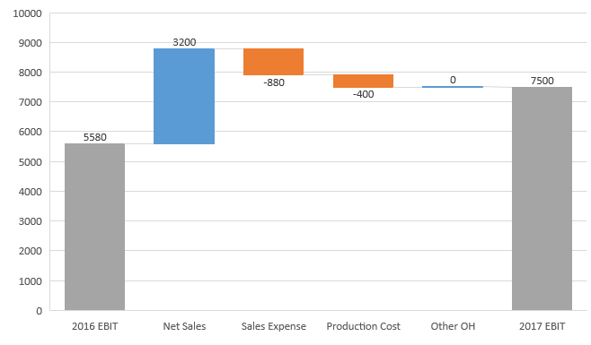
With measures like SumofNetSales or SumofSalesExpense, I'd like to draw the below waterfall chart in Power BI.
This is because I'd like to compare which account had a effect on overall profit between year 2016 and 2017.
Do you know how can I materialize the waterfall chart in Power BI
* FYI, the below is pasted dummy data
(as xlsx file is encrypted through DRM)
YearLocationNet SalesSales ExpenseProduction CostOther OHEBIT
| 2016 | UK | 400 | -50 | -200 | -100 | 50 |
| 2016 | France | 3000 | -230 | -300 | -50 | 2420 |
| 2016 | Germany | 4000 | -440 | -400 | -50 | 3110 |
| 2016 | Belgium | 2000 | -1000 | -500 | -500 | 0 |
| 2017 | UK | 600 | -200 | -300 | -100 | 0 |
| 2017 | France | 4000 | -600 | -400 | -50 | 2950 |
| 2017 | Germany | 5000 | -600 | -500 | -50 | 3850 |
| 2017 | Belgium | 3000 | -1200 | -600 | -500 | 700 |
- Mark as New
- Bookmark
- Subscribe
- Mute
- Subscribe to RSS Feed
- Permalink
- Report Inappropriate Content
Hi flavourabbit,
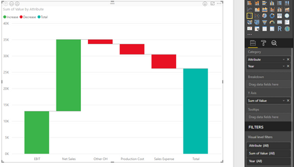
Click Editor Queries, click on [Net Sales], [sales Expense], [Production Cost], [Other OH], [EBIT], then click Transform-> Unpivot Columns, table after transforming is like below:

Then drag [Attribute] and [Year] to Category, drag [Value] to Y-axis, the result looks like this:

Regards,
Jimmy Tao
- Mark as New
- Bookmark
- Subscribe
- Mute
- Subscribe to RSS Feed
- Permalink
- Report Inappropriate Content
Thanks for the reply.
However, unlike the example, the fact table is quite hugh (1M rows, 200 columns) and also has a lot of measures based on the columns. so I think if I create a table with query editor only dedicated for the waterfall chart, then it would be a loss...
(resulting in slow performance and large file size)
Is there any workaround?
(it would be nice to recognize measure names as categorical field contents and use their value)
- Mark as New
- Bookmark
- Subscribe
- Mute
- Subscribe to RSS Feed
- Permalink
- Report Inappropriate Content
Hi there,
Have you found a solution for this since I am having the same issue where I have to create a waterfall chart from created measures?
Thanks
- Mark as New
- Bookmark
- Subscribe
- Mute
- Subscribe to RSS Feed
- Permalink
- Report Inappropriate Content
Hi,
The only workaround I know is using R script (or Python)
I followed the following article's instruction. (basically it's using ggplot2's rect function)
https://analyticstraining.com/waterfall-charts-using-ggplot2-in-r/
I hope it helps
- Mark as New
- Bookmark
- Subscribe
- Mute
- Subscribe to RSS Feed
- Permalink
- Report Inappropriate Content
Hi,
Thank for your reply ![]()
Let me have a look at it
Helpful resources

Microsoft Fabric Learn Together
Covering the world! 9:00-10:30 AM Sydney, 4:00-5:30 PM CET (Paris/Berlin), 7:00-8:30 PM Mexico City

Power BI Monthly Update - April 2024
Check out the April 2024 Power BI update to learn about new features.

| User | Count |
|---|---|
| 117 | |
| 107 | |
| 69 | |
| 68 | |
| 43 |
| User | Count |
|---|---|
| 148 | |
| 103 | |
| 103 | |
| 88 | |
| 66 |


