- Power BI forums
- Updates
- News & Announcements
- Get Help with Power BI
- Desktop
- Service
- Report Server
- Power Query
- Mobile Apps
- Developer
- DAX Commands and Tips
- Custom Visuals Development Discussion
- Health and Life Sciences
- Power BI Spanish forums
- Translated Spanish Desktop
- Power Platform Integration - Better Together!
- Power Platform Integrations (Read-only)
- Power Platform and Dynamics 365 Integrations (Read-only)
- Training and Consulting
- Instructor Led Training
- Dashboard in a Day for Women, by Women
- Galleries
- Community Connections & How-To Videos
- COVID-19 Data Stories Gallery
- Themes Gallery
- Data Stories Gallery
- R Script Showcase
- Webinars and Video Gallery
- Quick Measures Gallery
- 2021 MSBizAppsSummit Gallery
- 2020 MSBizAppsSummit Gallery
- 2019 MSBizAppsSummit Gallery
- Events
- Ideas
- Custom Visuals Ideas
- Issues
- Issues
- Events
- Upcoming Events
- Community Blog
- Power BI Community Blog
- Custom Visuals Community Blog
- Community Support
- Community Accounts & Registration
- Using the Community
- Community Feedback
Register now to learn Fabric in free live sessions led by the best Microsoft experts. From Apr 16 to May 9, in English and Spanish.
- Power BI forums
- Forums
- Get Help with Power BI
- Desktop
- Waterfall Chart - Current vs. Prior
- Subscribe to RSS Feed
- Mark Topic as New
- Mark Topic as Read
- Float this Topic for Current User
- Bookmark
- Subscribe
- Printer Friendly Page
- Mark as New
- Bookmark
- Subscribe
- Mute
- Subscribe to RSS Feed
- Permalink
- Report Inappropriate Content
Waterfall Chart - Current vs. Prior
I want to build a waterfall chart that shows how / why cost increased over time from one month to the next. For now I'm looking at two periods: Last Month and This Month.
What I'd like is this:
One bar representing Cost Per Piece for Prior Month
Three bars in between breaking down increases / decreases in Freight, Fuel, and Other Charges
Then a second large bar represetning Cost Per Piece for Current Month.
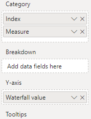
The answer in this thread was very helpful. I've created a table with my measures / index (representing freight, fuel, and other).
https://community.powerbi.com/t5/Desktop/Waterfall-Chart-using-multiple-measures/m-p/439275
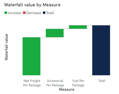
What I've got is this:
How can I update this so I see one large bar representing total cost for the prior month and one large bar representing total cost for the current month with the incremental steps in between showing the changes in freight, fuel, and accessorial that drove the difference between the two? For what it's worth, I have measures built to show each of these values for both the current and prior month and I have measures to show the difference between them as well.
Solved! Go to Solution.
- Mark as New
- Bookmark
- Subscribe
- Mute
- Subscribe to RSS Feed
- Permalink
- Report Inappropriate Content
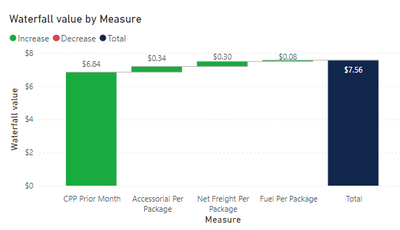
Okay, I figured it out. Solution below for posterity:
- Built measures for the delta between current and prior month
- Updated my "Waterfall Value" measure to use: CPP Prior Month (total), Net Freight Delta, Fuel Delta, Accessorial Delta
- Added a total column which reprents the curent month
It looks like this:
- Mark as New
- Bookmark
- Subscribe
- Mute
- Subscribe to RSS Feed
- Permalink
- Report Inappropriate Content
Doesn't sound like a waterfall chart is the right vehicle for the story you are trying to tell. Have you considered using other visuals?
- Mark as New
- Bookmark
- Subscribe
- Mute
- Subscribe to RSS Feed
- Permalink
- Report Inappropriate Content
I've done something similar in Excel that I'm trying to emulate.
It looks like this:
And uses these values:
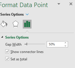
I set the second CPP as total in the series options:
I just want to emualte exactly this in Power BI if at all possible.
- Mark as New
- Bookmark
- Subscribe
- Mute
- Subscribe to RSS Feed
- Permalink
- Report Inappropriate Content
Okay, I figured it out. Solution below for posterity:
- Built measures for the delta between current and prior month
- Updated my "Waterfall Value" measure to use: CPP Prior Month (total), Net Freight Delta, Fuel Delta, Accessorial Delta
- Added a total column which reprents the curent month
It looks like this:
- Mark as New
- Bookmark
- Subscribe
- Mute
- Subscribe to RSS Feed
- Permalink
- Report Inappropriate Content
Hi Bensiqc,
Can you share how you build the "Waterfall Value" measure to use: CPP Prior Month (total), Net Freight Delta, Fuel Delta, Accessorial Delta?
I want to build similar waterfall chart but I do not know what measures to create in order to achieve this.
Thanks, Doris
- Mark as New
- Bookmark
- Subscribe
- Mute
- Subscribe to RSS Feed
- Permalink
- Report Inappropriate Content
Here's what I have.
My waterfall measure is written this way:

| Measure | Index |
| CPP Prior Month | 1 |
| Net Freight Per Package Current vs Prior | 2 |
| Fuel Per Package Current Vs Prior | 3 |
| Accessorial Per Package Current Vs Prior | 4 |
| CPP Current Month | 5 |
Helpful resources

Microsoft Fabric Learn Together
Covering the world! 9:00-10:30 AM Sydney, 4:00-5:30 PM CET (Paris/Berlin), 7:00-8:30 PM Mexico City

Power BI Monthly Update - April 2024
Check out the April 2024 Power BI update to learn about new features.

| User | Count |
|---|---|
| 106 | |
| 94 | |
| 77 | |
| 65 | |
| 53 |
| User | Count |
|---|---|
| 147 | |
| 106 | |
| 104 | |
| 87 | |
| 61 |


