- Power BI forums
- Updates
- News & Announcements
- Get Help with Power BI
- Desktop
- Service
- Report Server
- Power Query
- Mobile Apps
- Developer
- DAX Commands and Tips
- Custom Visuals Development Discussion
- Health and Life Sciences
- Power BI Spanish forums
- Translated Spanish Desktop
- Power Platform Integration - Better Together!
- Power Platform Integrations (Read-only)
- Power Platform and Dynamics 365 Integrations (Read-only)
- Training and Consulting
- Instructor Led Training
- Dashboard in a Day for Women, by Women
- Galleries
- Community Connections & How-To Videos
- COVID-19 Data Stories Gallery
- Themes Gallery
- Data Stories Gallery
- R Script Showcase
- Webinars and Video Gallery
- Quick Measures Gallery
- 2021 MSBizAppsSummit Gallery
- 2020 MSBizAppsSummit Gallery
- 2019 MSBizAppsSummit Gallery
- Events
- Ideas
- Custom Visuals Ideas
- Issues
- Issues
- Events
- Upcoming Events
- Community Blog
- Power BI Community Blog
- Custom Visuals Community Blog
- Community Support
- Community Accounts & Registration
- Using the Community
- Community Feedback
Register now to learn Fabric in free live sessions led by the best Microsoft experts. From Apr 16 to May 9, in English and Spanish.
- Power BI forums
- Forums
- Get Help with Power BI
- Desktop
- Re: Waterfall Chart But In Table
- Subscribe to RSS Feed
- Mark Topic as New
- Mark Topic as Read
- Float this Topic for Current User
- Bookmark
- Subscribe
- Printer Friendly Page
- Mark as New
- Bookmark
- Subscribe
- Mute
- Subscribe to RSS Feed
- Permalink
- Report Inappropriate Content
Waterfall Chart But In Table
Hi,
I would like to display a table that has the similar patterns to waterfall chart. (essentially works in the same way)
Does anyone know if there is such a visualization? I tried the tables but it seems like the only possible way is to do measures if I want it to display values like a waterfall chart.
So essentially the total is a measure a have and usually in a waterfall chart, they will automatically breakdown into the dates such as in this way. But is there a table that can do this?
| Jan | Feb | Mar | Total | |
| Apple | 1 | 2 | 3 | 6 |
| Grape | 2 | 4 | 2 | 8 |
| Orange | 5 | 0 | 0 | 5 |
- Mark as New
- Bookmark
- Subscribe
- Mute
- Subscribe to RSS Feed
- Permalink
- Report Inappropriate Content
Hi, @kitala11
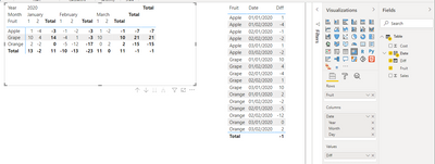
Based on your description, i created data to reproduce your scenario. The pbix file is attached in the end.
Table:
You may create a matrix visual as below.
Best Regards
Allan
If this post helps, then please consider Accept it as the solution to help the other members find it more quickly.
- Mark as New
- Bookmark
- Subscribe
- Mute
- Subscribe to RSS Feed
- Permalink
- Report Inappropriate Content
@kitala11 , Are you looking for Hybrid table. Month on columns and total as onr more value at end ?
if you are looking for a Hybrid display with Matrix Column and measure
https://community.powerbi.com/t5/Community-Blog/Creating-a-custom-or-hybrid-matrix-in-PowerBI/ba-p/1...
https://community.powerbi.com/t5/Quick-Measures-Gallery/The-New-Hotness-Custom-Matrix-Hierarchy/m-p/...
vote for Hybrid Table
https://ideas.powerbi.com/ideas/idea/?ideaid=9bc32b23-1eb1-4e74-8b34-349887b37ebc
Microsoft Power BI Learning Resources, 2023 !!
Learn Power BI - Full Course with Dec-2022, with Window, Index, Offset, 100+ Topics !!
Did I answer your question? Mark my post as a solution! Appreciate your Kudos !! Proud to be a Super User! !!
Helpful resources

Microsoft Fabric Learn Together
Covering the world! 9:00-10:30 AM Sydney, 4:00-5:30 PM CET (Paris/Berlin), 7:00-8:30 PM Mexico City

Power BI Monthly Update - April 2024
Check out the April 2024 Power BI update to learn about new features.

| User | Count |
|---|---|
| 114 | |
| 100 | |
| 75 | |
| 73 | |
| 49 |
| User | Count |
|---|---|
| 145 | |
| 109 | |
| 109 | |
| 90 | |
| 64 |


