- Power BI forums
- Updates
- News & Announcements
- Get Help with Power BI
- Desktop
- Service
- Report Server
- Power Query
- Mobile Apps
- Developer
- DAX Commands and Tips
- Custom Visuals Development Discussion
- Health and Life Sciences
- Power BI Spanish forums
- Translated Spanish Desktop
- Power Platform Integration - Better Together!
- Power Platform Integrations (Read-only)
- Power Platform and Dynamics 365 Integrations (Read-only)
- Training and Consulting
- Instructor Led Training
- Dashboard in a Day for Women, by Women
- Galleries
- Community Connections & How-To Videos
- COVID-19 Data Stories Gallery
- Themes Gallery
- Data Stories Gallery
- R Script Showcase
- Webinars and Video Gallery
- Quick Measures Gallery
- 2021 MSBizAppsSummit Gallery
- 2020 MSBizAppsSummit Gallery
- 2019 MSBizAppsSummit Gallery
- Events
- Ideas
- Custom Visuals Ideas
- Issues
- Issues
- Events
- Upcoming Events
- Community Blog
- Power BI Community Blog
- Custom Visuals Community Blog
- Community Support
- Community Accounts & Registration
- Using the Community
- Community Feedback
Register now to learn Fabric in free live sessions led by the best Microsoft experts. From Apr 16 to May 9, in English and Spanish.
- Power BI forums
- Forums
- Get Help with Power BI
- Desktop
- Waffle chart
- Subscribe to RSS Feed
- Mark Topic as New
- Mark Topic as Read
- Float this Topic for Current User
- Bookmark
- Subscribe
- Printer Friendly Page
- Mark as New
- Bookmark
- Subscribe
- Mute
- Subscribe to RSS Feed
- Permalink
- Report Inappropriate Content
Waffle chart
An easy question: in waffle chart, my group is 'gender' and what should i have in excel to value?
Thanks!
Solved! Go to Solution.
- Mark as New
- Bookmark
- Subscribe
- Mute
- Subscribe to RSS Feed
- Permalink
- Report Inappropriate Content
Hello,
Waffle Chart author here.
The Waffle Chart works nice if all the input values are between 0 and 100, but if one of them is over 100, then, the maximum value in the input is considered the 100% value and the rest of the values are calculated using cross multiplication.
There is a nice way to fix this, and it is using the Maximum value column. For example, if the values are greater than 100, then, you can provide what value is 100% in the Maximum value like this:
Group,   Value, Maximum Value
Female,   3400,          6000
Male,     2600,          6000
Then Female will become 57% and Male will become 43%.
Let me know if this does not solve the problem.
- Mark as New
- Bookmark
- Subscribe
- Mute
- Subscribe to RSS Feed
- Permalink
- Report Inappropriate Content
Hello!
Tell me please, why do not properly display information if i use custom visuals WaffleChart???
I think, the problem is with the time zone. But how to fix it?
Thank you.
- Mark as New
- Bookmark
- Subscribe
- Mute
- Subscribe to RSS Feed
- Permalink
- Report Inappropriate Content
Hello,
Waffle Chart author here.
The Waffle Chart works nice if all the input values are between 0 and 100, but if one of them is over 100, then, the maximum value in the input is considered the 100% value and the rest of the values are calculated using cross multiplication.
There is a nice way to fix this, and it is using the Maximum value column. For example, if the values are greater than 100, then, you can provide what value is 100% in the Maximum value like this:
Group,   Value, Maximum Value
Female,   3400,          6000
Male,     2600,          6000
Then Female will become 57% and Male will become 43%.
Let me know if this does not solve the problem.
- Mark as New
- Bookmark
- Subscribe
- Mute
- Subscribe to RSS Feed
- Permalink
- Report Inappropriate Content
Hello,
I face some problems as well, all visuals seem to work following your instructions accept one, one column has only answers "Yes", the waffle chart displays 0% in that case?
Do you know what this can be. It is all in the same table...
Thank you in advance for any support on that.
- Mark as New
- Bookmark
- Subscribe
- Mute
- Subscribe to RSS Feed
- Permalink
- Report Inappropriate Content
Yes, after some work i figured that out a few days ago. That was exactly what i did!
Thanks! @kiewic
PS: Good job with waffle chart creation 🙂
- Mark as New
- Bookmark
- Subscribe
- Mute
- Subscribe to RSS Feed
- Permalink
- Report Inappropriate Content
Hi gonrodrigues,
Could you please elaborate more details about your scenario? Do you create waffle chart visualization in Excel or in Power BI Desktop? We will appreciate it if you can post relevant screenshot.
Thanks,
Lydia Zhang
If this post helps, then please consider Accept it as the solution to help the other members find it more quickly.
- Mark as New
- Bookmark
- Subscribe
- Mute
- Subscribe to RSS Feed
- Permalink
- Report Inappropriate Content
Hey @v-yuezhe-msft
I have an excel DB and i want to create a waffle chart in Power Bi Desktop.
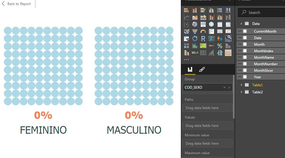
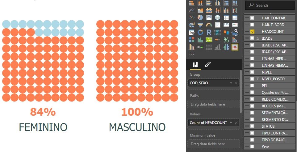
The results should be 46% and 54% of a total of 6000 headcount and not the percentage of "feminino" when compared to a total of 'masculino' (3240).
Thanks!
- Mark as New
- Bookmark
- Subscribe
- Mute
- Subscribe to RSS Feed
- Permalink
- Report Inappropriate Content
What worked for me was to create a Measure that calculates all items in the report excluding any items you would want to filter out. Then using this measure as your max value. This allows your data to display properly all the time, and not to rely on a fixed value.
Example:
Create a measure named "Max Value Example" as follows:
Max Value Example = CALCULATE(count('Gender'[ItemID]),'Gender'[Male/Female]<>"")
I filtered blank values but if you have no null values you can just do a Count for all items.
- Mark as New
- Bookmark
- Subscribe
- Mute
- Subscribe to RSS Feed
- Permalink
- Report Inappropriate Content
Hi gonrodrigues,
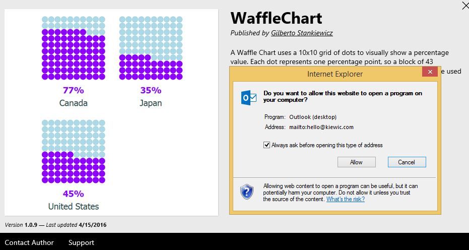
Regarding to the WaffleChart visual issues, please directly contact the author. In this link, you can send an email to the author by clicking “Contact Author” as shown in the following screenshot.
Thanks,
Lydia Zhang
If this post helps, then please consider Accept it as the solution to help the other members find it more quickly.
- Mark as New
- Bookmark
- Subscribe
- Mute
- Subscribe to RSS Feed
- Permalink
- Report Inappropriate Content
Not an easy question!
- Mark as New
- Bookmark
- Subscribe
- Mute
- Subscribe to RSS Feed
- Permalink
- Report Inappropriate Content
I really thought it was easy but for some reason i couldnt get the answer ![]()
Helpful resources

Microsoft Fabric Learn Together
Covering the world! 9:00-10:30 AM Sydney, 4:00-5:30 PM CET (Paris/Berlin), 7:00-8:30 PM Mexico City

Power BI Monthly Update - April 2024
Check out the April 2024 Power BI update to learn about new features.

| User | Count |
|---|---|
| 113 | |
| 99 | |
| 80 | |
| 70 | |
| 60 |
| User | Count |
|---|---|
| 149 | |
| 114 | |
| 107 | |
| 89 | |
| 67 |
