- Power BI forums
- Updates
- News & Announcements
- Get Help with Power BI
- Desktop
- Service
- Report Server
- Power Query
- Mobile Apps
- Developer
- DAX Commands and Tips
- Custom Visuals Development Discussion
- Health and Life Sciences
- Power BI Spanish forums
- Translated Spanish Desktop
- Power Platform Integration - Better Together!
- Power Platform Integrations (Read-only)
- Power Platform and Dynamics 365 Integrations (Read-only)
- Training and Consulting
- Instructor Led Training
- Dashboard in a Day for Women, by Women
- Galleries
- Community Connections & How-To Videos
- COVID-19 Data Stories Gallery
- Themes Gallery
- Data Stories Gallery
- R Script Showcase
- Webinars and Video Gallery
- Quick Measures Gallery
- 2021 MSBizAppsSummit Gallery
- 2020 MSBizAppsSummit Gallery
- 2019 MSBizAppsSummit Gallery
- Events
- Ideas
- Custom Visuals Ideas
- Issues
- Issues
- Events
- Upcoming Events
- Community Blog
- Power BI Community Blog
- Custom Visuals Community Blog
- Community Support
- Community Accounts & Registration
- Using the Community
- Community Feedback
Register now to learn Fabric in free live sessions led by the best Microsoft experts. From Apr 16 to May 9, in English and Spanish.
- Power BI forums
- Forums
- Get Help with Power BI
- Desktop
- Visualizing series with different X-axis in one ch...
- Subscribe to RSS Feed
- Mark Topic as New
- Mark Topic as Read
- Float this Topic for Current User
- Bookmark
- Subscribe
- Printer Friendly Page
- Mark as New
- Bookmark
- Subscribe
- Mute
- Subscribe to RSS Feed
- Permalink
- Report Inappropriate Content
Visualizing series with different X-axis on the same chart
Hi,
my question is not really technical, but a visualizing problem. I have a report containing many KPIs, and one is a hard nut to crack for me.
Each quarter closing month (3, 6, 9, 12th month) I receive 3 data (all in percentages):
- an actual for the closed quarter
- an estimate for the next quarter
- an estimate for the full year
Each non-quarter closing month (1, 2, 4, ..., 11th month) I receive 2:
- an estimate for the current quarter
- an estimate for the full year
Things I have to visualize:
- all the quarter actual results
- an estimate for the current, non-closed quarter
- two estimates for the full year, the latest and the previous month's
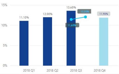
The latest data I have at the moment is September (P09), so at this point I'd like to visualize Q1, Q2, Q3 actual, Q4 estimate, and P08, P09 full year estimate.
You can see my current state on the picture below.
I achieved this by 2 different chart on each other, a Clustered Column and a Line chart, the Clustered Column contains all the Quarterly data, the Line chart contains the Monthly full year estimate data, but I have many problems with this. The two value for the Line are P08 and P09 and the X-axis means the time the prediction was made, while as for the Column chart the meaning of the X-axis is the period we are making the prediction for, so I find this very confusing, but I'm yet to find a better solution.
(All the numbers are percentages, thus the full year estimate and actuals can share a Y-axis. Of course if these were absolute values, then it wouldn't make any sense as the full year would be a much higher value.)
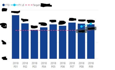
Just to show you another KPI, where the actuals are monthly values, hence the X-axis can be shared and the same approach works just fine:
The series I have to visualize is fixed, but I'm open to any kind of visualization, if you have a better idea.
Thank you.
- Mark as New
- Bookmark
- Subscribe
- Mute
- Subscribe to RSS Feed
- Permalink
- Report Inappropriate Content
Hi @mafaber,
Could you have used the "Line and clustered column chart"?
And I could not understand what is your desired result, could you please share me some sample data and post your desired result if possible?
Regards,
Daniel He
If this post helps, then please consider Accept it as the solution to help the other members find it more quickly.
- Mark as New
- Bookmark
- Subscribe
- Mute
- Subscribe to RSS Feed
- Permalink
- Report Inappropriate Content
Hi @v-danhe-msft,
I created a data sample file that you can access here: https://drive.google.com/open?id=1oIVn_VKxFP0Fz5383mmCvxM5cGDSMUd_
You can also find a small explanation for the meaning of the columns in a textbox below the table.
The desired results is just visualizing the KPI in a clear and understandable way, I listed the things I have to see in my post, I don't have a fixed chart type I'd have to stick to.
The whole problem is that I couldn't visualize Quarter actuals, a Quarter estimate and two full year estimates in a way I'd be satisfied with. 🙂
I try to describe things as clear as possible, but please let me know if you have anymore questions 🙂
Thank you.
Regards,
Marton
- Mark as New
- Bookmark
- Subscribe
- Mute
- Subscribe to RSS Feed
- Permalink
- Report Inappropriate Content
Hi @mafaber,
From your description, I could not understand how to judge below conditions:
estimate for the current, non-closed quarter
latest and previous estimate for the full year
Could you please offer me more detail information?
Regards,
Daniel He
If this post helps, then please consider Accept it as the solution to help the other members find it more quickly.
- Mark as New
- Bookmark
- Subscribe
- Mute
- Subscribe to RSS Feed
- Permalink
- Report Inappropriate Content
Hi,
my question is not really technical, but a visualizing problem. I have a report containing many KPIs, and one is a hard nut to crack for me.
Each quarter closing month (3, 6, 9, 12th month) I receive 3 data (all in percentages):
- an actual for the closed quarter
- an estimate for the next quarter
- an estimate for the full year
Each non-quarter closing month (1, 2, 4, ..., 11th month) I receive 2:
- an estimate for the current quarter
- an estimate for the full year
Things I have to visualize:
- all the quarter actual results
- an estimate for the current, non-closed quarter
- two estimates for the full year, the latest and the previous month's
The latest data I have at the moment is September (P09), so at this point I'd like to visualize Q1, Q2, Q3 actual, Q4 estimate, and P08, P09 full year estimate.
You can see my current state on the picture below.
I achieved this by 2 different chart, a Clustered Column and a Line chart, the Clustered Column contains all the Quarterly data, the Line chart contains the Monthly full year estimate data. I have many problems with this. The two value for the Line are P08 and P09 and the X-axis means the time the prediction was made, while for the Column chart the meaning of the X-axis is the time we are predicting, so I find this very confusing, but I'm yet to find a better solution. Also I'm not sure where to put the line on the X-axis.
(All the numbers are percentages, thus the full year estimate and actuals can share a Y-axis. Of course if these were absolute values, then it wouldn't make any sense as the full year would be a much higher value.)
Moving the quarterly and monthly values to two different charts isn't working, because I wouldn't use a whole chart for just one line with 2 values.
Just to show you another KPI, where the actuals are monthly values hence the X-axis can be shared and the same approach works just fine:
The series I have to visualize is fixed, but I'm open to any kind of visualization, if you have a better idea.
Thank you.
Helpful resources

Microsoft Fabric Learn Together
Covering the world! 9:00-10:30 AM Sydney, 4:00-5:30 PM CET (Paris/Berlin), 7:00-8:30 PM Mexico City

Power BI Monthly Update - April 2024
Check out the April 2024 Power BI update to learn about new features.

| User | Count |
|---|---|
| 109 | |
| 99 | |
| 77 | |
| 66 | |
| 54 |
| User | Count |
|---|---|
| 144 | |
| 104 | |
| 101 | |
| 86 | |
| 64 |


