- Power BI forums
- Updates
- News & Announcements
- Get Help with Power BI
- Desktop
- Service
- Report Server
- Power Query
- Mobile Apps
- Developer
- DAX Commands and Tips
- Custom Visuals Development Discussion
- Health and Life Sciences
- Power BI Spanish forums
- Translated Spanish Desktop
- Power Platform Integration - Better Together!
- Power Platform Integrations (Read-only)
- Power Platform and Dynamics 365 Integrations (Read-only)
- Training and Consulting
- Instructor Led Training
- Dashboard in a Day for Women, by Women
- Galleries
- Community Connections & How-To Videos
- COVID-19 Data Stories Gallery
- Themes Gallery
- Data Stories Gallery
- R Script Showcase
- Webinars and Video Gallery
- Quick Measures Gallery
- 2021 MSBizAppsSummit Gallery
- 2020 MSBizAppsSummit Gallery
- 2019 MSBizAppsSummit Gallery
- Events
- Ideas
- Custom Visuals Ideas
- Issues
- Issues
- Events
- Upcoming Events
- Community Blog
- Power BI Community Blog
- Custom Visuals Community Blog
- Community Support
- Community Accounts & Registration
- Using the Community
- Community Feedback
Register now to learn Fabric in free live sessions led by the best Microsoft experts. From Apr 16 to May 9, in English and Spanish.
- Power BI forums
- Forums
- Get Help with Power BI
- Desktop
- Re: Visualizing multiple true/false questions in O...
- Subscribe to RSS Feed
- Mark Topic as New
- Mark Topic as Read
- Float this Topic for Current User
- Bookmark
- Subscribe
- Printer Friendly Page
- Mark as New
- Bookmark
- Subscribe
- Mute
- Subscribe to RSS Feed
- Permalink
- Report Inappropriate Content
Visualizing multiple true/false questions in ONE visual
I would like to find a good visual for displaying segmentation of accounts (and leads).
Each account has about 6 segmentation columns which can be TRUE or FALSE. Leads have the same segmentation columns.
I have an extra table with the TRUE/FALSE value and a translated value.
So the visual could be like the sunburst visual - but my values are not hierachical.
So a count of accounts in first segment. - And a count of accounts in second segment. And all accounts can be in 0-6 segments.
I need to display the value from the extra tabel with only two columns and two rows, because this extra table works a a dataslicer for both accounts and leads.

Accountid Metal Segment 2 Segment 3
Account 1 TRUE FALSE FALSE
Account2 FALSE TRUE TRUE
- Mark as New
- Bookmark
- Subscribe
- Mute
- Subscribe to RSS Feed
- Permalink
- Report Inappropriate Content
Hi @Mezmarianne,
I still have several problems to confirm.
1. What you resource table look like, from the data snippet, I didn't see "Each account has about 6 segmentation columns".
2. You want to display your data in sunburst visual? But sunburst visual needs different categories in different levels, your data does not match the format.
3. The following part is your expected result table?
4. >>I need to display the value from the extra tabel with only two columns and two rows
What's the mean of the setence?
Could you please share more details and sample table, list the expected result, so that we can post solution which is close to what you want.
Best Regards,
Angelia
- Mark as New
- Bookmark
- Subscribe
- Mute
- Subscribe to RSS Feed
- Permalink
- Report Inappropriate Content
Sorry for not being clear.


- Mark as New
- Bookmark
- Subscribe
- Mute
- Subscribe to RSS Feed
- Permalink
- Report Inappropriate Content
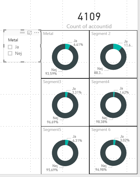
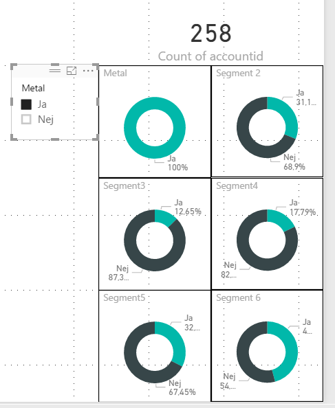
I would like to be able to show these six yes/no values in one visual.
The slicer comes from a related table.
- Mark as New
- Bookmark
- Subscribe
- Mute
- Subscribe to RSS Feed
- Permalink
- Report Inappropriate Content
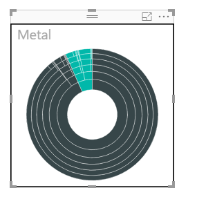
try "Sunburst" visual from market
- Mark as New
- Bookmark
- Subscribe
- Mute
- Subscribe to RSS Feed
- Permalink
- Report Inappropriate Content
Because the data is not hierachical it does not really show how many accounts are in each segment.
- Mark as New
- Bookmark
- Subscribe
- Mute
- Subscribe to RSS Feed
- Permalink
- Report Inappropriate Content
HI @Mezmarianne,
Try the KPItable custom visual you can have a table with (traffic light images) to display values.
Regards,
MFelix
Regards
Miguel Félix
Did I answer your question? Mark my post as a solution!
Proud to be a Super User!
Check out my blog: Power BI em Português- Mark as New
- Bookmark
- Subscribe
- Mute
- Subscribe to RSS Feed
- Permalink
- Report Inappropriate Content
Hi @Mezmarianne,
Have you resolved your issue, please marlk the right reply as answer. So more people will benefit this.
Best Regards,
Angelia
- Mark as New
- Bookmark
- Subscribe
- Mute
- Subscribe to RSS Feed
- Permalink
- Report Inappropriate Content
I am not quite there yet. Now I have settled for 6 tables (preview version). If clicked, the maps only shows the selected type. More than one can be selested. But there is no color indication that a row has been clicked, when there is only one row.

- Mark as New
- Bookmark
- Subscribe
- Mute
- Subscribe to RSS Feed
- Permalink
- Report Inappropriate Content
Hi @Mezmarianne,
Did you use the matrix visual? If it is, you can use the conditional formatting?
Best Regards,
Angelia
- Mark as New
- Bookmark
- Subscribe
- Mute
- Subscribe to RSS Feed
- Permalink
- Report Inappropriate Content
Hi @Mezmarianne,
Check this answer I gave in a previous post with similar option.
https://community.powerbi.com/t5/Desktop/Help-with-display-chart/m-p/177592#M77680
Please tell me if it work or if you need any help.
Regards,
MFelix
Regards
Miguel Félix
Did I answer your question? Mark my post as a solution!
Proud to be a Super User!
Check out my blog: Power BI em PortuguêsHelpful resources

Microsoft Fabric Learn Together
Covering the world! 9:00-10:30 AM Sydney, 4:00-5:30 PM CET (Paris/Berlin), 7:00-8:30 PM Mexico City

Power BI Monthly Update - April 2024
Check out the April 2024 Power BI update to learn about new features.

| User | Count |
|---|---|
| 117 | |
| 105 | |
| 69 | |
| 67 | |
| 43 |
| User | Count |
|---|---|
| 148 | |
| 103 | |
| 103 | |
| 88 | |
| 66 |


