- Power BI forums
- Updates
- News & Announcements
- Get Help with Power BI
- Desktop
- Service
- Report Server
- Power Query
- Mobile Apps
- Developer
- DAX Commands and Tips
- Custom Visuals Development Discussion
- Health and Life Sciences
- Power BI Spanish forums
- Translated Spanish Desktop
- Power Platform Integration - Better Together!
- Power Platform Integrations (Read-only)
- Power Platform and Dynamics 365 Integrations (Read-only)
- Training and Consulting
- Instructor Led Training
- Dashboard in a Day for Women, by Women
- Galleries
- Community Connections & How-To Videos
- COVID-19 Data Stories Gallery
- Themes Gallery
- Data Stories Gallery
- R Script Showcase
- Webinars and Video Gallery
- Quick Measures Gallery
- 2021 MSBizAppsSummit Gallery
- 2020 MSBizAppsSummit Gallery
- 2019 MSBizAppsSummit Gallery
- Events
- Ideas
- Custom Visuals Ideas
- Issues
- Issues
- Events
- Upcoming Events
- Community Blog
- Power BI Community Blog
- Custom Visuals Community Blog
- Community Support
- Community Accounts & Registration
- Using the Community
- Community Feedback
Register now to learn Fabric in free live sessions led by the best Microsoft experts. From Apr 16 to May 9, in English and Spanish.
- Power BI forums
- Forums
- Get Help with Power BI
- Desktop
- Visualizing multiple true/false questions in ONE s...
- Subscribe to RSS Feed
- Mark Topic as New
- Mark Topic as Read
- Float this Topic for Current User
- Bookmark
- Subscribe
- Printer Friendly Page
- Mark as New
- Bookmark
- Subscribe
- Mute
- Subscribe to RSS Feed
- Permalink
- Report Inappropriate Content
Visualizing multiple true/false questions in ONE stacked chart
Hi everybody
I'm new to Power BI and need some help visualizing multiple true/false questions in one chart as a percentage average of the sum sales prize. Here it goes:
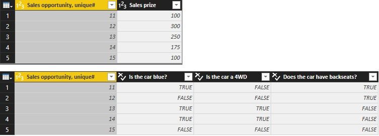
| Sales opportunity, unique# | Sales prize | Is the car blue? | Is the car a 4WD | Does the car have backseats? |
| 11 | $ 100 | True | False | True |
| 12 | $ 300 | False | False | True |
| 13 | $ 250 | True | True | False |
| 14 | $ 175 | True | True | False |
| 15 | $ 100 | Fales | False | False |
Is it possible to display/visualize the true/false data in ONE stacked bar chart, where you get a percentage view.
Example:
Sum sales prize is: $925.
Percentage of cars that are blue: 60 %. Display: 60 % of sum sales price =$555
Percentage of cars that are 4WD: 40 %. Display: 40 % of sum sales price =$370
And so on... All in the same stacked bar chart.
I hope you're able to help.Thanks
BR
Anders
Solved! Go to Solution.
- Mark as New
- Bookmark
- Subscribe
- Mute
- Subscribe to RSS Feed
- Permalink
- Report Inappropriate Content
@Anonymous
In this scenario, you can first transform your table in Query Editor and then you can get the expected result with one measure. Please refer to following steps.
- In Query Editor, duplicate Table1 and rename it to Table2.
- Delete the three columns (blue, 4WD and backseats) of Table1. Delete one column (Sales prize) of Table2.
- Multiple select the three columns (blue, 4WD and backseats) of Table2, click “Unpivot Columns”.
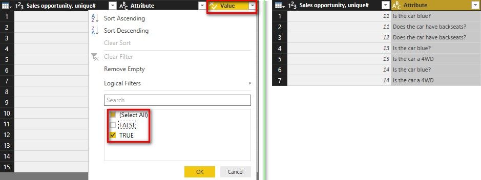
- Filter the rows which “Value” = True in Table2. Then delete the “Value” column.
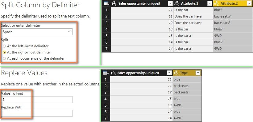
- Select the “Attribute” column in Table2, click “Split Column by Delimiter” of Space at the right-most delimiter as below. Replace ? with null in “Attribute.2” column. Rename “Attribute.2” to “Type” and delete “Attribute.1” column.
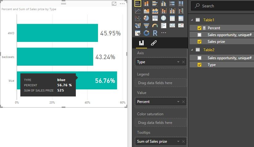
- Close and apply Query Editor. A 1:* relationship between Table1 and Table2 will be created automatically. Create a measure with following formula. Set its Format to “Percentage”.
Percent = DIVIDE ( SUM ( Table1[Sales prize] ), CALCULATE ( SUM ( Table1[Sales prize] ), ALL ( Table2 ) ) ) - Drag Stacked bar chart into your canvas. Select Type for Axis, Percent for Value, Sales prize (Quick Calc Sum) for Tooltips.
- Mark as New
- Bookmark
- Subscribe
- Mute
- Subscribe to RSS Feed
- Permalink
- Report Inappropriate Content
@Anonymous
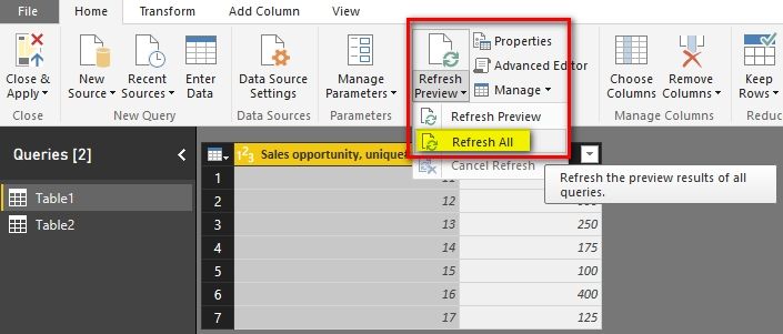
After you update the data tables, you only need to click “Refresh All” in Query Editor.
Best Regards,
Herbert
- Mark as New
- Bookmark
- Subscribe
- Mute
- Subscribe to RSS Feed
- Permalink
- Report Inappropriate Content
@Anonymous
In this scenario, you can first transform your table in Query Editor and then you can get the expected result with one measure. Please refer to following steps.
- In Query Editor, duplicate Table1 and rename it to Table2.
- Delete the three columns (blue, 4WD and backseats) of Table1. Delete one column (Sales prize) of Table2.
- Multiple select the three columns (blue, 4WD and backseats) of Table2, click “Unpivot Columns”.
- Filter the rows which “Value” = True in Table2. Then delete the “Value” column.
- Select the “Attribute” column in Table2, click “Split Column by Delimiter” of Space at the right-most delimiter as below. Replace ? with null in “Attribute.2” column. Rename “Attribute.2” to “Type” and delete “Attribute.1” column.
- Close and apply Query Editor. A 1:* relationship between Table1 and Table2 will be created automatically. Create a measure with following formula. Set its Format to “Percentage”.
Percent = DIVIDE ( SUM ( Table1[Sales prize] ), CALCULATE ( SUM ( Table1[Sales prize] ), ALL ( Table2 ) ) ) - Drag Stacked bar chart into your canvas. Select Type for Axis, Percent for Value, Sales prize (Quick Calc Sum) for Tooltips.
- Mark as New
- Bookmark
- Subscribe
- Mute
- Subscribe to RSS Feed
- Permalink
- Report Inappropriate Content
Thanks a lot, just what I needed! Seems like I have a lot "text editing" to do in the Query Editor, before I have the desired result.
Do you know if the table copying in the Query Editor is "remembered" or do I have to do this manually each time I update the data tables?
- Mark as New
- Bookmark
- Subscribe
- Mute
- Subscribe to RSS Feed
- Permalink
- Report Inappropriate Content
@Anonymous
After you update the data tables, you only need to click “Refresh All” in Query Editor.
Best Regards,
Herbert
- Mark as New
- Bookmark
- Subscribe
- Mute
- Subscribe to RSS Feed
- Permalink
- Report Inappropriate Content
- Mark as New
- Bookmark
- Subscribe
- Mute
- Subscribe to RSS Feed
- Permalink
- Report Inappropriate Content
Thaks a lot! Just what I neeeded - quite a workaround though 🙂
Seems like I'm going to do a lot of "text-work" in the Query Editor, since the real table of course has a lot more content/questions. Do you know if the Query Editor is able to "remember" the copying of tables if I need to update theese numbers each month?
Helpful resources

Microsoft Fabric Learn Together
Covering the world! 9:00-10:30 AM Sydney, 4:00-5:30 PM CET (Paris/Berlin), 7:00-8:30 PM Mexico City

Power BI Monthly Update - April 2024
Check out the April 2024 Power BI update to learn about new features.

| User | Count |
|---|---|
| 106 | |
| 93 | |
| 75 | |
| 62 | |
| 50 |
| User | Count |
|---|---|
| 147 | |
| 107 | |
| 105 | |
| 87 | |
| 61 |
