- Power BI forums
- Updates
- News & Announcements
- Get Help with Power BI
- Desktop
- Service
- Report Server
- Power Query
- Mobile Apps
- Developer
- DAX Commands and Tips
- Custom Visuals Development Discussion
- Health and Life Sciences
- Power BI Spanish forums
- Translated Spanish Desktop
- Power Platform Integration - Better Together!
- Power Platform Integrations (Read-only)
- Power Platform and Dynamics 365 Integrations (Read-only)
- Training and Consulting
- Instructor Led Training
- Dashboard in a Day for Women, by Women
- Galleries
- Community Connections & How-To Videos
- COVID-19 Data Stories Gallery
- Themes Gallery
- Data Stories Gallery
- R Script Showcase
- Webinars and Video Gallery
- Quick Measures Gallery
- 2021 MSBizAppsSummit Gallery
- 2020 MSBizAppsSummit Gallery
- 2019 MSBizAppsSummit Gallery
- Events
- Ideas
- Custom Visuals Ideas
- Issues
- Issues
- Events
- Upcoming Events
- Community Blog
- Power BI Community Blog
- Custom Visuals Community Blog
- Community Support
- Community Accounts & Registration
- Using the Community
- Community Feedback
Register now to learn Fabric in free live sessions led by the best Microsoft experts. From Apr 16 to May 9, in English and Spanish.
- Power BI forums
- Forums
- Get Help with Power BI
- Desktop
- Visualizing Multiple Choice Data
- Subscribe to RSS Feed
- Mark Topic as New
- Mark Topic as Read
- Float this Topic for Current User
- Bookmark
- Subscribe
- Printer Friendly Page
- Mark as New
- Bookmark
- Subscribe
- Mute
- Subscribe to RSS Feed
- Permalink
- Report Inappropriate Content
Visualizing Multiple Choice Data
Hi there,
How do I visualize the following multiple choice data:
| Respondent Name | What are the ages of your children? (Tick all that applies) | ||||
| <2 | 2-5 | 6-12 | 13-18 | above 18 | |
| B | 2-5 | ||||
| C | <2 | 2-5 | |||
| D | 13-18 | ||||
| E | 6-12 | ||||
| F | <2 | ||||
| G | 2-5 | 13-18 | |||
| H | <2 | 6-12 | |||
| I | 6-12 | ||||
| J | <2 | 2-5 | 6-12 | ||
| K | <2 | ||||
| L | 6-12 |
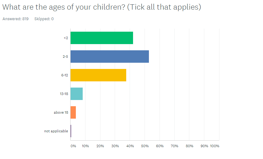
Into the following visual (taken from Survey Monkey)
Am quite a basic user when it comes to visualization.
Appreciate your help in advance.
Solved! Go to Solution.
- Mark as New
- Bookmark
- Subscribe
- Mute
- Subscribe to RSS Feed
- Permalink
- Report Inappropriate Content
I would suggest that you open the data in Power Query, then select the choices for the question and Unpivot data. I've recently done a webinar on handling survey data. See if it might help you with some best practice tips for yours.
Just click the 'Watch Now!' button under the Survey Says heading: https://www.excelwithallison.com/MCT/news#h.p_NkgcNxVFFYaS
Please @mention me in your reply if you want a response.
Copying DAX from this post? Click here for a hack to quickly replace it with your own table names
Has this post solved your problem? Please Accept as Solution so that others can find it quickly and to let the community know your problem has been solved.
If you found this post helpful, please give Kudos C
I work as a Microsoft trainer and consultant, specialising in Power BI and Power Query.
www.excelwithallison.com
- Mark as New
- Bookmark
- Subscribe
- Mute
- Subscribe to RSS Feed
- Permalink
- Report Inappropriate Content
hI @ngiam
Here's a sample PBIX file containing the following steps and visual.
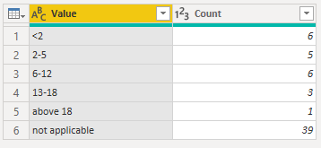
You can unpivot the answer columns in Power Query then do a Group By where those answers are counted. This gives you this table which is based on the sample of data you provided above.
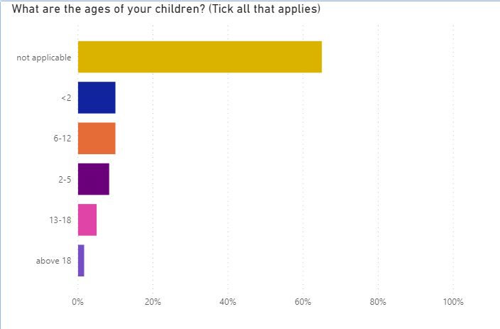
You can use that to produce this visual
Regards
Phil
If I answered your question please mark my post as the solution.
If my answer helped solve your problem, give it a kudos by clicking on the Thumbs Up.
Did I answer your question? Then please mark my post as the solution.
If I helped you, click on the Thumbs Up to give Kudos.
Blog :: YouTube Channel :: Connect on Linkedin
Proud to be a Super User!
- Mark as New
- Bookmark
- Subscribe
- Mute
- Subscribe to RSS Feed
- Permalink
- Report Inappropriate Content
50% of respondents in your dataset have children <2
Your visual shows 28,57% because during unpivoting you've got some "extra" respondents
- Mark as New
- Bookmark
- Subscribe
- Mute
- Subscribe to RSS Feed
- Permalink
- Report Inappropriate Content
@ngiam , if they separated by space. they use split by a delimiter. https://www.tutorialgateway.org/how-to-split-columns-in-power-bi/
Or Unpivot : https://radacad.com/pivot-and-unpivot-with-power-bi
Transpose : https://yodalearning.com/tutorials/power-query-helps-transposing-data/
Microsoft Power BI Learning Resources, 2023 !!
Learn Power BI - Full Course with Dec-2022, with Window, Index, Offset, 100+ Topics !!
Did I answer your question? Mark my post as a solution! Appreciate your Kudos !! Proud to be a Super User! !!
- Mark as New
- Bookmark
- Subscribe
- Mute
- Subscribe to RSS Feed
- Permalink
- Report Inappropriate Content
I would suggest that you open the data in Power Query, then select the choices for the question and Unpivot data. I've recently done a webinar on handling survey data. See if it might help you with some best practice tips for yours.
Just click the 'Watch Now!' button under the Survey Says heading: https://www.excelwithallison.com/MCT/news#h.p_NkgcNxVFFYaS
Please @mention me in your reply if you want a response.
Copying DAX from this post? Click here for a hack to quickly replace it with your own table names
Has this post solved your problem? Please Accept as Solution so that others can find it quickly and to let the community know your problem has been solved.
If you found this post helpful, please give Kudos C
I work as a Microsoft trainer and consultant, specialising in Power BI and Power Query.
www.excelwithallison.com
Helpful resources

Microsoft Fabric Learn Together
Covering the world! 9:00-10:30 AM Sydney, 4:00-5:30 PM CET (Paris/Berlin), 7:00-8:30 PM Mexico City

Power BI Monthly Update - April 2024
Check out the April 2024 Power BI update to learn about new features.

| User | Count |
|---|---|
| 114 | |
| 99 | |
| 82 | |
| 70 | |
| 60 |
| User | Count |
|---|---|
| 149 | |
| 114 | |
| 107 | |
| 89 | |
| 67 |


