- Power BI forums
- Updates
- News & Announcements
- Get Help with Power BI
- Desktop
- Service
- Report Server
- Power Query
- Mobile Apps
- Developer
- DAX Commands and Tips
- Custom Visuals Development Discussion
- Health and Life Sciences
- Power BI Spanish forums
- Translated Spanish Desktop
- Power Platform Integration - Better Together!
- Power Platform Integrations (Read-only)
- Power Platform and Dynamics 365 Integrations (Read-only)
- Training and Consulting
- Instructor Led Training
- Dashboard in a Day for Women, by Women
- Galleries
- Community Connections & How-To Videos
- COVID-19 Data Stories Gallery
- Themes Gallery
- Data Stories Gallery
- R Script Showcase
- Webinars and Video Gallery
- Quick Measures Gallery
- 2021 MSBizAppsSummit Gallery
- 2020 MSBizAppsSummit Gallery
- 2019 MSBizAppsSummit Gallery
- Events
- Ideas
- Custom Visuals Ideas
- Issues
- Issues
- Events
- Upcoming Events
- Community Blog
- Power BI Community Blog
- Custom Visuals Community Blog
- Community Support
- Community Accounts & Registration
- Using the Community
- Community Feedback
Register now to learn Fabric in free live sessions led by the best Microsoft experts. From Apr 16 to May 9, in English and Spanish.
- Power BI forums
- Forums
- Get Help with Power BI
- Desktop
- Visualizing Actual and Targets in a Guage
- Subscribe to RSS Feed
- Mark Topic as New
- Mark Topic as Read
- Float this Topic for Current User
- Bookmark
- Subscribe
- Printer Friendly Page
- Mark as New
- Bookmark
- Subscribe
- Mute
- Subscribe to RSS Feed
- Permalink
- Report Inappropriate Content
Visualizing Actual and Targets in a Guage
Hi,
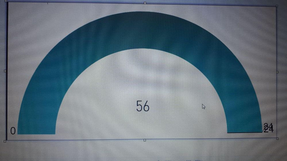
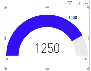
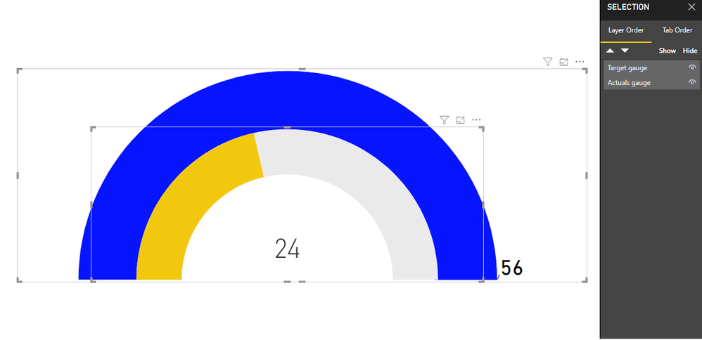
I want to visualize both Actual and Target in one guage(I thought about default Guage visualize) but I got in to the following problem as screenshots are showing:
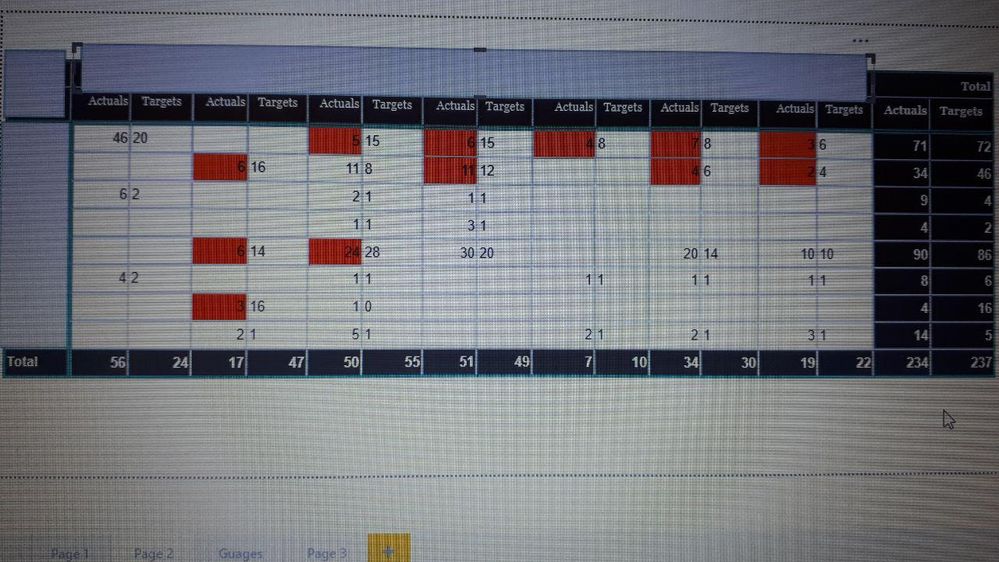
in this visual my Target is 24 and my Actual is 56 and the Maximum value is set to Target(always should be). The following is the Matrix visual that shows all my values for Actual and Target in one view:
I created a measure for each of the Guage visuals as per above picture but my problem is I need to illustrate both Target and Actual in my visual which is not possible with the current default visual! Which visual I should use or how I can do a work around on the same visual?
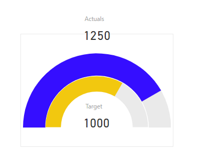
I need to use a visual like the following:
Solved! Go to Solution.
- Mark as New
- Bookmark
- Subscribe
- Mute
- Subscribe to RSS Feed
- Permalink
- Report Inappropriate Content
Hi @Anonymous ,
In the gauge chat you cannot highlight with condittional formatting, maybe a workaround could be create a pie chart with a single value 1 or blank when the target is higher than the actuals and make red as is would be an traffic light alert?
Just do a measures similar to this:
Alert = IF( SUM(Table1[Actuals]) <= SUM(Table1[Target])/2 ; 1 ; BLANK())
Regards,
MFelix
Regards
Miguel Félix
Did I answer your question? Mark my post as a solution!
Proud to be a Super User!
Check out my blog: Power BI em Português- Mark as New
- Bookmark
- Subscribe
- Mute
- Subscribe to RSS Feed
- Permalink
- Report Inappropriate Content
Hi There,
Could anyone tell me how the titling at the bottom of each gauge for actual vs target values was done !
Much apprecaited.
- Mark as New
- Bookmark
- Subscribe
- Mute
- Subscribe to RSS Feed
- Permalink
- Report Inappropriate Content
Hi @Anad63 ,
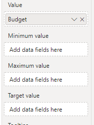
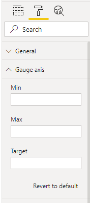
If you are refering on the having the values on the end of each end of the gauge that can be done in two ways adding measures or columns to the Gauge Minimum and Maximum Value or making it a fixed value on the Gauge Axis:
Regards
Miguel Félix
Did I answer your question? Mark my post as a solution!
Proud to be a Super User!
Check out my blog: Power BI em Português- Mark as New
- Bookmark
- Subscribe
- Mute
- Subscribe to RSS Feed
- Permalink
- Report Inappropriate Content
Hi Felix,
Thank you for the answer, I mean the actual words you see i nthe middle of each gauge for actual and target value. For example the word Actual is listed in yellow and the word Target is listed in red with a numerical value below each word.
- Mark as New
- Bookmark
- Subscribe
- Mute
- Subscribe to RSS Feed
- Permalink
- Report Inappropriate Content
Those values should have been created with a card visualization and then setup in this colors or using condittional formatting.
Regards
Miguel Félix
Did I answer your question? Mark my post as a solution!
Proud to be a Super User!
Check out my blog: Power BI em Português- Mark as New
- Bookmark
- Subscribe
- Mute
- Subscribe to RSS Feed
- Permalink
- Report Inappropriate Content
Thank you! I'm reletavilty new to powe BI, i'm not exactly sure how to link a card visualization to a gauge chart to show those values. Any tips on how to do so?
- Mark as New
- Bookmark
- Subscribe
- Mute
- Subscribe to RSS Feed
- Permalink
- Report Inappropriate Content
Hi @Anonymous ,
Appears to me that you are defining the maximum of the Gauge equal to the Target of the gauge you should define both value differently on that way you would get a single line for the target however is just one line not two visual one under the other.
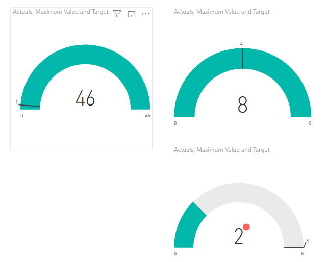
One option can be making two Gauge charts with the same maximum value and on one place the target on another the actuals and add some cards with the values something like this:
you could also use the custom visual rainbow gauge https://appsource.microsoft.com/en-us/product/power-bi-visuals/WA104382043?tab=Overview
Regards,
MFelix
Regards
Miguel Félix
Did I answer your question? Mark my post as a solution!
Proud to be a Super User!
Check out my blog: Power BI em Português- Mark as New
- Bookmark
- Subscribe
- Mute
- Subscribe to RSS Feed
- Permalink
- Report Inappropriate Content
Great! Thanks @MFelix very much!
There is only one with your visual(custom visual you illustrated) which is how to show the below target values in different color(something like applying conditional formatting for the matrix visual)???
And for the rainbow Guage ,https://appsource.microsoft.com/en-us/product/power-bi-visuals/WA104382043?tab=Overview, that you suggested since I don't have all the fields as needed by the visual how I can use it for this purpose?! I only have Actual, Target, Max and that's it!
Would appreciate if you can show me?
- Mark as New
- Bookmark
- Subscribe
- Mute
- Subscribe to RSS Feed
- Permalink
- Report Inappropriate Content
Hi @Anonymous ,
What I showed was not a custom visual was two gauges chart on top of each other one with actuals another with target and formatted in different colours check the PBIX file attach.
In the previous example I added cards in this one I added the callout on target and target value to show as actual on the actual gauge.
The maximum is a measure that gives the actuals totals and place on both gauges but you can define a differente value.
Regards,
MFelix
Regards
Miguel Félix
Did I answer your question? Mark my post as a solution!
Proud to be a Super User!
Check out my blog: Power BI em Português- Mark as New
- Bookmark
- Subscribe
- Mute
- Subscribe to RSS Feed
- Permalink
- Report Inappropriate Content
@MFelix Thanks
I know those are not one visual but two visual inside each other, but my questions was about rainbow Gauge: How I can use it when I don't have all the fields in my data set?
- Mark as New
- Bookmark
- Subscribe
- Mute
- Subscribe to RSS Feed
- Permalink
- Report Inappropriate Content
Did you tried to add measure for each value needed?
Check the example they show in the images.
Never used this visual before.
Regards,
Mfelix
Regards
Miguel Félix
Did I answer your question? Mark my post as a solution!
Proud to be a Super User!
Check out my blog: Power BI em Português- Mark as New
- Bookmark
- Subscribe
- Mute
- Subscribe to RSS Feed
- Permalink
- Report Inappropriate Content
@MFelixThanks,
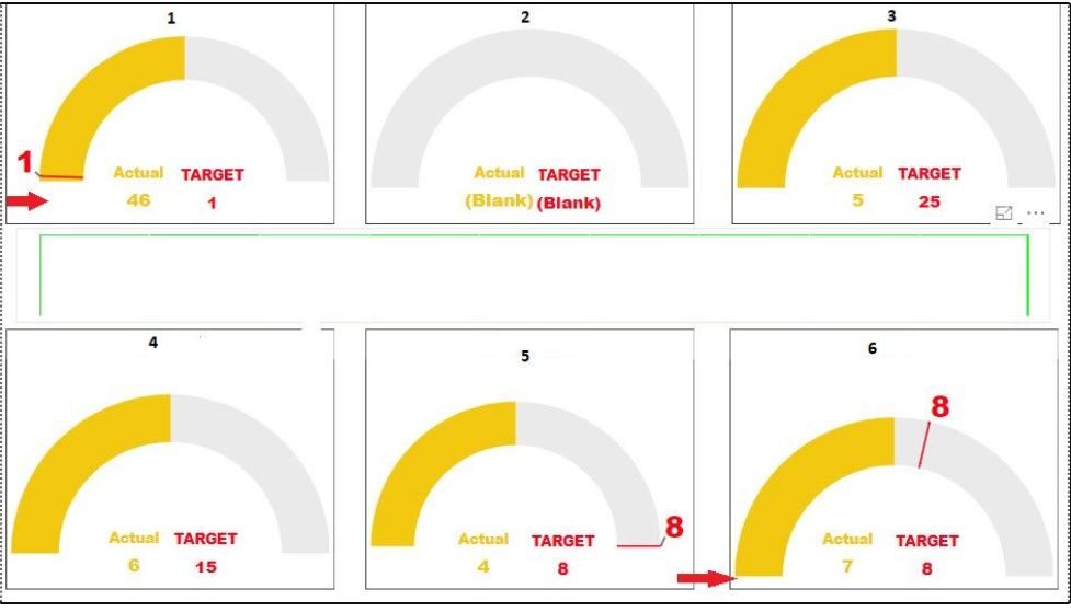
Actually all the values are based on the measures I created myself on the one radial gauge visual! Now my problem is (please look at the following screenshots):
Now there are follwoing problems:
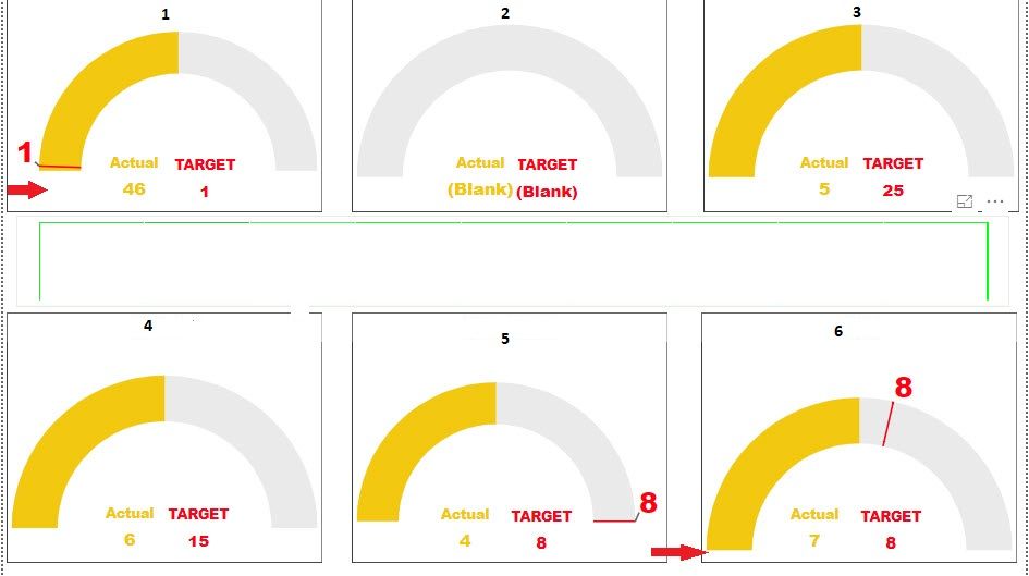
1. The Maximum value is double the Actual by default (PBI preference) which is not good forPicture 6 because my Target is lost which creats confusion, so how to choose a dynamic Maximum based on either Actual or Target which is bigger? (look at picture 4 where my target is bigger but in picture 1 the Actual is bigger value!)
2. in picture 2 when there is no data for Actual or Target or both the visual shows up as blank! how to avoid it?
3. why Picture 1 and 6 are deshaped and for a general user look like skewed? How I can avoid it to happen?
- Mark as New
- Bookmark
- Subscribe
- Mute
- Subscribe to RSS Feed
- Permalink
- Report Inappropriate Content
Hi @MFelix ,
I wanted to compare the Actuals and Target of my dataset so I used default Gauge visual on Power BI as the following:
Now there are follwoing problems:
1. The Maximum value is double the Actual by default (PBI preference) which is not good forPicture 6 because my Target is lost which creats confusion, so how to choose a dynamic Maximum based on either Actual or Target which is bigger? (look at picture 4 where my target is bigger but in picture 1 the Actual is bigger value!)
2. in picture 2 when there is no data for Actual or Target or both the visual shows up as blank! how to avoid it?
3. why Picture 1 and 6 are deshaped and for a general user look like skewed? How I can avoid it to happen?
Many thanks in advance supporters and super users
- Mark as New
- Bookmark
- Subscribe
- Mute
- Subscribe to RSS Feed
- Permalink
- Report Inappropriate Content
Hi @Anonymous ,
See my answers below:
1. You can setup a measure to have your maximum value don't know what type of actual you want but it can be a fixed value or a derivative of the actuals see examples below:
Maximum = 8

Maximum = SUM(Table[Actuals]) // Maximum will be always your actuals

Maximum = SUM(Table[Actuals]) * 1.10  // Add 10% to your actuals value so your chart will always present as 90% filled
Just some examples, then just place this measure on the chart Maximum part.
2. Create the following measures to use instead of placing values from columns:
Actuals = SUM (Table[Actuals]) + 0

Target = SUM (Table[Target]) + 0
The additional zero will make your values to be 0 (is maknig the same as a IF measure to return 0).
3. Be sure that all your visuals have the same size maybe can be only a question of eye trick since they appear to be bigger.
If you want to elaborate on this final question please share a sample file trough private message or with mockupdata.
Regards,
MFelix
Regards
Miguel Félix
Did I answer your question? Mark my post as a solution!
Proud to be a Super User!
Check out my blog: Power BI em Português- Mark as New
- Bookmark
- Subscribe
- Mute
- Subscribe to RSS Feed
- Permalink
- Report Inappropriate Content
Thanks @MFelix ,
The problem with your reply is that I can't put a predefined Maximum based on Target or Actual! I have to first compare and see which one is bigger and then create a measure accordingly. Let's see this example:
Actual: 100
Target: 4
now if I predefined my Maximum based on the Target then I would run into trouble! do you see? How I can use a what-if analysis to first find the bigger number? Or if I take Actual as biggest I might have Target as 80 and Actual as 2! Please show me the trick on it?
2. I want to appley something like conditional formatting like when the actual is below %50 of the Target it turns red or be in the red zone or something like this and if it's between 50%-100% of Target it turns Yellow and 100%+ it turns green! I couldn't find the solution, please show me the solution?
- Mark as New
- Bookmark
- Subscribe
- Mute
- Subscribe to RSS Feed
- Permalink
- Report Inappropriate Content
Hi @Anonymous ,
The question you raise is pretty simple to address, you just need to make a measure for the maximum value that uses the maximum value between target and actuals:
Maximum Value = MAX(SUM(Table1[Actuals]);SUM(Table1[Target]))
Regarding your second question on the gauge visual there is no way of making condittional formatting and you also cannot place gauge on top of gauge since it has a grey background and the top one would overlap the other ones one option could be using a donut chart and some measures.
I'm working on a blog post regarding making this type of customization without recurring to custom visuals, will put it during the next days on the blog. Do you want me to make some test with making it dinamic on colour coding based on the data you have?
And then you can implement on your data.
It always a way to improve my post and the community.
Regards,
MFelix
Regards
Miguel Félix
Did I answer your question? Mark my post as a solution!
Proud to be a Super User!
Check out my blog: Power BI em Português- Mark as New
- Bookmark
- Subscribe
- Mute
- Subscribe to RSS Feed
- Permalink
- Report Inappropriate Content
Thanks for your reply! I think there is a misunderstanding in my question because I won't waste both of ours time! However, I found a workaround. But now the issue which hasn't been solved yet is I have 8 of these gauges, it happens quite often(based on data parsed from SAP) that in one or some of the gauges the actual is less than half of the target which should be noticed by the user, I need someway of defferantiating that(those) gauge from others so the user get noticed and react! So if conditional formatting is not possible how I can do it? Please note that it might be gauge 1 today but gauge 8 tomorrow and so forth...
Is it possible to create an if measure, what if analysis to address this?!
- Mark as New
- Bookmark
- Subscribe
- Mute
- Subscribe to RSS Feed
- Permalink
- Report Inappropriate Content
Hi @Anonymous ,
In the gauge chat you cannot highlight with condittional formatting, maybe a workaround could be create a pie chart with a single value 1 or blank when the target is higher than the actuals and make red as is would be an traffic light alert?
Just do a measures similar to this:
Alert = IF( SUM(Table1[Actuals]) <= SUM(Table1[Target])/2 ; 1 ; BLANK())
Regards,
MFelix
Regards
Miguel Félix
Did I answer your question? Mark my post as a solution!
Proud to be a Super User!
Check out my blog: Power BI em Português- Mark as New
- Bookmark
- Subscribe
- Mute
- Subscribe to RSS Feed
- Permalink
- Report Inappropriate Content
On the June realease now you can condittional format gauge colors.
So this solves your issue.
Regards
MFelix
Regards
Miguel Félix
Did I answer your question? Mark my post as a solution!
Proud to be a Super User!
Check out my blog: Power BI em Português- Mark as New
- Bookmark
- Subscribe
- Mute
- Subscribe to RSS Feed
- Permalink
- Report Inappropriate Content
@MFelix Thanks for the reply!
Actually I can not download June relase due to limitation but your reply triggered a good solution and I used another custom visual.
Regards
Helpful resources

Microsoft Fabric Learn Together
Covering the world! 9:00-10:30 AM Sydney, 4:00-5:30 PM CET (Paris/Berlin), 7:00-8:30 PM Mexico City

Power BI Monthly Update - April 2024
Check out the April 2024 Power BI update to learn about new features.

| User | Count |
|---|---|
| 114 | |
| 99 | |
| 82 | |
| 70 | |
| 60 |
| User | Count |
|---|---|
| 149 | |
| 114 | |
| 107 | |
| 89 | |
| 67 |
