- Power BI forums
- Updates
- News & Announcements
- Get Help with Power BI
- Desktop
- Service
- Report Server
- Power Query
- Mobile Apps
- Developer
- DAX Commands and Tips
- Custom Visuals Development Discussion
- Health and Life Sciences
- Power BI Spanish forums
- Translated Spanish Desktop
- Power Platform Integration - Better Together!
- Power Platform Integrations (Read-only)
- Power Platform and Dynamics 365 Integrations (Read-only)
- Training and Consulting
- Instructor Led Training
- Dashboard in a Day for Women, by Women
- Galleries
- Community Connections & How-To Videos
- COVID-19 Data Stories Gallery
- Themes Gallery
- Data Stories Gallery
- R Script Showcase
- Webinars and Video Gallery
- Quick Measures Gallery
- 2021 MSBizAppsSummit Gallery
- 2020 MSBizAppsSummit Gallery
- 2019 MSBizAppsSummit Gallery
- Events
- Ideas
- Custom Visuals Ideas
- Issues
- Issues
- Events
- Upcoming Events
- Community Blog
- Power BI Community Blog
- Custom Visuals Community Blog
- Community Support
- Community Accounts & Registration
- Using the Community
- Community Feedback
Register now to learn Fabric in free live sessions led by the best Microsoft experts. From Apr 16 to May 9, in English and Spanish.
- Power BI forums
- Forums
- Get Help with Power BI
- Desktop
- Re: Visualize Rolling 12 Months
- Subscribe to RSS Feed
- Mark Topic as New
- Mark Topic as Read
- Float this Topic for Current User
- Bookmark
- Subscribe
- Printer Friendly Page
- Mark as New
- Bookmark
- Subscribe
- Mute
- Subscribe to RSS Feed
- Permalink
- Report Inappropriate Content
Visualize Rolling 12 Months
Hi Everyone,
I've spent about two days researching how to accomplish this, reading articles both on the PBI forum and also external articles. I've attempted to solve this myself using some DAX others shared, but I'm still not able to accomplish what I'm trying to achieve.
I have a dates table that's already set and built quite extensively. It's also set as my date table in PBI. [Dates]
I have another table with row by row employees who've terminated and within the table a date of when they were terminated. [EE Details]
I've sucessfully written a dax called MoM Terms, which calculates total terms by month, and I've sucessfully visualize it as such and use that dax on other plots. [MoM Terms]
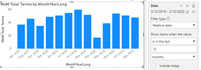
I'm trying to visualize using a bar chart the rolling last twelve months (not including current month). This is what it looks like:
As you can see, it's still including March 2020, though I didn't check off include today. ;(
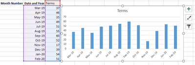
What I'm really trying to achieve is the following:
Any thoughts on how I can do this? 🙂 Thanks so much!
Nabsters
- Mark as New
- Bookmark
- Subscribe
- Mute
- Subscribe to RSS Feed
- Permalink
- Report Inappropriate Content
Please see this post regarding How to Get Your Question Answered Quickly: https://community.powerbi.com/t5/Community-Blog/How-to-Get-Your-Question-Answered-Quickly/ba-p/38490
See if my Time Intelligence the Hard Way provides a different way of accomplishing what you are going for.
https://community.powerbi.com/t5/Quick-Measures-Gallery/Time-Intelligence-quot-The-Hard-Way-quot-TIT...
@ me in replies or I'll lose your thread!!!
Instead of a Kudo, please vote for this idea
Become an expert!: Enterprise DNA
External Tools: MSHGQM
YouTube Channel!: Microsoft Hates Greg
Latest book!: The Definitive Guide to Power Query (M)
DAX is easy, CALCULATE makes DAX hard...
- Mark as New
- Bookmark
- Subscribe
- Mute
- Subscribe to RSS Feed
- Permalink
- Report Inappropriate Content
@Greg_Deckler Thanks for your response, I actually referenced that before I posted.
- Mark as New
- Bookmark
- Subscribe
- Mute
- Subscribe to RSS Feed
- Permalink
- Report Inappropriate Content
@Anonymous Great, sample/example data as text would be great!
@ me in replies or I'll lose your thread!!!
Instead of a Kudo, please vote for this idea
Become an expert!: Enterprise DNA
External Tools: MSHGQM
YouTube Channel!: Microsoft Hates Greg
Latest book!: The Definitive Guide to Power Query (M)
DAX is easy, CALCULATE makes DAX hard...
- Mark as New
- Bookmark
- Subscribe
- Mute
- Subscribe to RSS Feed
- Permalink
- Report Inappropriate Content
Hi @Greg_Deckler - thank you! Here's the .pbix file and you'll also find the dataset in an excel file. I'm very new at DAX and I've been learning at lot, thanks to some articles like yours. :).
Really need to figure out how to get this visual to appear in a rolling way, like I have it in the example above.
I've been doing a bit more research on the forums and online on how to get this configured and calculated correctly, but still running into some issues. For example, the % Churn calculation isn't calculating correctly overall and MoM.
Churn is calculated as follows = Total#ofChurn/Avg.MonthlyHC. I believe I might be missing some pieces in my dax code.
Could you take a look and let me know please? Please let me know if you have issues accessing the files.
Thanks Much
Helpful resources

Microsoft Fabric Learn Together
Covering the world! 9:00-10:30 AM Sydney, 4:00-5:30 PM CET (Paris/Berlin), 7:00-8:30 PM Mexico City

Power BI Monthly Update - April 2024
Check out the April 2024 Power BI update to learn about new features.

| User | Count |
|---|---|
| 114 | |
| 100 | |
| 78 | |
| 75 | |
| 50 |
| User | Count |
|---|---|
| 144 | |
| 109 | |
| 108 | |
| 88 | |
| 61 |


