- Power BI forums
- Updates
- News & Announcements
- Get Help with Power BI
- Desktop
- Service
- Report Server
- Power Query
- Mobile Apps
- Developer
- DAX Commands and Tips
- Custom Visuals Development Discussion
- Health and Life Sciences
- Power BI Spanish forums
- Translated Spanish Desktop
- Power Platform Integration - Better Together!
- Power Platform Integrations (Read-only)
- Power Platform and Dynamics 365 Integrations (Read-only)
- Training and Consulting
- Instructor Led Training
- Dashboard in a Day for Women, by Women
- Galleries
- Community Connections & How-To Videos
- COVID-19 Data Stories Gallery
- Themes Gallery
- Data Stories Gallery
- R Script Showcase
- Webinars and Video Gallery
- Quick Measures Gallery
- 2021 MSBizAppsSummit Gallery
- 2020 MSBizAppsSummit Gallery
- 2019 MSBizAppsSummit Gallery
- Events
- Ideas
- Custom Visuals Ideas
- Issues
- Issues
- Events
- Upcoming Events
- Community Blog
- Power BI Community Blog
- Custom Visuals Community Blog
- Community Support
- Community Accounts & Registration
- Using the Community
- Community Feedback
Register now to learn Fabric in free live sessions led by the best Microsoft experts. From Apr 16 to May 9, in English and Spanish.
- Power BI forums
- Forums
- Get Help with Power BI
- Desktop
- Visualizations: Grouped bar chart (help)
- Subscribe to RSS Feed
- Mark Topic as New
- Mark Topic as Read
- Float this Topic for Current User
- Bookmark
- Subscribe
- Printer Friendly Page
- Mark as New
- Bookmark
- Subscribe
- Mute
- Subscribe to RSS Feed
- Permalink
- Report Inappropriate Content
Visualizations: Grouped bar chart (help)
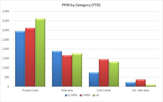
Still a newbie at PBI, but I've been laboring the past few days learning DAX and tables. So now I've finally created a very large table with many measures and calculated columns, but I want to display one row from 12 columns grouped like this:
I should point out that all of the data I need exists in a single table and is organized by date. So, for example, if you went to the row for June 2018 and scanned accross the columns you'd find (among many others) the measures for Cost Center PPM, Warranty PPM, etc. as well as the calculated 3MRA and 12MRA values.
So everything is already there, in one row, but how to I create a column visual that (using a slicer) will extract those specific 12 columns from that selected row and group them as shown.
Is it possible?
- Mark as New
- Bookmark
- Subscribe
- Mute
- Subscribe to RSS Feed
- Permalink
- Report Inappropriate Content
Hi @Daryl_K
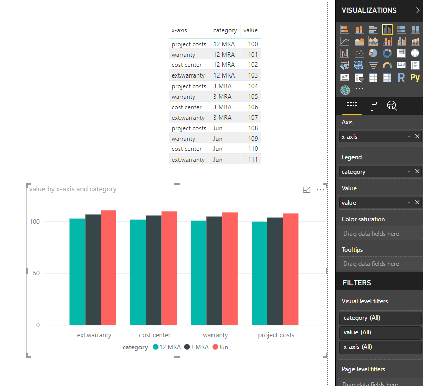
Based on my test, to get the visual like the screenshot, your table should structure as below
From you second screenshot, your table is not like this, i'm afraid it is neccessary to change the model of your table in Edit Queries.
It would be better to share a table with me.
Best Regards
Maggie
- Mark as New
- Bookmark
- Subscribe
- Mute
- Subscribe to RSS Feed
- Permalink
- Report Inappropriate Content
Hi @Daryl_K,
Although you say that the information is all there in your table be aware that in order to have the correct results sometimes the information needs to be in a single column. To what I can understand from your question you have several measures (3MRA, 12 MRA) and then several columns the PPM Categorys. In order to achieve this look and feel you need to make the unpivot of the PPM categorys to single column and that will allow you to place the Category on the X-axis then add the measures on the values.
However as I said the question is not clear.
Please see this post regarding How to Get Your Question Answered Quickly:
https://community.powerbi.com/t5/Community-Blog/How-to-Get-Your-Question-Answered-Quickly/ba-p/38490...(courtesy of @Greg_Deckler).
Regards,
MFelix
Regards
Miguel Félix
Did I answer your question? Mark my post as a solution!
Proud to be a Super User!
Check out my blog: Power BI em Português- Mark as New
- Bookmark
- Subscribe
- Mute
- Subscribe to RSS Feed
- Permalink
- Report Inappropriate Content
You are correct. As noted, I am a major newbie in PBI and still think like Excel, so my table looks like an Excel data table would. Categories are in columns, and dates are from top to bottom. All data from a given year/month exists in a single row accross.
My actual data has a lot of proprietary info in it, but here is a sampe of what my table looks like (it actually has about 6x this many columns):
Can it be done arranged like this?
P.S. I am still trying to convert my thinking process to the Power BI way.
- Mark as New
- Bookmark
- Subscribe
- Mute
- Subscribe to RSS Feed
- Permalink
- Report Inappropriate Content
I made this as big as it allows, but to my eye it seems unreadable. Are you able to see the text?
- Mark as New
- Bookmark
- Subscribe
- Mute
- Subscribe to RSS Feed
- Permalink
- Report Inappropriate Content
Hi @Daryl_K,
Can you share your file? maybe by private message.
Regards,
MFelix
Regards
Miguel Félix
Did I answer your question? Mark my post as a solution!
Proud to be a Super User!
Check out my blog: Power BI em PortuguêsHelpful resources

Microsoft Fabric Learn Together
Covering the world! 9:00-10:30 AM Sydney, 4:00-5:30 PM CET (Paris/Berlin), 7:00-8:30 PM Mexico City

Power BI Monthly Update - April 2024
Check out the April 2024 Power BI update to learn about new features.

| User | Count |
|---|---|
| 114 | |
| 99 | |
| 82 | |
| 70 | |
| 61 |
| User | Count |
|---|---|
| 149 | |
| 114 | |
| 107 | |
| 89 | |
| 67 |


