- Power BI forums
- Updates
- News & Announcements
- Get Help with Power BI
- Desktop
- Service
- Report Server
- Power Query
- Mobile Apps
- Developer
- DAX Commands and Tips
- Custom Visuals Development Discussion
- Health and Life Sciences
- Power BI Spanish forums
- Translated Spanish Desktop
- Power Platform Integration - Better Together!
- Power Platform Integrations (Read-only)
- Power Platform and Dynamics 365 Integrations (Read-only)
- Training and Consulting
- Instructor Led Training
- Dashboard in a Day for Women, by Women
- Galleries
- Community Connections & How-To Videos
- COVID-19 Data Stories Gallery
- Themes Gallery
- Data Stories Gallery
- R Script Showcase
- Webinars and Video Gallery
- Quick Measures Gallery
- 2021 MSBizAppsSummit Gallery
- 2020 MSBizAppsSummit Gallery
- 2019 MSBizAppsSummit Gallery
- Events
- Ideas
- Custom Visuals Ideas
- Issues
- Issues
- Events
- Upcoming Events
- Community Blog
- Power BI Community Blog
- Custom Visuals Community Blog
- Community Support
- Community Accounts & Registration
- Using the Community
- Community Feedback
Register now to learn Fabric in free live sessions led by the best Microsoft experts. From Apr 16 to May 9, in English and Spanish.
- Power BI forums
- Forums
- Get Help with Power BI
- Desktop
- Visualization to show Max value + category name
- Subscribe to RSS Feed
- Mark Topic as New
- Mark Topic as Read
- Float this Topic for Current User
- Bookmark
- Subscribe
- Printer Friendly Page
- Mark as New
- Bookmark
- Subscribe
- Mute
- Subscribe to RSS Feed
- Permalink
- Report Inappropriate Content
Visualization to show Max value + category name
Hello Dear community,
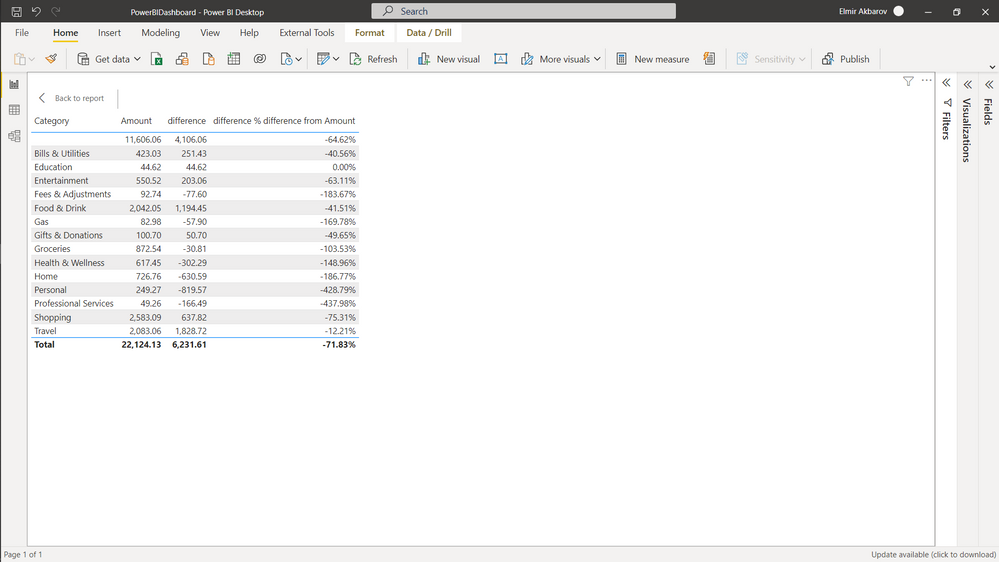
Can anyone help me to with DAX measure which will return Max value from difference % column & it's category name.
And which visualization can I use which will show both?
In following example I want visualization to show : [Personal Service 166] or [Personal Service 437%]
Thank you.
Solved! Go to Solution.
- Mark as New
- Bookmark
- Subscribe
- Mute
- Subscribe to RSS Feed
- Permalink
- Report Inappropriate Content
Hi @Akbarov ,
You can use a Card Visual to show your requirement.
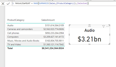
I tested the steps below out in the Contoso Sample Power BI dataset on my machine. They got me this result:
1. Create a measure which would go something like this:
Measure For Card Visual =
VAR ABC = SUM(TableName[%DifferenceFromAmountField])

VAR BCD = MAXX(SUMMARIZE(TableName, CategoryName), ABC)

RETURN
BCD
2. Add a card visual. Add the above created measure into the card visual.
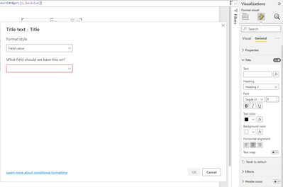
3. Go into the format settings of the Card Visual -> NAvigate to "General" -> Switch On Title settings -> Click the Fx button next to title heading (refer screenshot below):
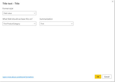
4. Now choose the Category field as in the Fx conditional formatting field.
5. Click Ok.
Your card will show you the MAX Value of your field and the title will show the category that the MAX value belongs to.
Hope this helps. Please give a thumbs up if it does 🙂
Also, to understand the idea behind the calculation you can refer to this video -
https://youtu.be/UJPBeiGBEg4
- Mark as New
- Bookmark
- Subscribe
- Mute
- Subscribe to RSS Feed
- Permalink
- Report Inappropriate Content
Hi,
Trythese measures
Max difference % = MAXX(all(data[category]),[difference %])
Category of max difference % = FIRSTNONBLANK(TOPN(1,VALUES(Products[Category]),[difference %]),1)
Drag both measures to a multi card visual. If these measures do not work, then share the link from where i can download your PBI file.
Regards,
Ashish Mathur
http://www.ashishmathur.com
https://www.linkedin.com/in/excelenthusiasts/
- Mark as New
- Bookmark
- Subscribe
- Mute
- Subscribe to RSS Feed
- Permalink
- Report Inappropriate Content
Thanks both for answers, my values ( % ) mostly negative values, I used ABS() now results are correct.
- Mark as New
- Bookmark
- Subscribe
- Mute
- Subscribe to RSS Feed
- Permalink
- Report Inappropriate Content
Hi,
Trythese measures
Max difference % = MAXX(all(data[category]),[difference %])
Category of max difference % = FIRSTNONBLANK(TOPN(1,VALUES(Products[Category]),[difference %]),1)
Drag both measures to a multi card visual. If these measures do not work, then share the link from where i can download your PBI file.
Regards,
Ashish Mathur
http://www.ashishmathur.com
https://www.linkedin.com/in/excelenthusiasts/
- Mark as New
- Bookmark
- Subscribe
- Mute
- Subscribe to RSS Feed
- Permalink
- Report Inappropriate Content
Hi @Akbarov ,
You can use a Card Visual to show your requirement.
I tested the steps below out in the Contoso Sample Power BI dataset on my machine. They got me this result:
1. Create a measure which would go something like this:
Measure For Card Visual =
VAR ABC = SUM(TableName[%DifferenceFromAmountField])

VAR BCD = MAXX(SUMMARIZE(TableName, CategoryName), ABC)

RETURN
BCD
2. Add a card visual. Add the above created measure into the card visual.
3. Go into the format settings of the Card Visual -> NAvigate to "General" -> Switch On Title settings -> Click the Fx button next to title heading (refer screenshot below):
4. Now choose the Category field as in the Fx conditional formatting field.
5. Click Ok.
Your card will show you the MAX Value of your field and the title will show the category that the MAX value belongs to.
Hope this helps. Please give a thumbs up if it does 🙂
Also, to understand the idea behind the calculation you can refer to this video -
https://youtu.be/UJPBeiGBEg4
Helpful resources

Microsoft Fabric Learn Together
Covering the world! 9:00-10:30 AM Sydney, 4:00-5:30 PM CET (Paris/Berlin), 7:00-8:30 PM Mexico City

Power BI Monthly Update - April 2024
Check out the April 2024 Power BI update to learn about new features.

| User | Count |
|---|---|
| 112 | |
| 100 | |
| 80 | |
| 64 | |
| 57 |
| User | Count |
|---|---|
| 145 | |
| 111 | |
| 92 | |
| 84 | |
| 66 |


