- Power BI forums
- Updates
- News & Announcements
- Get Help with Power BI
- Desktop
- Service
- Report Server
- Power Query
- Mobile Apps
- Developer
- DAX Commands and Tips
- Custom Visuals Development Discussion
- Health and Life Sciences
- Power BI Spanish forums
- Translated Spanish Desktop
- Power Platform Integration - Better Together!
- Power Platform Integrations (Read-only)
- Power Platform and Dynamics 365 Integrations (Read-only)
- Training and Consulting
- Instructor Led Training
- Dashboard in a Day for Women, by Women
- Galleries
- Community Connections & How-To Videos
- COVID-19 Data Stories Gallery
- Themes Gallery
- Data Stories Gallery
- R Script Showcase
- Webinars and Video Gallery
- Quick Measures Gallery
- 2021 MSBizAppsSummit Gallery
- 2020 MSBizAppsSummit Gallery
- 2019 MSBizAppsSummit Gallery
- Events
- Ideas
- Custom Visuals Ideas
- Issues
- Issues
- Events
- Upcoming Events
- Community Blog
- Power BI Community Blog
- Custom Visuals Community Blog
- Community Support
- Community Accounts & Registration
- Using the Community
- Community Feedback
Register now to learn Fabric in free live sessions led by the best Microsoft experts. From Apr 16 to May 9, in English and Spanish.
- Power BI forums
- Forums
- Get Help with Power BI
- Desktop
- Re: Visualization of grouped bar chart with 3 colu...
- Subscribe to RSS Feed
- Mark Topic as New
- Mark Topic as Read
- Float this Topic for Current User
- Bookmark
- Subscribe
- Printer Friendly Page
- Mark as New
- Bookmark
- Subscribe
- Mute
- Subscribe to RSS Feed
- Permalink
- Report Inappropriate Content
Visualization of grouped bar chart with 3 columns
Hello,
I am a new user of Power BI and I am facing this issue I couldn´t resolve. My source of data has 6 columns, which are the ones i am showing below:
I would like to build a visualization that shows me only the grand total of Region A, Region B and Region C in three different columns (bar chart) by Region, so when i click for example 25 of january, it shows me the values of Region A, B and C of that day in ascendent or descendent order. I can not do this, since the grouped bar chart only let me sort by which region I want to be the first or last, and I want that automatically it orders by the greatest value of that day, month or year.
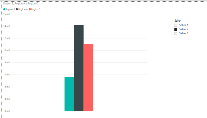
Here, as an example, I am sorting by "Seller 2", and this is what the chart bar shows me. I want that the black bar be the first, then the red and last the blue. Also I want the references to appear at the bottom of the chart, like in excel
By the other hand, I want to do the same but instead of showing me the monetary values, I want the chart bar to show the percentage of each regarding the total of the sum of the 3 regions.
I hope to have explained it clearly
Thank you in advance,
Solved! Go to Solution.
- Mark as New
- Bookmark
- Subscribe
- Mute
- Subscribe to RSS Feed
- Permalink
- Report Inappropriate Content
Hi @Anonymous,
Based on my test, you could refer to below steps:
Sample data:
Unpivot the Region A B C
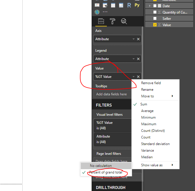
Set value as Percent of Gand Total:
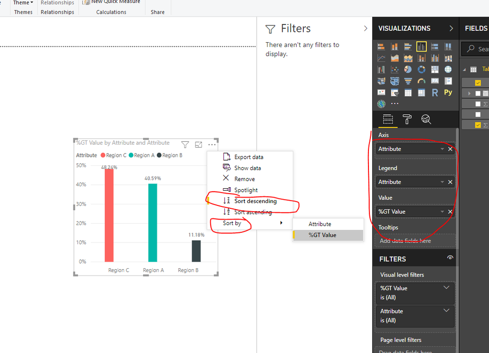
Use below column to creat bar visual and order by value:
You could also download the pbix file to have a view.
Regards,
Daniel He
If this post helps, then please consider Accept it as the solution to help the other members find it more quickly.
- Mark as New
- Bookmark
- Subscribe
- Mute
- Subscribe to RSS Feed
- Permalink
- Report Inappropriate Content
Hello Daniel, how are you?
First of all I want to thank you very much for your help, this is what I was looking for. Clearly I am not familiar with all the functions that power BI has. I will keep learning in how to use it.
Thank you again, my doubt was solved.
Best regards!
Joaquín
Helpful resources

Microsoft Fabric Learn Together
Covering the world! 9:00-10:30 AM Sydney, 4:00-5:30 PM CET (Paris/Berlin), 7:00-8:30 PM Mexico City

Power BI Monthly Update - April 2024
Check out the April 2024 Power BI update to learn about new features.

| User | Count |
|---|---|
| 118 | |
| 107 | |
| 70 | |
| 70 | |
| 43 |
| User | Count |
|---|---|
| 148 | |
| 104 | |
| 104 | |
| 89 | |
| 66 |


